Zebra BI visuals offer extensive support for applying custom design. You can change the color, font type, font size, shape, etc. on practically every element in the Zebra BI visuals.
Let’s see some of the most important styling elements and how you can change them. Make sure to download the sample PBIX file to play around with all these features
Changing Colors
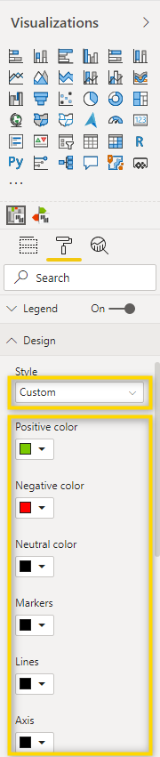
The default colors in Zebra BI visuals are according to International Business Communication Standards (IBCS). If you haven’t heard about IBCS before or want to refreshen your memory, find the advantages of having IBCS certified visuals like the ones from Zebra BI. Nevertheless, you have full flexibility and can change any color you want. The Zebra BI visuals are delivered with some predefined color settings which you can find in the Design section of the formatting pane. Simply select the visual that you’d like to change and select a Style from the drop-down.
If none of the predefined Styles works for you because of corporate design rules or personal preference, you can just select the Custom Style and change every color of the visual individually. Take a look at the report page with the name Custom in the attached file, where you can find visuals that are using a custom-created style.
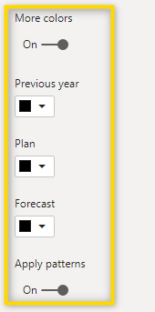
You will note that there’s also an option for More colors and once it has been enabled, you can even change the color per scenario. The default is that the scenarios Previous year, Plan, and Forecast have the same color as the Actuals but are shown in a different pattern (the previous year is a lighter shade of Actuals, Plan is an outline, and Forecast is hatched). In case you are using the scenario placeholders for something different than the actual scenarios, you might want to play around with these settings to get the desired result.
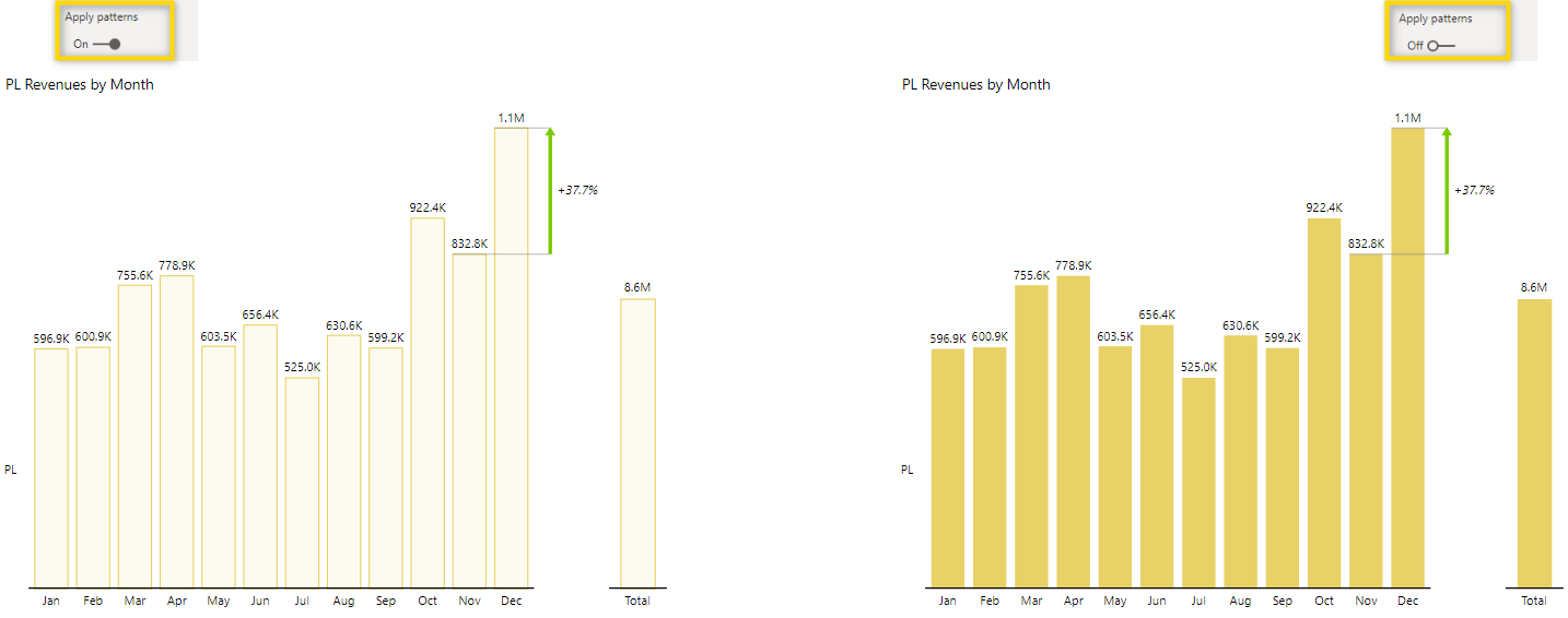
Let’s make this a bit clear by looking at one specific example. To better illustrate, we’ve removed the Actuals and only show Plan figures in this visual. The visual on the left has the pattern for plan applied, while the visual on the right has no pattern applied.
Changing the design of text (Font, Size, Color, etc.)
The Zebra BI visuals contain different text elements that need to be changed in different places in the menu, but it’s important to know that there are a lot of options and you can change nearly every setting.
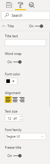
Titles are changed in the Title menu, where you can turn Word wrap on or off (this is helpful for long titles in narrow visuals, change the font color, alignment, text size, and font family. This is also where you can freeze the title which is useful in long tables where you want to see the title even after scrolling down in the visual.
The Style of Data labels can be changed from the data labels menu. You can not only change color, size, and font family but also some formatting options related to values. Discover the settings related to the values.
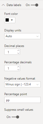
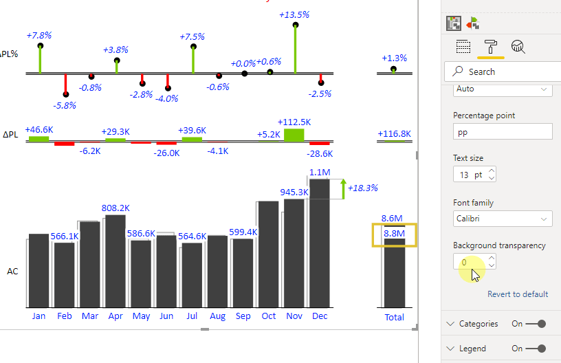
You can even design the background transparency of labels that overlap a chart element.
Style columns in the Zebra BI tables visual
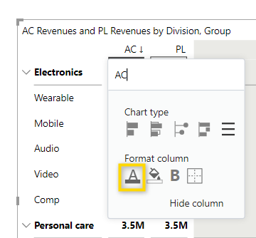
In the Zebra BI tables visual, you can individually style a column by clicking on the little arrow next to the header and change the format settings. You can color the background, make the header bold and add a border to the column.
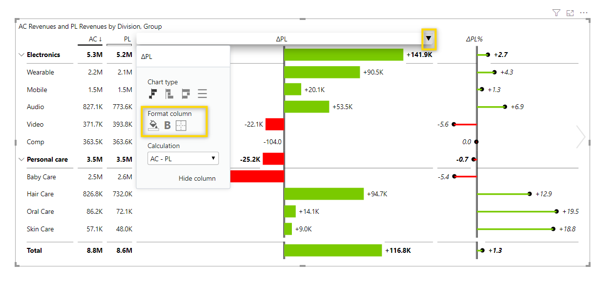
If the column is defined as a table, you can even change the font color.
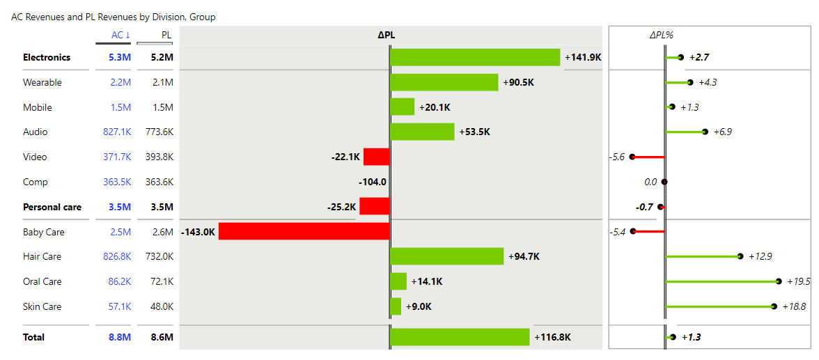
Like this, you can style the Tables visual exactly the way you want and it could look like this. See the report page Columns in the attached sample file and play around with all the settings yourself to see what you can do.
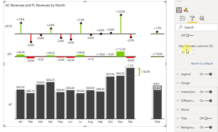
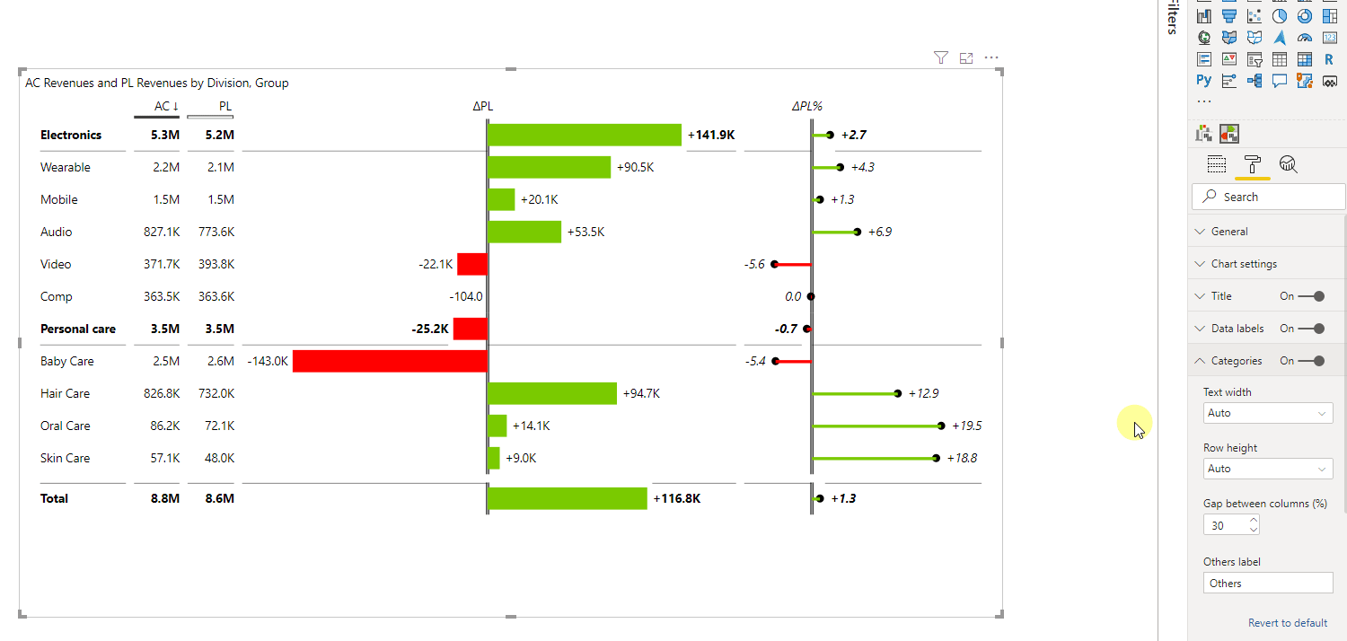
Change the gap between columns and rows
In both visuals, the Zebra BI Charts and the Zebra BI Tables visual, you can define the gap between the chart elements. You can find this setting in the Category section. This is what it looks like for the Zebra BI Charts visual. The functionality is the same for the Tables visual, just for the gab between rows instead of columns.
Change row height
Depending on the space you have in your report, you might want to change the height of the rows in a Zebra BI Tables visual. You can find the setting to do this in the Category section. The default setting is Auto but you can change it to Font sized to use less space or to Stretch to use the full height of the visual. If you want to manually define the height, just set to fixed and define the height in pixels yourself.
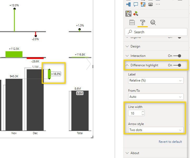
Style Difference highlight
In the Zebra BI Charts visual, you can add a so-called difference highlight. It can be enabled with the toggle in the formatting pane and that’s also the place where you can change the design of it.
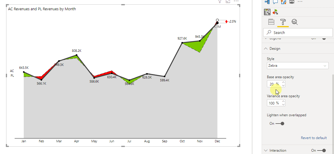
Styling the hills & valleys chart type
In this specific chart type (explore all visuals that are available with Zebra BI), you can change the opacity of the base and variance. This can be found in the design section.
As you saw in this article, there are not many things that you can’t change in the Zebra BI visuals and with every new version we publish, there are even more advanced options to let you build reports that look exactly the way you like them.
By the way: To make the styling process even easier, Zebra BI visuals support custom themes so you can define your design preferences in a central place and make them the default view which is shown when you add a new visual. Learn more about custom themes.