There are different types of titles in a Power BI Report. To help the end-users understand the report, you can make titles dynamically display which values are shown.
In a Power BI report, you can have titles in the page header, in a visual, on a tooltip or drill-through page, and in other places. Because Power BI is a self-service BI tool that lets the user interact with the report, it’s important that the titles are dynamically showing what has been selected by the user. Otherwise, the user might not know what data is currently shown. Since there are so many different ways to deal with dynamic titles, we will only cover a couple of often-appearing scenarios and, hopefully, you will be able to build on them.
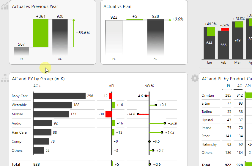
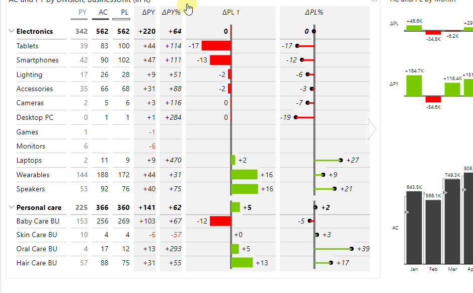
To demonstrate some of the possibilities, we are using our very popular Zebra BI Sales dashboard.
Watch how to create and design report page tooltips in Power BI.
Before we start…
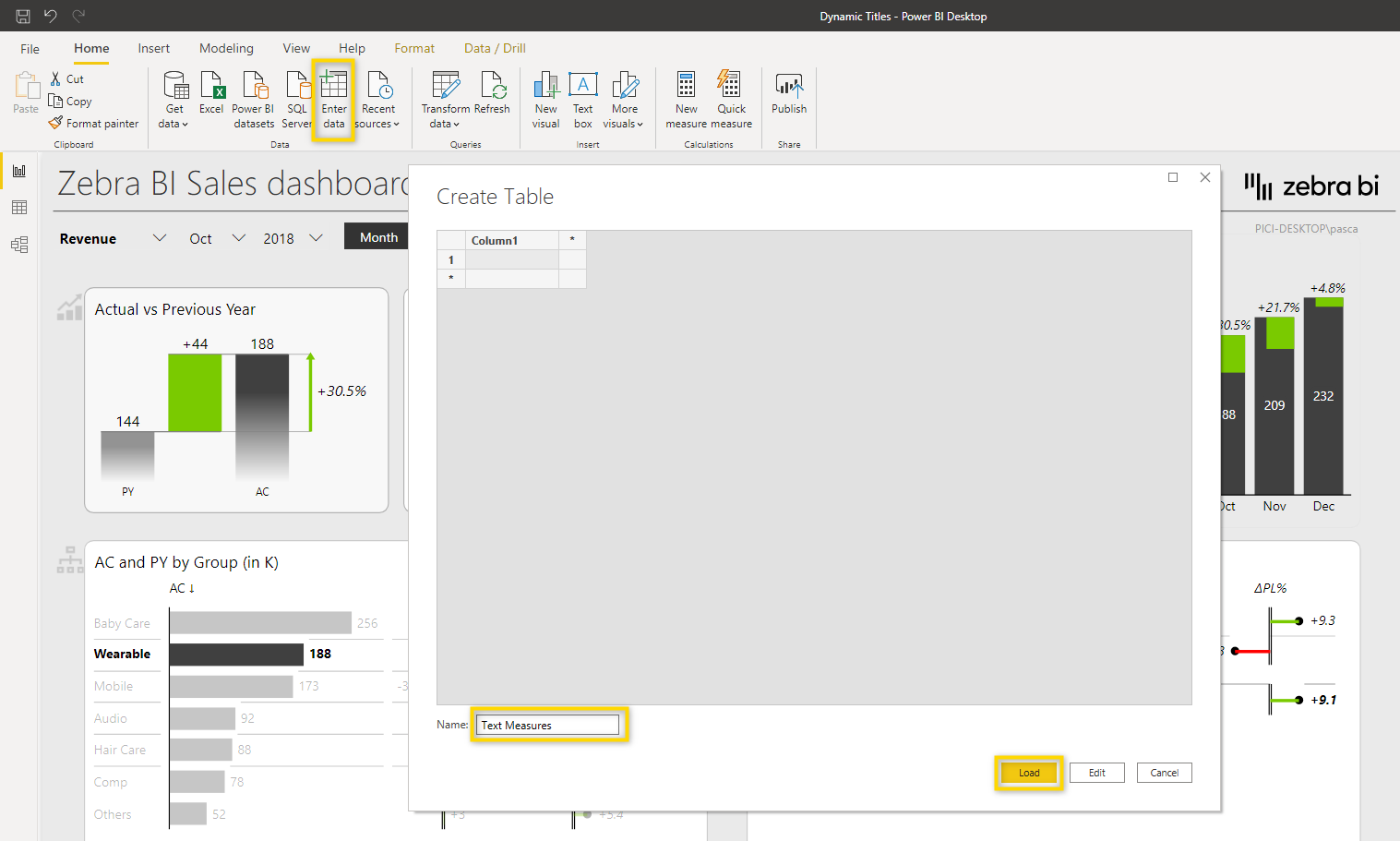
As always, it’s important to keep your data model and report nice and tidy. Because you will need to create new measures for dynamic titles and text, it’s a good idea to organize them in a separate table. So let’s create a Text Measures table first.
Select Enter data > add a Name for the table and confirm with Load.
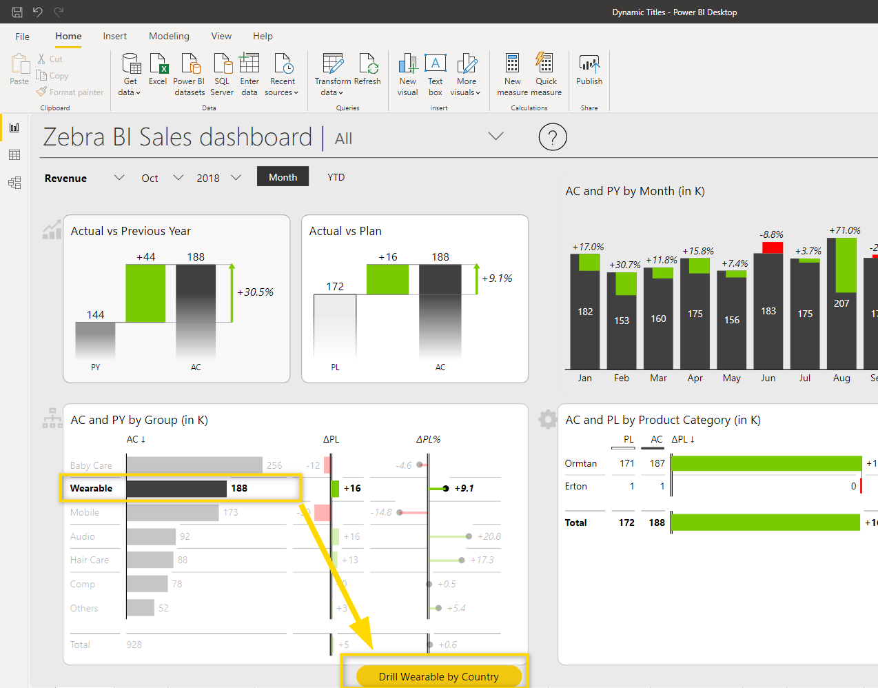
Dynamic Buttons
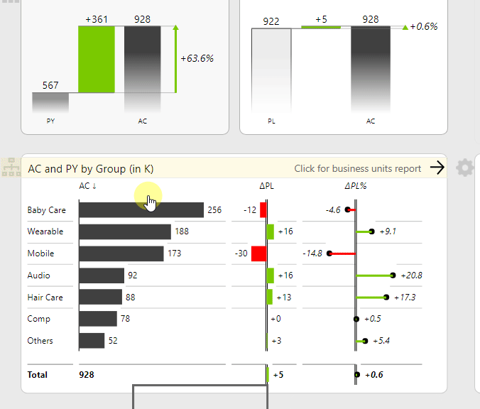
On the landing page, the drill-through button dynamically displays what is selected in the visual.
We’ll only focus on the dynamic button text and not on the other styling elements and functionalities of the button. If you want to learn more about what you can do with buttons, check out Using Bookmarks + Practical Examples.
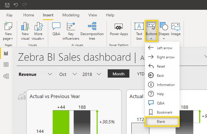
1. First, let’s add a blank button by selecting Buttons > Blank.
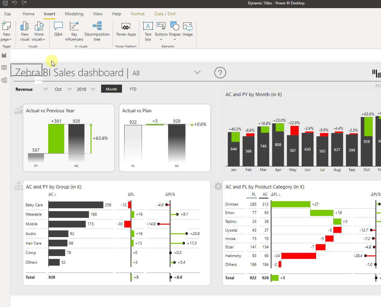
2. Now adjust the size of the button and move it to the desired position.
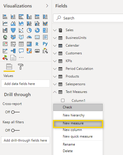
3. Because we will use conditional formatting of the Button Text, we first need to create a measure that displays exactly the text that should be shown on the button. So let’s create a new measure in the Text Measures table. Right-click the Text Measures table and select New measure.
There are different DAX functions that can be used for this. In our sample, we use a different function than the one in the original button next to it. Feel free to also look at the other option directly in the report.
DAX formula we use:
Button Text =
IF(SELECTEDVALUE(BusinessUnits[Group])="",
    "",
    "Drill "&SELECTEDVALUE(BusinessUnits[Group])&" by Country")
The part of the formula below only shows a value if a value from the column Group of the table BusinessUnits has been selected. If no selection has been made, this function returns nothing.
SELECTEDVALUE(BusinessUnits[Group])
By nesting this into an IF statement, you can define that if no Group has been selected, then show nothing (“”), otherwise show what has been selected. Because we want to add some additional text to the button and not only show the Group, we can add text in quotation marks and use the “&” symbol in between different elements.
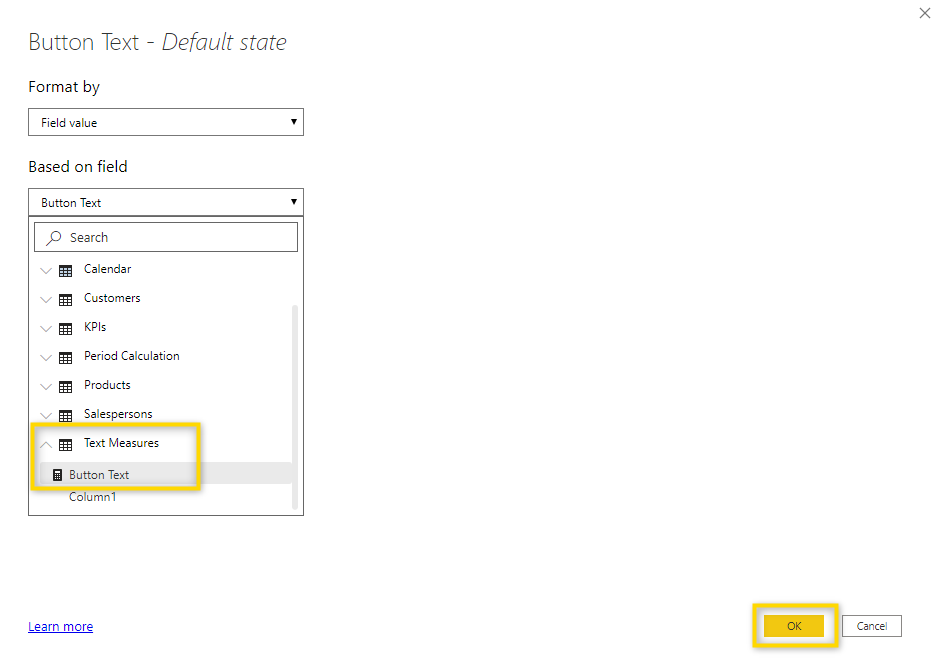
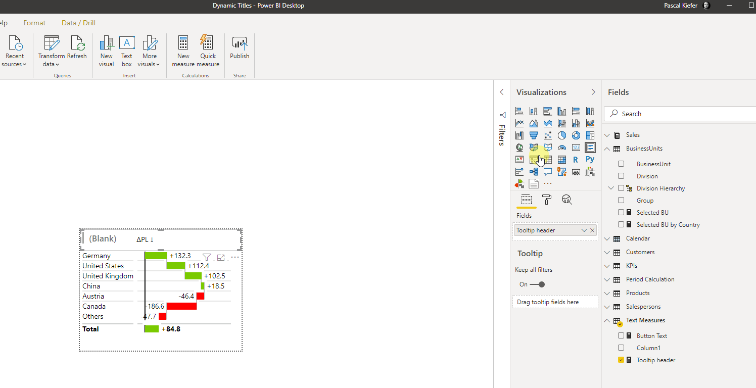
4. Now that the measure has been created, it needs to be added to the Button. To do this, select the button, then turn on the ButtonText and click the conditional formatting symbol.
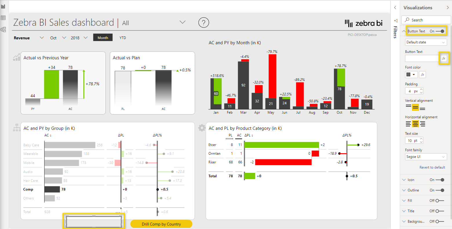
Now you need to select the new measure. Because you have created a Text measures table before, it will be easy to find it.
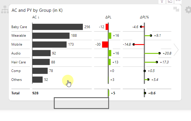
The new button now dynamically shows the Group which has been selected in the visual or is blank if nothing has been selected.
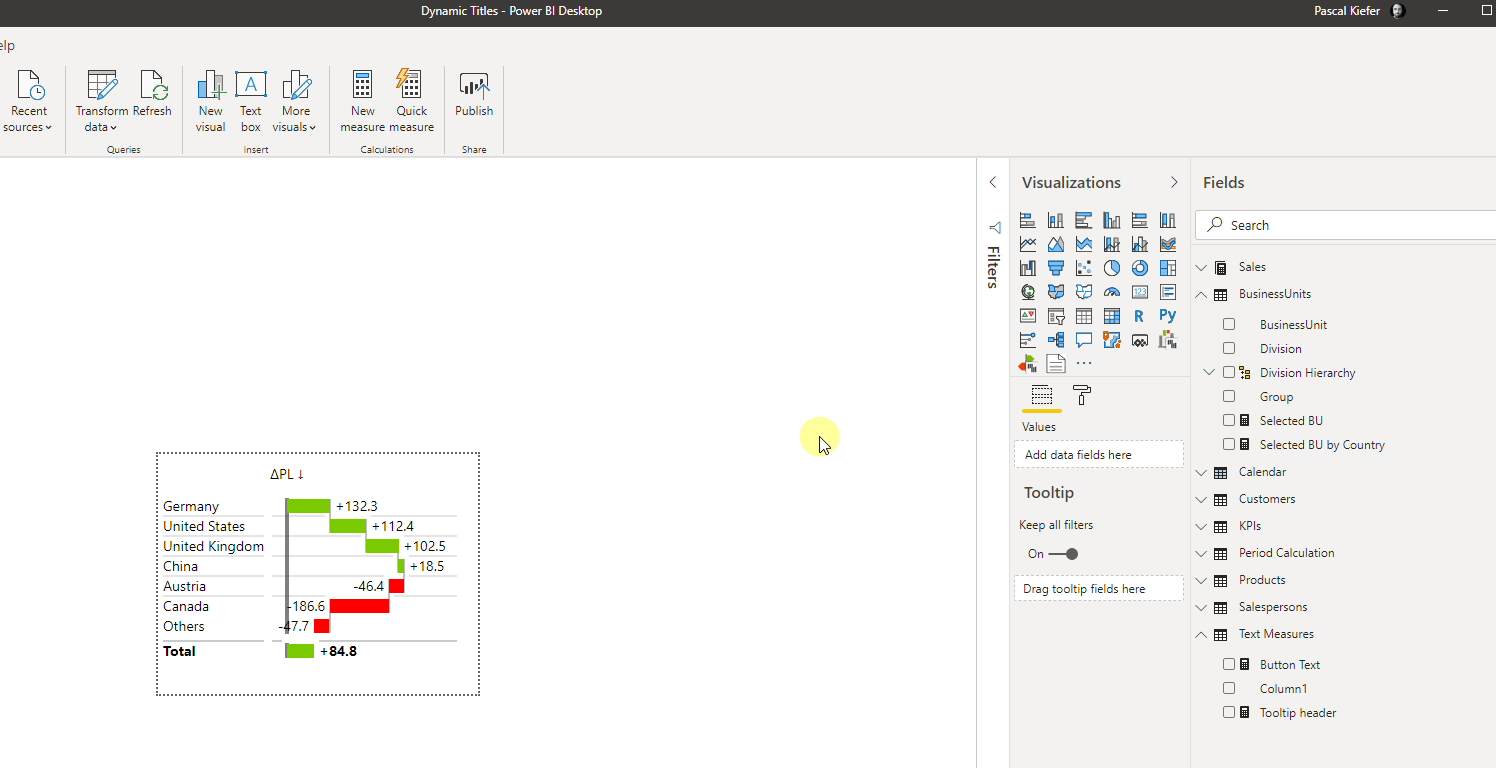
5. Tooltip titles
As you can see below, the header of the tooltip always names the Group which is currently shown.
First of all, let’s create a measure that we can use for the title. As always, there are different functions that have the same result. One such formula is the one below:
Tooltip header = SELECTEDVALUE(BusinessUnits[Group])
We use the SELECTVALUE function again because it shows exactly the value which we have selected.
Now you can add the title to the tooltip page. If it should look like in the sample above (text left-aligned) you can use the Multi-row card visual. Simply add the visual to the report, arrange size and location, and add the newly created measure to it.
If you want the title to be in the center, simply change to a Card visual.
If you now go back to the Landing page and hover over the visual in the bottom left corner, the tooltip will show the correct header.
In order to check if this also works when we show the tooltip from a different page, let’s navigate to the Page by BU, vs PY-PL and let’s show, for example, the tooltip for Tablets.
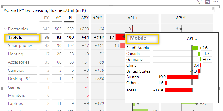
In this case, the tooltip shows Mobile instead of Tablets.
And if we try the tooltip for Electronics…
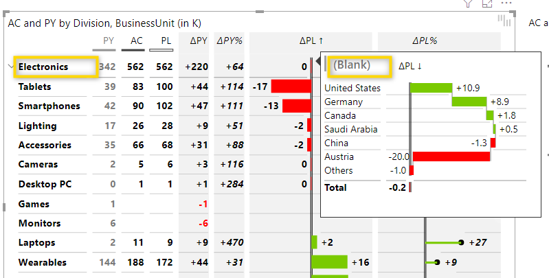
…then the tooltip shows (Blank).
In order to fix this problem and figure out what’s actually wrong, let’s look at what is shown in this visual:
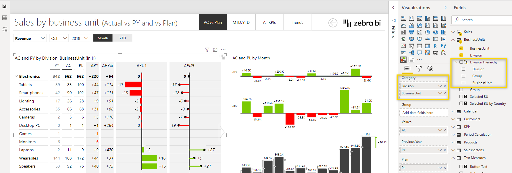
On the right, the shown Categories are Division and BusinessUnit, but our text measure is based on Group, which is not part of the visual. Why did it still show a text when we selected Tablets? When you look at the Divison Hierarchy on the right, you can see that BusinessUnits are part of a Group, so the BusinessUnit Tables is part of the Group Mobile. This is why Mobile was shown. But Electronics is a Division and higher up in the hierarchy which means that multiple Groups can belong to a Divison. This is why our measure returned blank.
6. Luckily, this is easy to fix. All we need to do is to update the measure and make sure that it works for all combinations. We’ll use the formula below:
Tooltip header new =
    IF(HASONEFILTER(BusinessUnits[BusinessUnit]),
    SELECTEDVALUE(BusinessUnits[BusinessUnit],""),
    IF(HASONEFILTER(BusinessUnits[Group]),
    SELECTEDVALUE(BusinessUnits[Group],""),
    IF(HASONEFILTER(BusinessUnits[Division]),
    SELECTEDVALUE(BusinessUnits[Division],""))))
This formula nests several IF statements in the reversed order of the Division Hierarchy. First, the HASONEFILTER statement checks if there is a filter on BusinessUnit. If yes, then the SELECTVALUE statement returns the name of the BusinessUnit. If not, the same is done for Group and then for Divison.
Let’s go back to the tooltip page and add the new measure to the header.
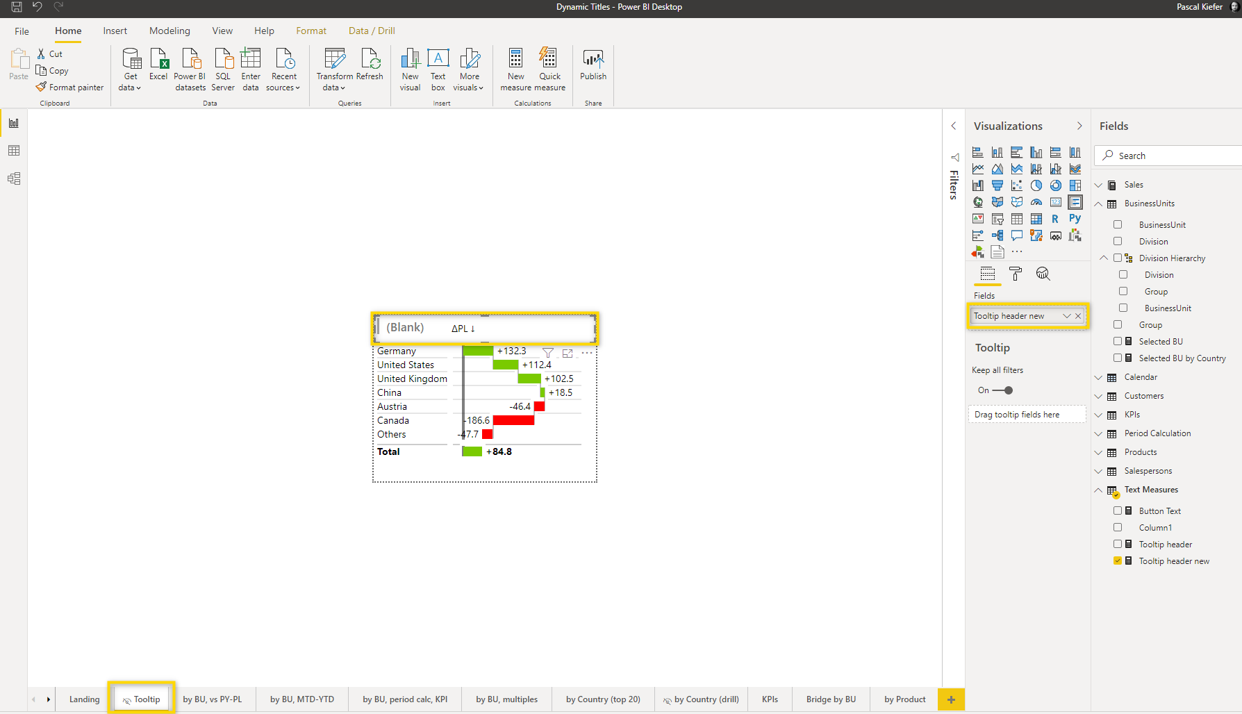
7. Like before, let’s test the tooltip again:
Now it works as intended. And it also still works when we using it from the Landing page. This consequentially means that the previously created measure Tooltip header measure is not needed anymore and can be deleted.
As you can see in this sample, many times you can use the same tooltip page for multiple cases. Just make sure you get the DAX measure right, so it’ll be fully dynamic.
There are many other scenarios in which you might want to add dynamic titles and it might become quite complex. But with the samples above, you should be able to master most of the dynamic titles. And if you still need some help with a more complex case, just reach out to our support, we’re happy to assist you.