Both Zebra BI visuals (Zebra BI Charts and Zebra BI Tables) offer the possibility of highlighting important data points. This functionality is useful in cases where you want to add special attention to a certain data point or a data category within your dataset, e.g. to highlight your company within the list of your competitors, highlight a specific time period, etc.
To highlight an individual row in your Zebra BI Tables, simply right click on the category name and tick the Highlight checkbox from the context menu:
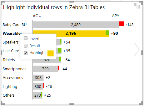
Once a specific element is highlighted, you can also change its color by clicking on the color box next to the Highlight menu option.
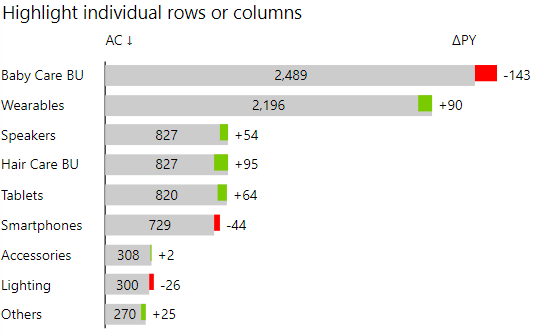
As illustrated in the example above, you can highlight multiple data categories in the same chart and use an individual color for each highlight.
The highlight is completely dynamic so if your end users sort tables in a different order, the highlight will stick with its data category. In other words, the highlights are linked to category names.
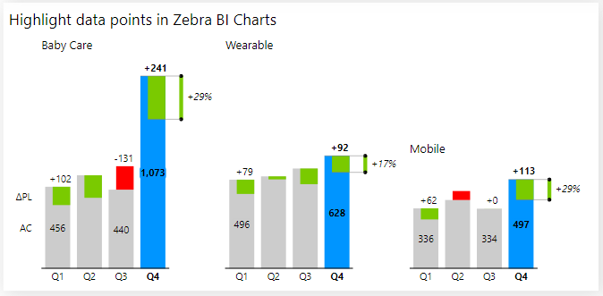
You can do the same in the Zebra BI Charts visual, even if you have small multiples. Here’s an example where Q4 is highlighted in the Zebra BI Charts visual:
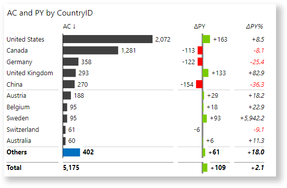
Here’s a bonus idea: why not highlight the Others data bar in charts where the Top N + Others setting is turned on? In the following picture, the Others row is highlighted in blue:
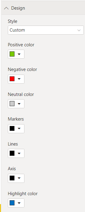
The default color for the highlight is specified in the Design group of settings under the Highlight color:
You can change all the default colors at once by using Power BI themes.
Learn how to create your own custom theme and apply it to your Power BI reports. →