Dynamic comments are one of the strongest features of your reports. They enable you to provide additional context and explain your data in detail. From now on, you don’t only have the option to add the comments to your reports, but you can also change several settings and customize the comment box to make it reflect your needs even more!
In this article, you will learn how to control the placement and the width of the comment box, how to customize it, and what design options are available for you.
See how to apply different settings to your dynamic comments!
How to control the comment box
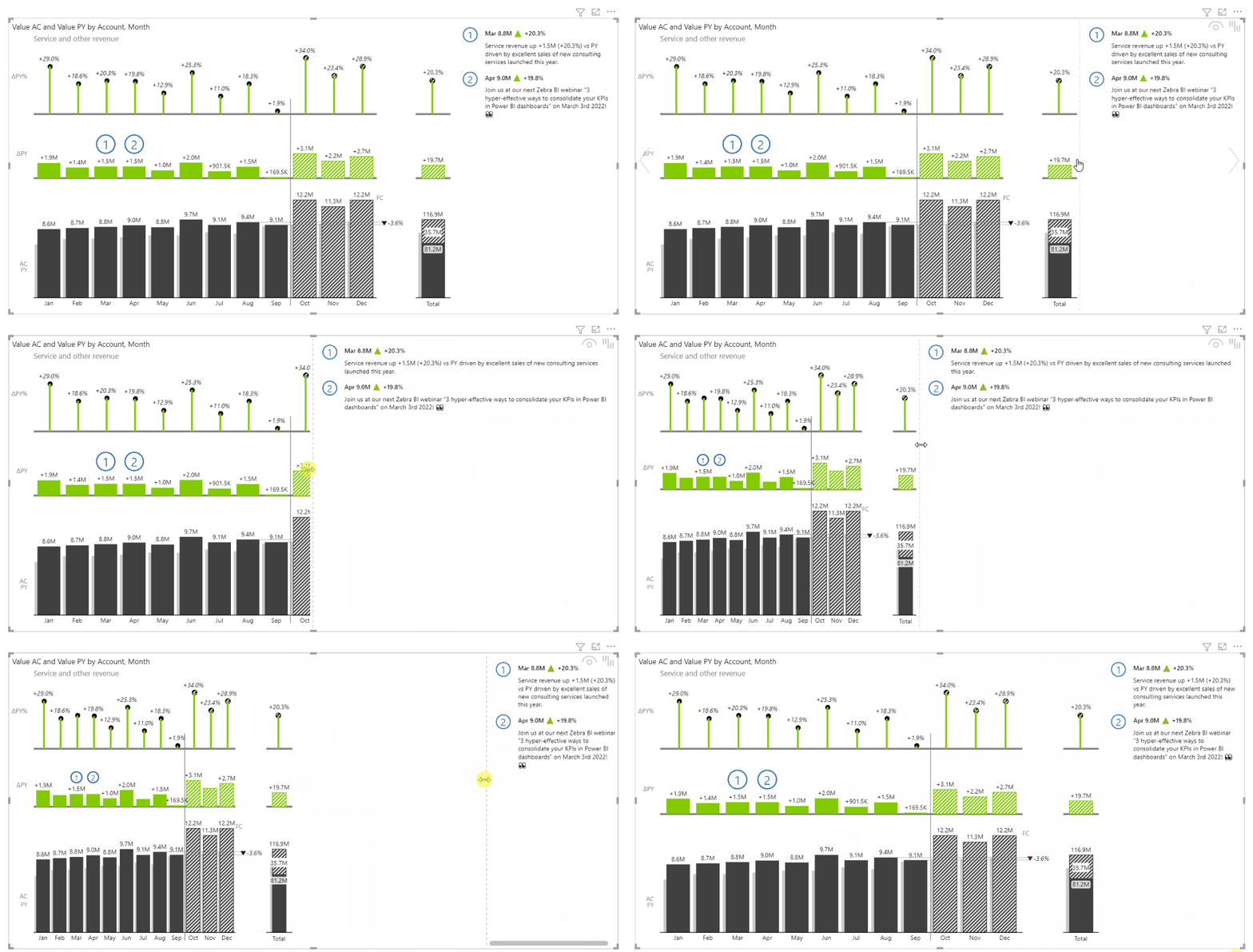
You can now control what part of the visual the comment box represents. In practice, this means that you can now
adjust the width of the comment box.
- Go under Settings and turn on the comment box.
- Hover over the line between the visual and the comments.
- Adjust the proportions of the visual and the comment box depending on your needs.

This way you have more control over the comments and the visuals and you can create even more flexible and insightful reports.
How to customize the comment box
Having the ability to adjust different settings of the comment box gives you a unique advantage as you can make your reports with dynamic comments to
show the exact information you need.
⚠ Hint: With the release of Zebra BI Charts 6.2 in December 2022, you can now customize the comment box directly on the visual. For a more seamless user experience and interactive reports you can change different settings without having to open the formatting pane.
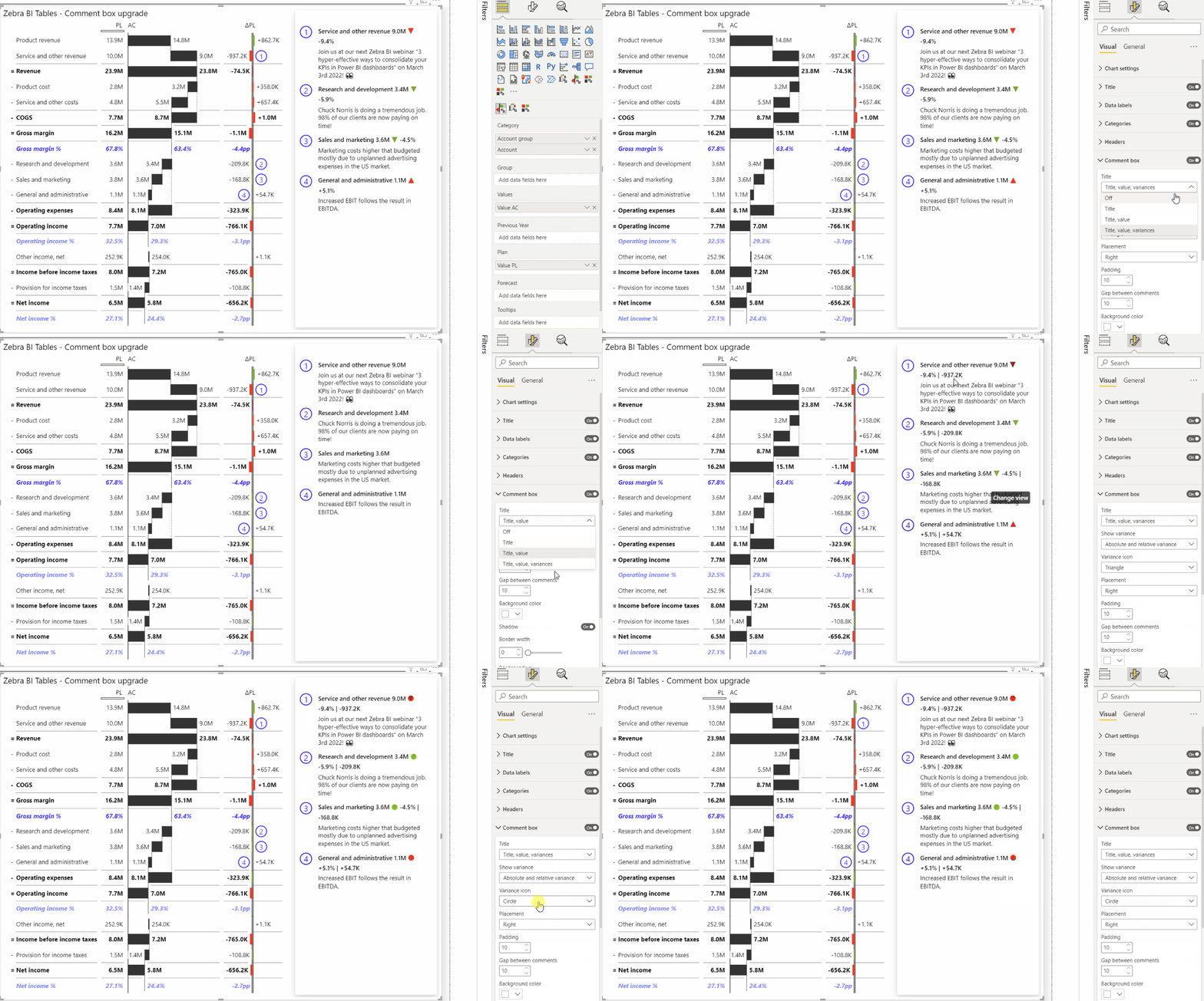
However, you can adjust the amount of information in the title, choose which variance you want to represent, and define the variance icon also by opening the formatting pane.
- Go under Settings > Comment box settings.
- In the Title dropdown, you can select between switching it off completely, displaying just the title, adding a value to it, or displaying the full information with variance next to the value and the title.
- If you decide to display variance in the title, you can choose whether to show the relative or absolute variance in the title. Or you can simply display both and provide as much information as possible.
- Lastly, adjust the variance icon so it matches your needs. By default, you will see a triangle, but you can change it to either circle or a circle with arrows
To easily change between the variances and the variance icons, you can do so also by clicking on the labels directly on the visual itself.

With this feature, you can control the amount of information displayed in your comment and can make sure that it contains all the right information you need to make a smart business decision.
How to design the comment box
Having the ability to adjust features to your company design is often a great advantage and it helps you standardize the look and feel of the reports. This helps you save time as you immediately know what you are looking at and can decide faster.
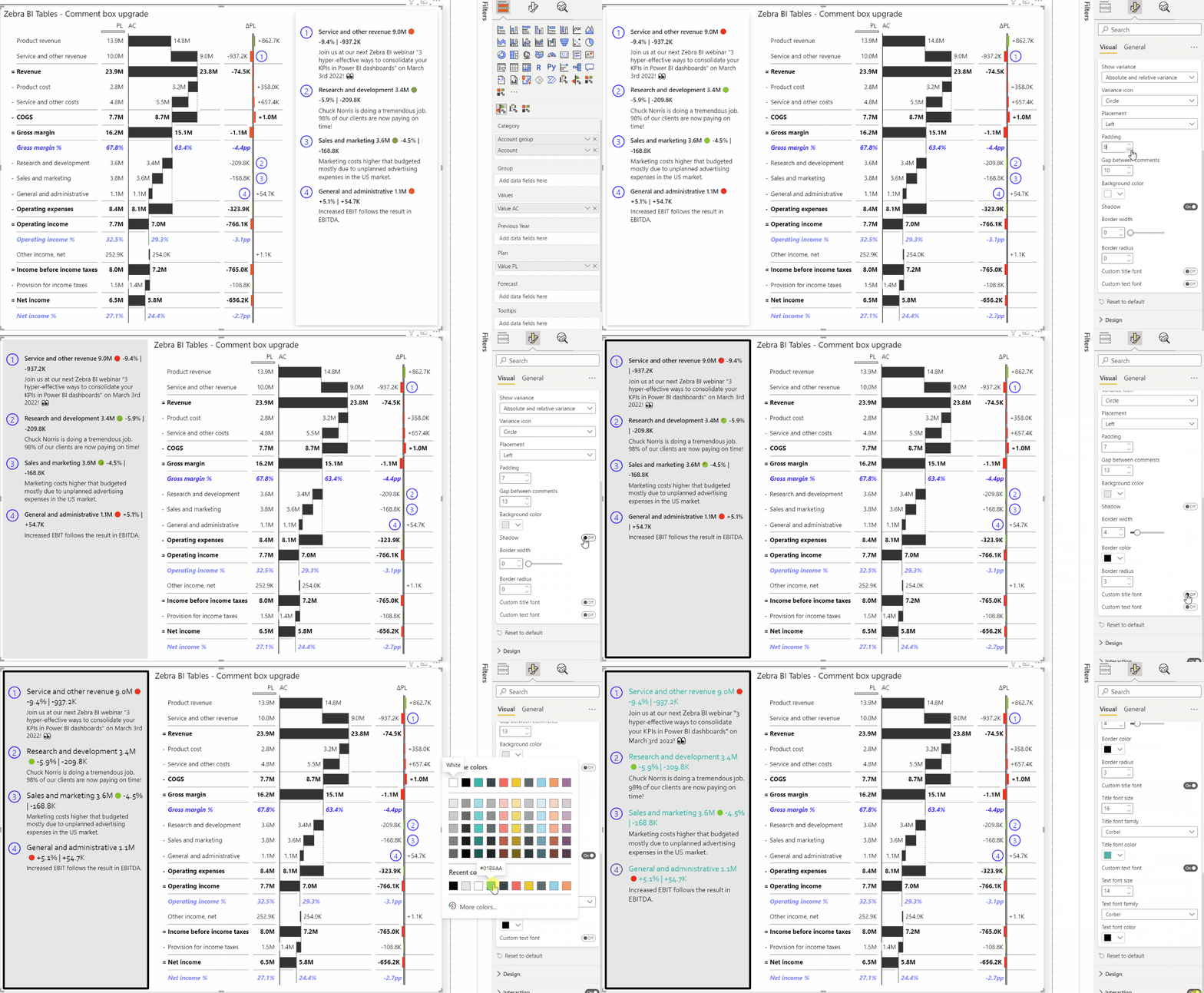
With the new feature, you can adjust the comment placement and the padding, apply the desired background color, set the gap between the comments, apply the shadow, change the border width and radius, and even customize the title and text fonts!
- Go under Settings > Comment box settings.
- Define the placement where you want the comment box to appear left, right, below, or above the visual. If you decide to place it above, you will also have the option to list comments horizontally, to make the best use of the visual.
- Define the padding between the elements in a comment and the gap between the comments themselves.
- Apply custom background color to match the report design with your company design.
- Toggle on or off the option to apply the Shadow and this way separate visually the comments from the visual.
- Add a border and apply the desired color or change the radius to give it a smooth edge.
- Customize title and text fonts to reflect your company font style and make your reports in line with the branding. For each element, you can choose a specific font size, font family, and font color.
Remember, whenever you are customizing the colors to match your needs and design, don’t forget that the same color should always have the same meaning and that less is more in reporting.

Change the placement of the dynamic comment markers
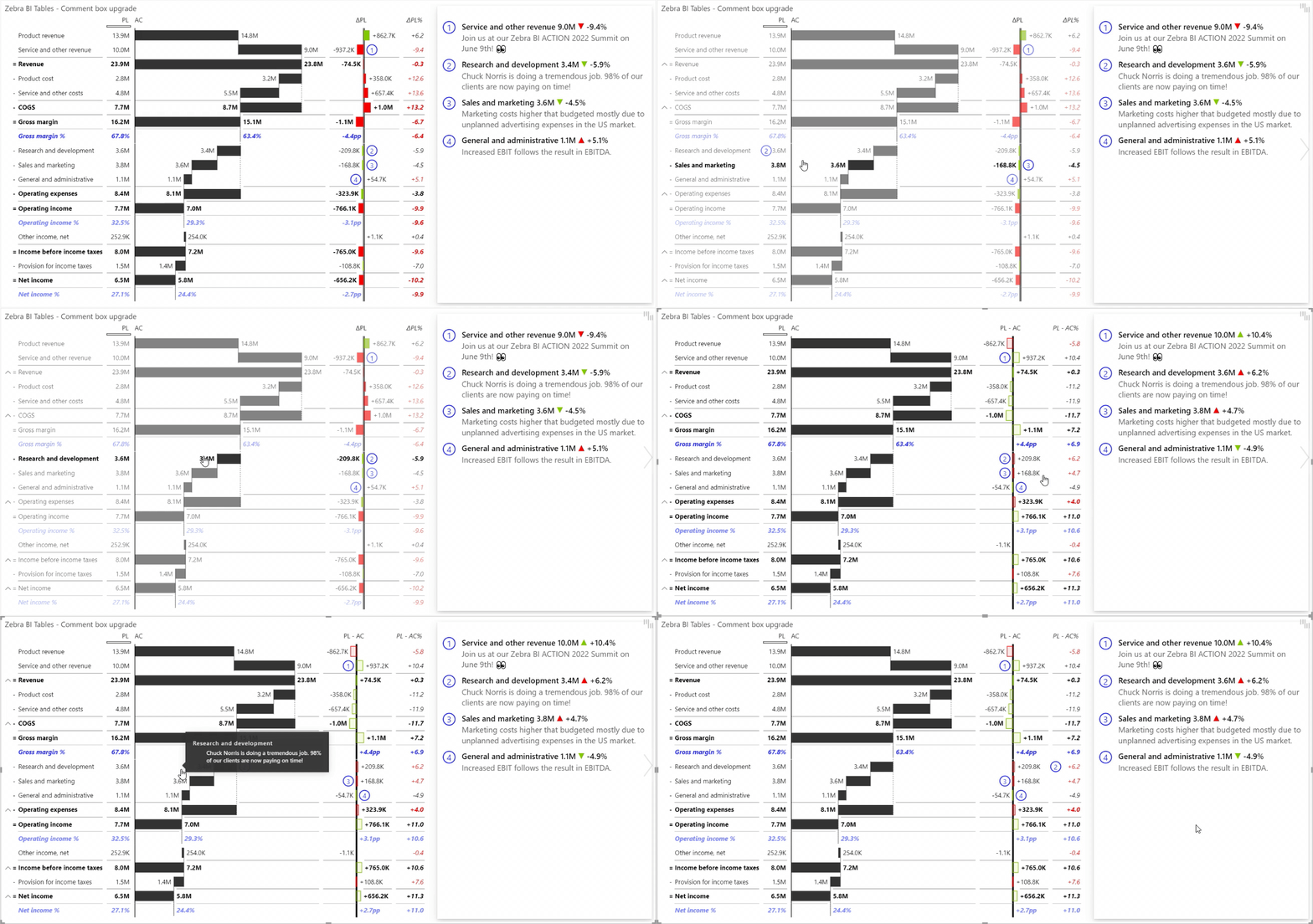
With the 5.4 update of the Zebra BI Tables comes also the next exciting update for the dynamic comments’ features. You can now also change the placement of the comment markers which makes the Zebra BI commenting feature the most advanced out there!
Having dynamic comment markers allows you to move them from one column to another. You simply drag and drop the marker to the place where you need it.
Changing the position of the marker will also adjust the values in the title. For example, if you move the comment marker from the Plan (PL) to the Previous year (PY), the numbers and variances in the comment title will change and reflect the transition. If the comment marker is one of the calculation columns (ΔFC, ΔFC%…), the first value in the calculation gets displayed alongside the variances. If the comment marker is on the base measures’ columns (PL, AC…) the corresponding value is displayed alongside the variances. If the comment marker is on the additional measure, only the corresponding value is shown without variances.

Make the most out of your reports with dynamic comments and gain from increased flexibility and visibility to make better-informed business decisions.
Read more about the dynamic comments feature.