Showing an income statement in the correct structure is a must in every financial report. Including drill-down functionality is a huge bonus because recipients can decide for themselves, whether they want to just see an aggregated overview or drill down into the details.
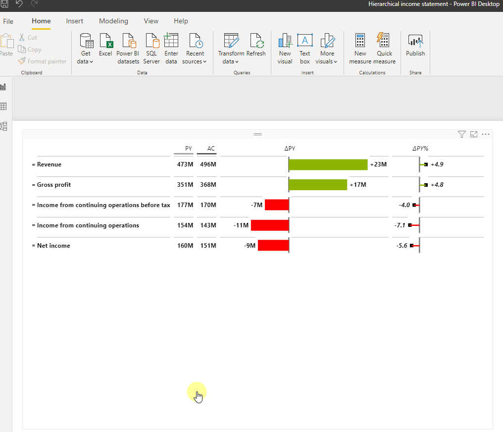
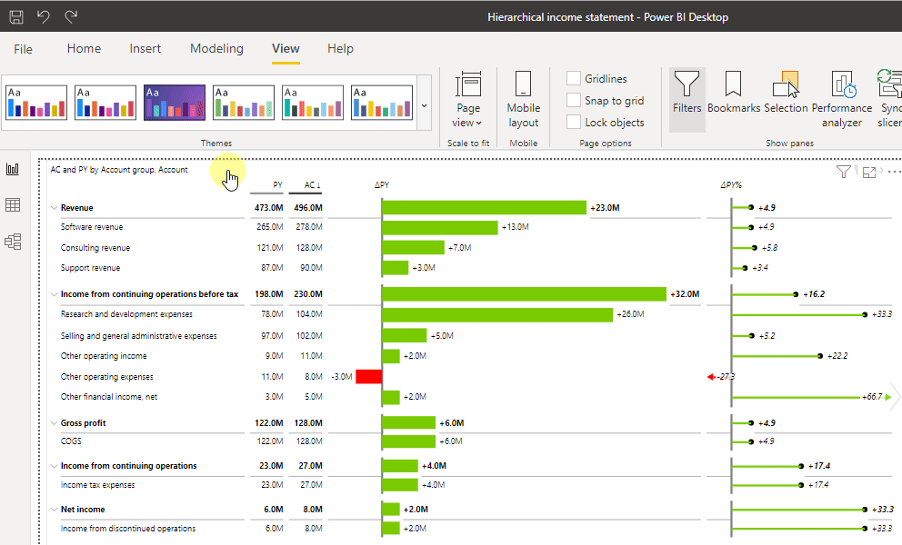
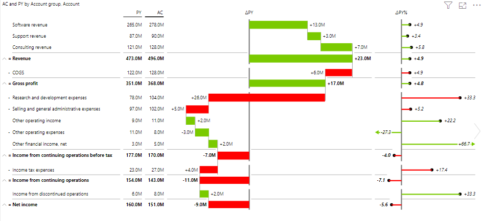
In this article, you will learn how to create a report like the one shown below. It contains your company’s Income Statement structure and you can drill down to account level to see the details you need. There’s also an article about basic income statements which could be interesting for you.
Let’s look at what the data should look like to create this visual.
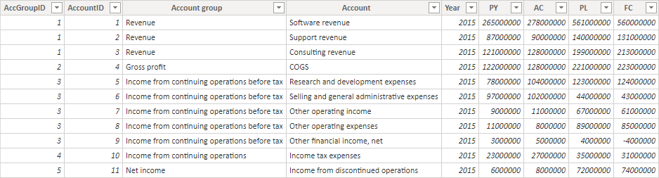
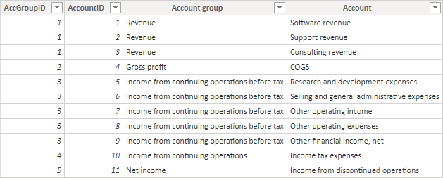
AccGroupID: Because we want the column Account group to be sorted in a specific way (Revenue in 1st position and Net income in 5th and last position) we need to have a numeric sorting column. Without it, the Account group would be sorted alphabetically.
AccountID: This column indicates the sort order of the Account column.
Account group and Account: These columns show the names of the accounts that will be shown in the report. Note that this is a hierarchy, meaning that accounts Software revenue, Support revenue, and Consulting revenue all belong to the account group Revenue.
Year: Year of the posting
PY, AC, PL, FC: Previous Year, Actuals, Plan and Forecast values
⚠️ Your Income statement structure will most likely look different than the one used in this sample. You can simply adjust the Excel file so it represents your specific structure.
The following steps lead to the visual shown above:
1. Load data from Excel to Power BI. Learn how to load data.
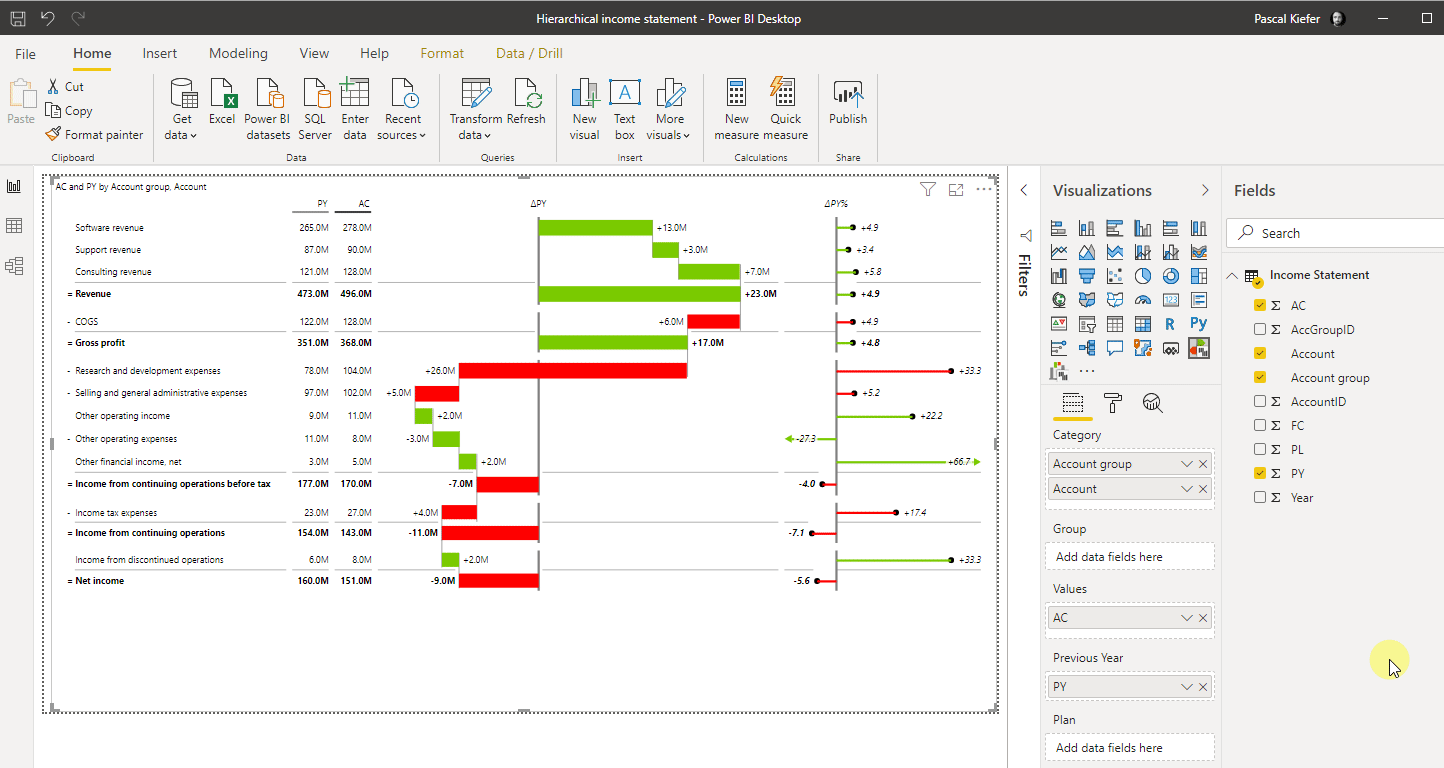
2. Add a Zebra BI Tables visual to the report and assign the fields to the placeholders. AC goes into Values, PY goes into Previous Year, and Account group, along with Account, goes into the Category placeholder. The Account group is the main category and needs to be placed above the Accounts themselves because the Accounts are part of the Account group in the hierarchy.
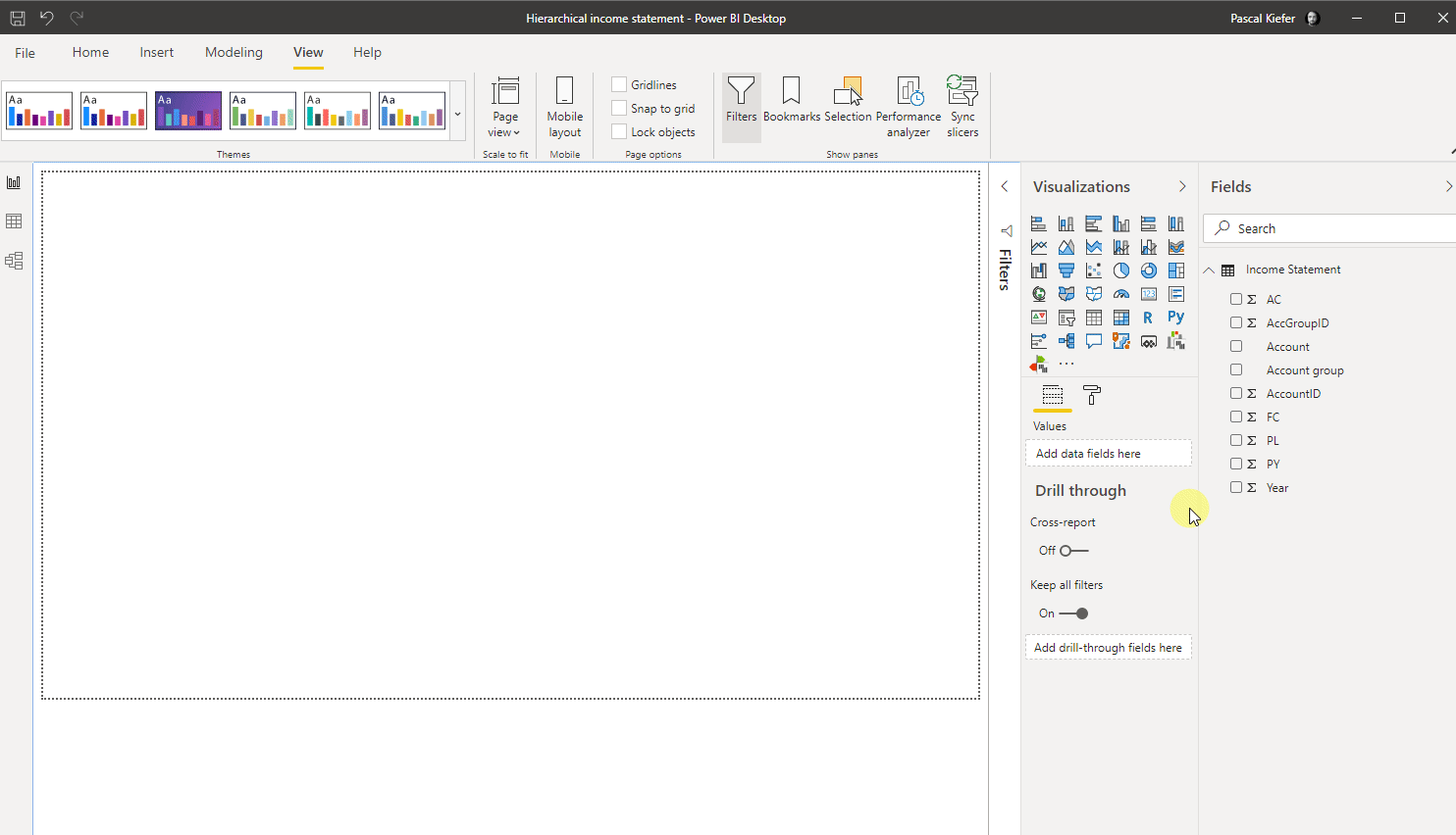
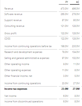
The visual should now look like the one below. The drill-down functionality is already available but because no specific sorting has been defined yet, the default sort order is applied.
3. Change the sort order
To make sure the visual isn’t sorted by the values in the AC column anymore, click the AC column until the arrow disappears.
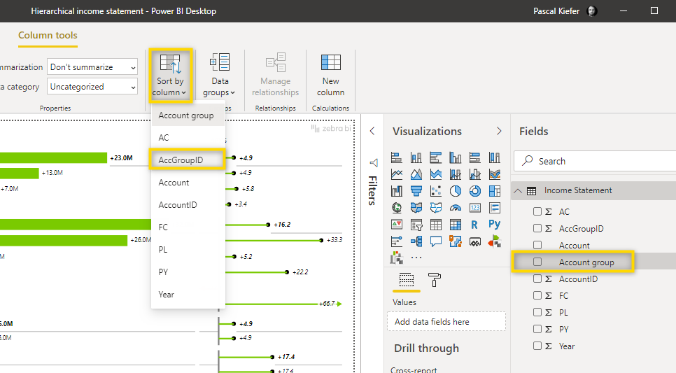
Now you should make sure that the Account group and Account are not sorted alphabetically but by the column indicating the numeric sort order. To do that, select the Account group in the fields list and then click Sort by column > AccGroupID.
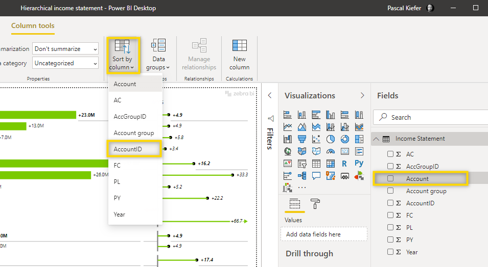
To do the same for Accounts, select Account from the fields list and then click Sort by Column > Account ID.
Now you need to select the More options button ( …) in the top-right corner of the visual and select Sort by > Account group.
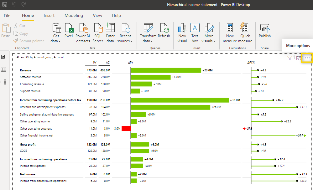
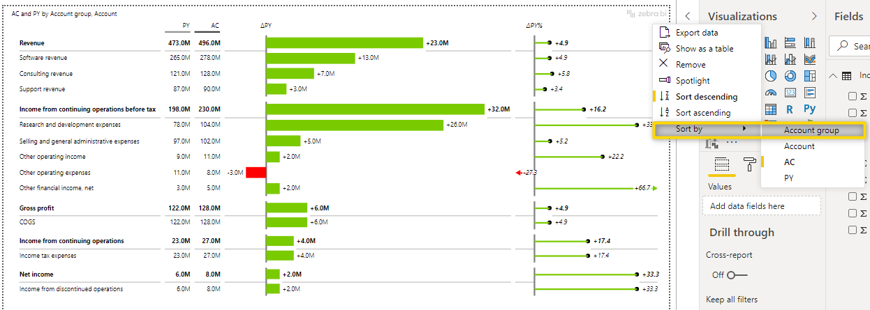
Since the default sort order is descending, you have to change it to ascending by selecting the More options menu > Sort ascending.
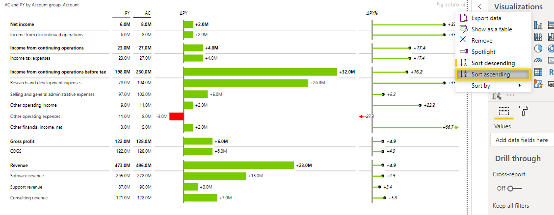
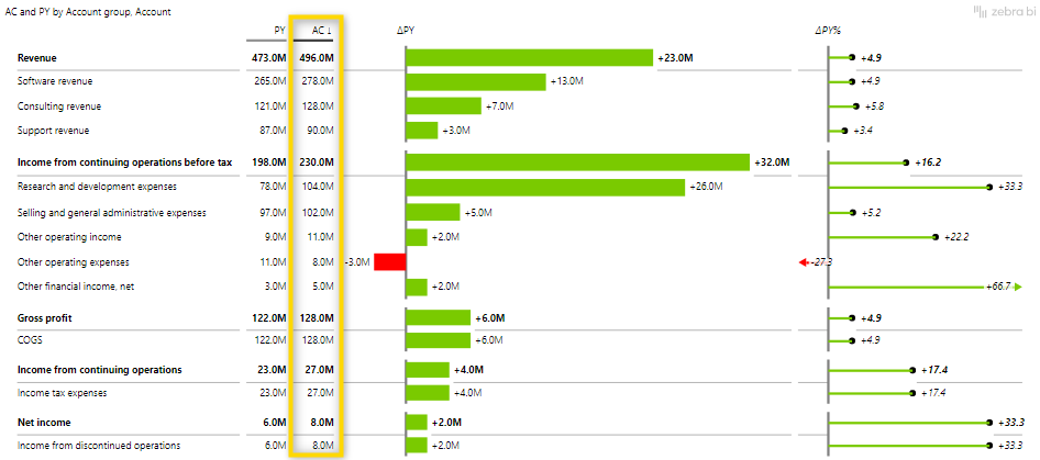
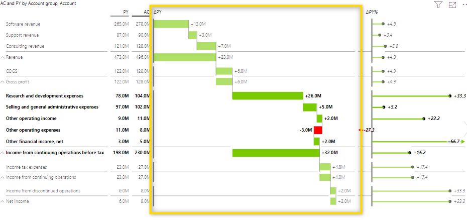
The account structure is now sorted according to your definition:
4. Change the chart type to waterfall.
Select the settings of the column and change the Chart type to waterfall.
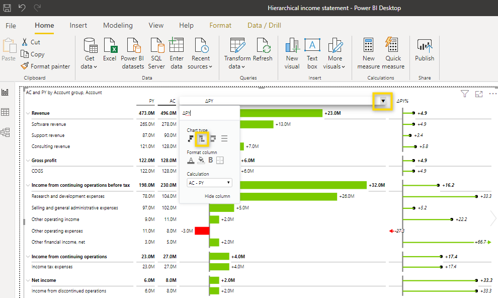
The report now looks like the one below, but there’s still one more step left.
5. Define results and inverted accounts
Results (totals and subtotals) need to be manually defined so they are shown correctly. They should be easy to identify as they represent the top level of the hierarchy. This means you have to mark all Account groups as results. To do this, simply right-click the respective row and select Result.
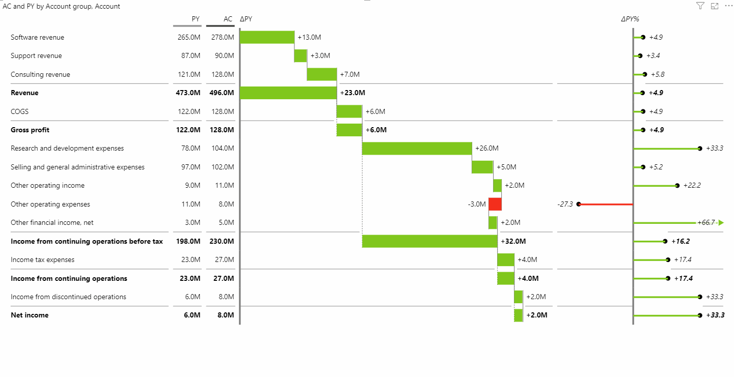
Most of the deviations are green (positive effects) but this is not correct. Let’s look at the account COGS. The AC value is 128.0M and the PY value is 122.0. This means that this year’s costs are 6 M higher than last year. This should be a negative (red) effect. So what’s left to do is to invert all costs accounts (We also call them negative KPIs) as shown below. Just right-click the accounts and select invert. The color changes immediately when you check this option.
After you invert the cost accounts, the visual should look like this:
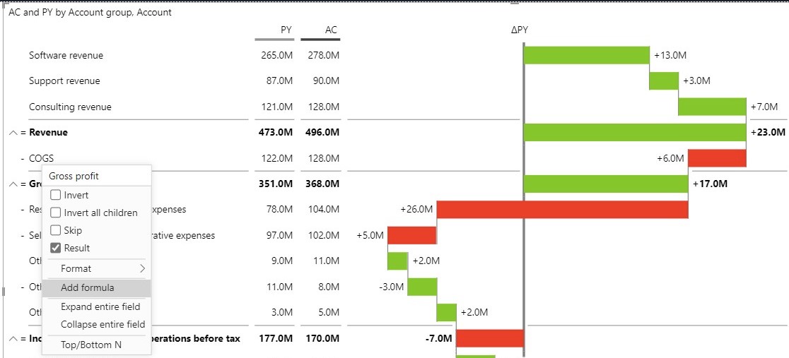
Additionally, you can add a new element to your table by simply calculating it using our Zebra BI Formula Editor.
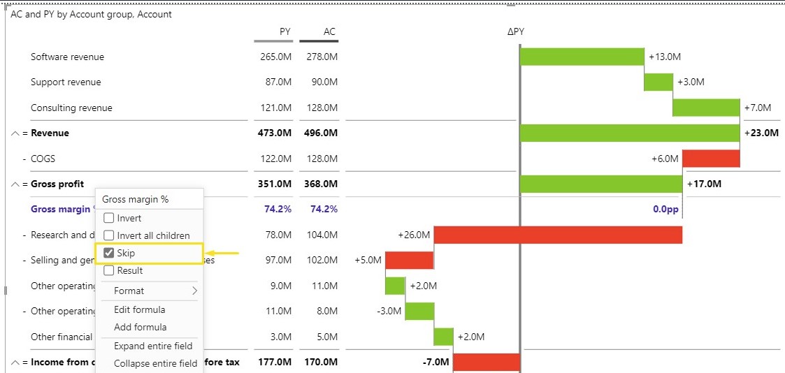
If you’ve included calculations with values that shouldn’t be included in Subtotals and/or Total value you can easily use the Skip option to exclude the value from aggregation.
So far, this report compares Actuals with the Previous Year. But of course, you could also add Plan data to the visual. To do that, just add PL to the Plan placeholder.
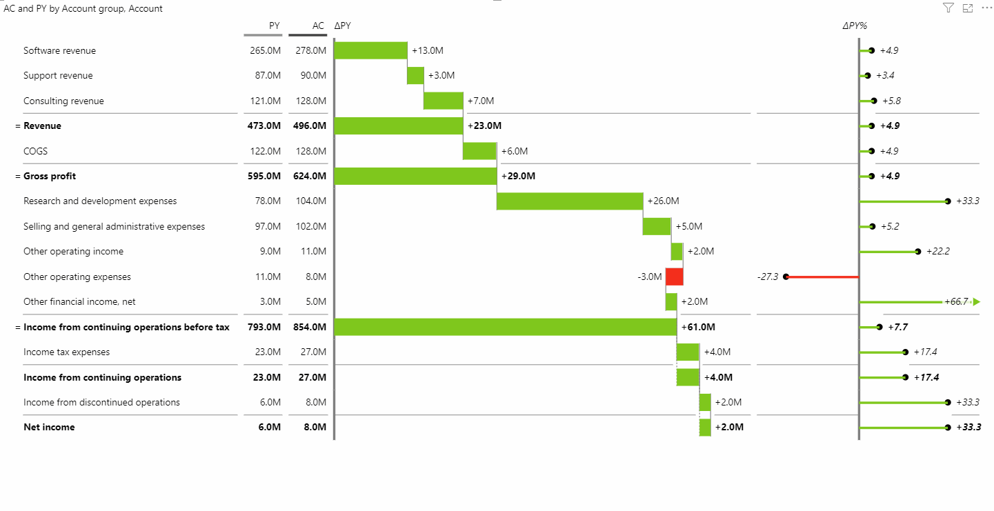
This report now provides so many insights and if you have too many details, simply collapse the hierarchy of the income statement and only have the overview. This is one of the most important objects on a financial report because finance people know their Income statement hierarchy and showing it to them on a regular basis is crucial for decision-making.
In case you want to hide some columns, change the displayed units, or remove the decimal places, take a look at the section about Visualizing Data.