Having hierarchies in a Power BI data model opens up many possibilities. When you have hierarchies in your data, you can actually drill down into the details using the structure of the hierarchy.
One specific kind of hierarchy, which is part of almost every Power BI report, is the date hierarchy, which normally includes years, quarters, months, and days.
But you might also have an organizational hierarchy, a regional hierarchy, a product category hierarchy, or any other type of hierarchy depending on the data in the report.
First, let’s see how you can create a new hierarchy from the data in the BusinessUnits table. This is what the data looks like:
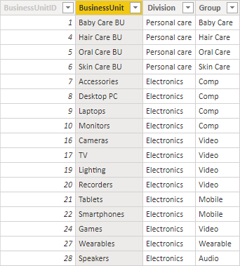
This table has a hierarchy with three levels. The top-level is Division, followed by Group and then BusinessUnit. This means that several BusinessUnits below belong to one Group and several Groups belong to one Division. To create the first level of the hierarchy, drag and drop the Groups Field to the Divisions field.
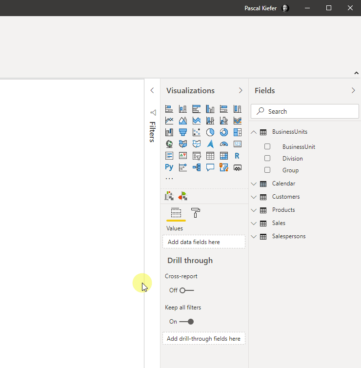
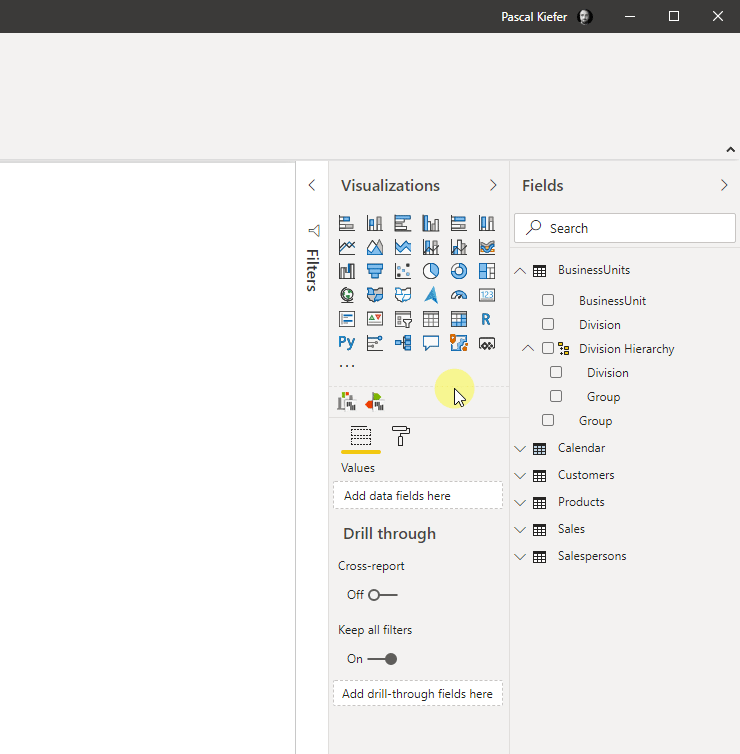
The next step is to also add the BusinessUnit field to the hierarchy. Here you can also use drag and drop function.
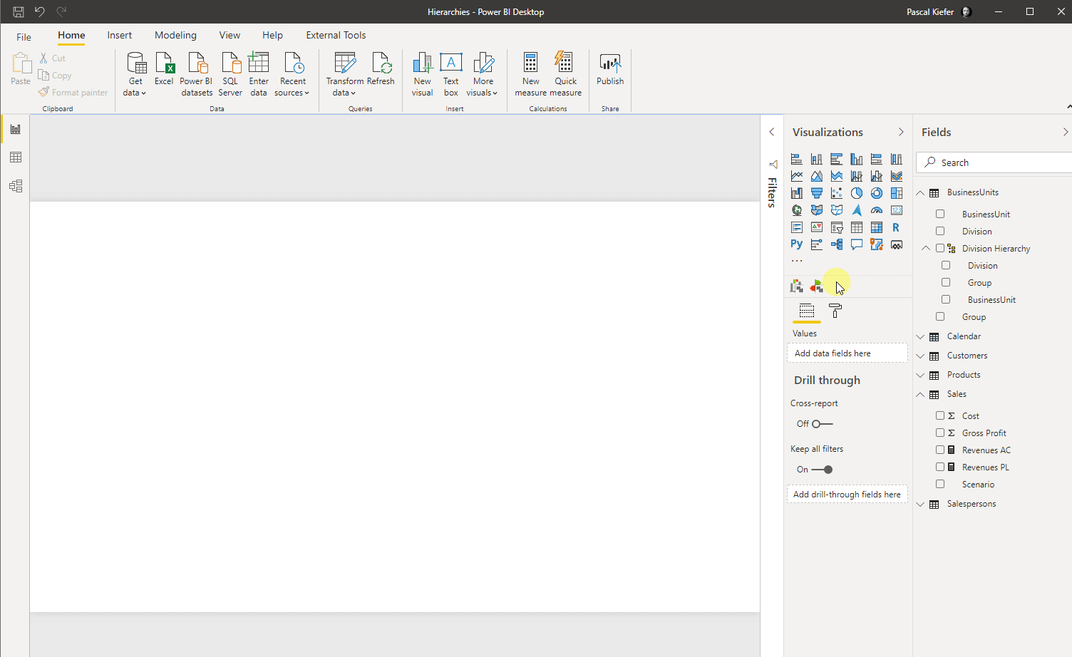
Now let’s see what this hierarchy looks like in a Zebra BI Tables visual. Let’s add the visual to the report and then add the Division Hierarchy to the Category field. To see some values, let’s add the Revenues AC measure to the Values placeholder and Revenues PL to the Plan placeholder.
You can now expand and collapse the different levels of the hierarchy by clicking on the little arrowheads on the left of every category. If you want to expand or collapse an entire level of the hierarchy, simply right-click on of the elements from the specific level and select to either expand the entire field or collapse the entire field.
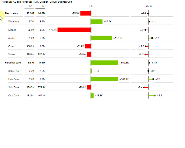
⚠️ Hint: If you don’t want to show all levels of the hierarchy in a visual, you can simply unselect the level which should not be shown
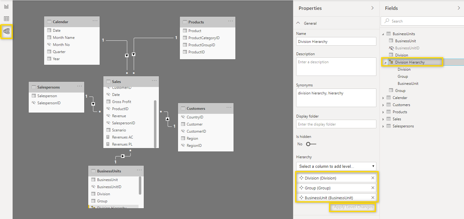
Now let’s see how you can change the levels in an already created hierarchy. To do this, you need to navigate to the model view and select the hierarchy you want to change. Once you did this, you can use drag and drop to change the order of the levels. Once you are done creating the new structure, click Apply Level Changes.
⚠️ Hint: By clicking the X next to a level, you can remove it from the hierarchy.
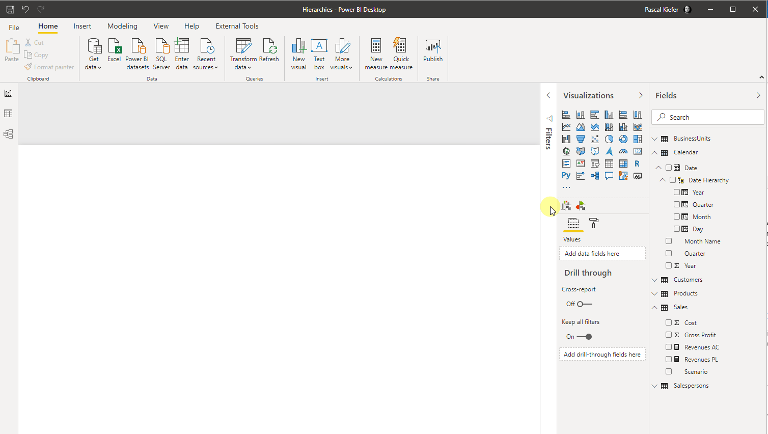
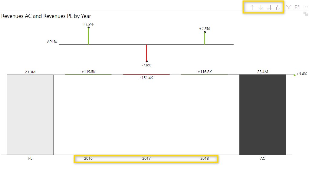
Next up, let’s see how hierarchies behave in a Zebra BI Charts visual. To do this, add the Date Hierarchy to the category placeholder and Revenues AC to Values and Revenues PL to Plan.
The initial view of the visual now shows the variance by year. But because a hierarchy was added, the drill-down buttons appear in the top right corner of the visual. With these buttons, the end-user can drill down (or drill up) to see a different level. Below, we’ll explain the drill-down buttons.
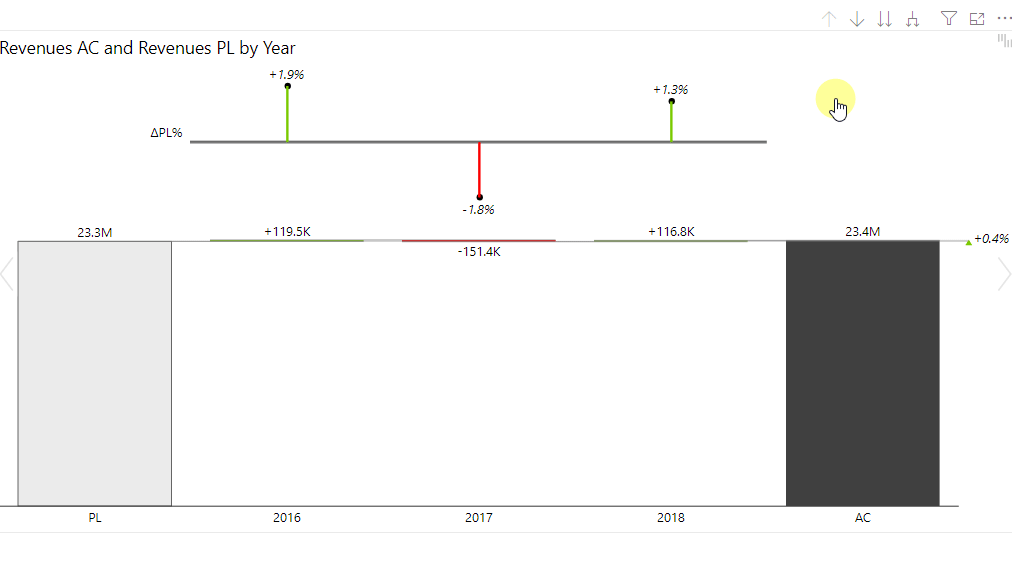
The upwards arrow (drill up) is initially greyed out and not active. It only becomes active once you click on the second button – the downwards arrow and actually drills down into the details. To activate the drill down, just select the second button and then click on the element for which you want to drill down to the next level. In the sample below, a drill-down was made from the year 2018 to quarters and then from Q3 to months. Use the first button to drill back up to a higher level. Note how the title of the visual always indicates the drill down you did so you know what you are looking at.
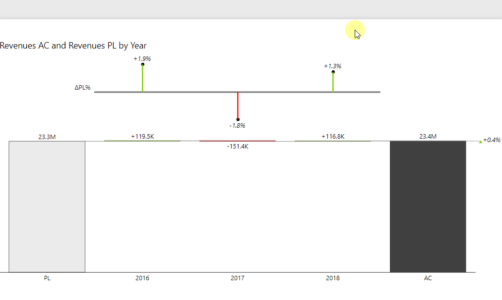
The third button can be used to drill down to the next level. In the example before, we drill down from years, to quarters and to months. Please note that since there’s no filter applied, the total values stay the same. So for example when we see January, this number is actually the sum of all values in January 2016, January 2017, and January 2018. If this should be separated, you can use the fourth and last of the drill-down buttons.
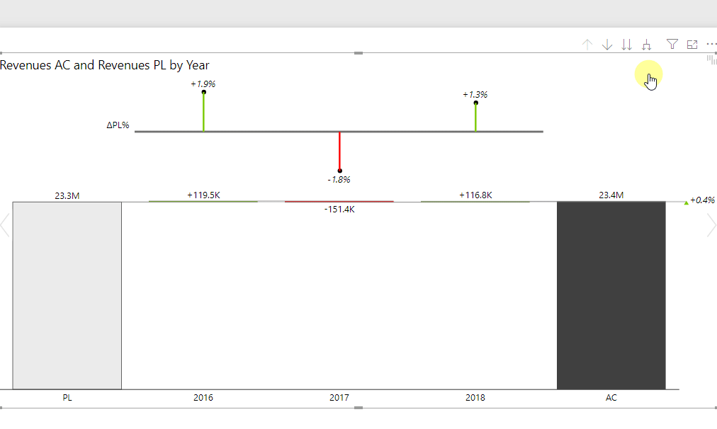
The fourth button expands each level of the hierarchy and reveals details of each level below.
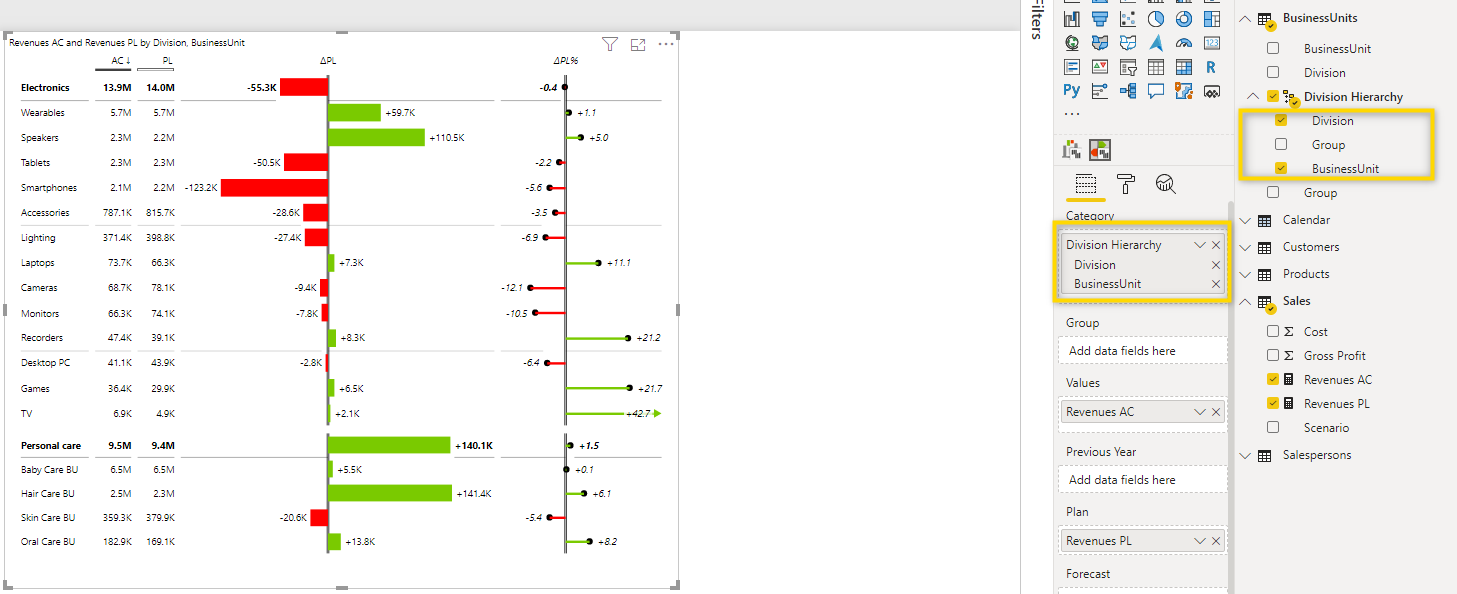
Having one hierarchy in a visual is already good but, even better, you can add a second hierarchy to it. Below is a Zebra BI Tables visual which shows the Division Hierarchy in the Group field and the 2 fields from the Products table in the Category placeholder. Note that ProductCategoryID and Product are not actually in a hierarchy but are just 2 individual fields that were added to the visual. This should show that creating a hierarchy is not a must. You can also just add the individual fields to the visual and have the same result.
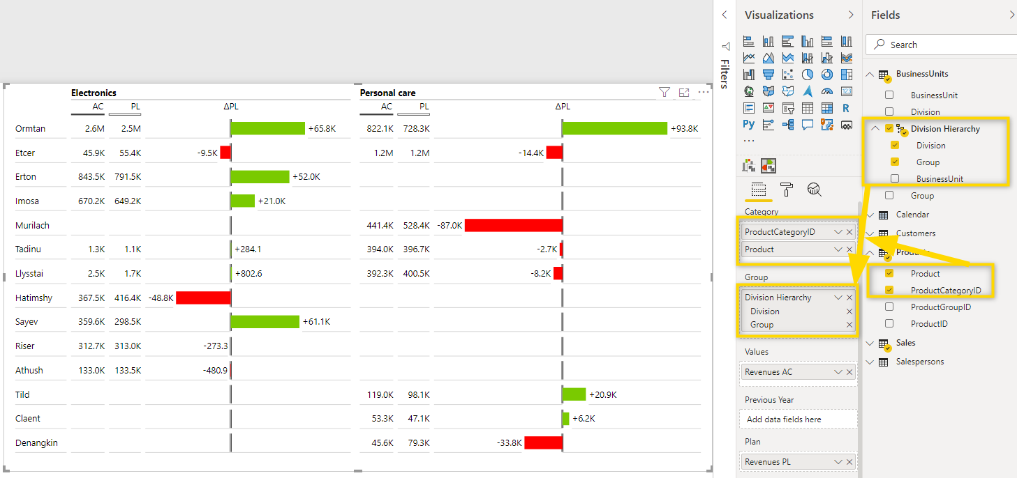
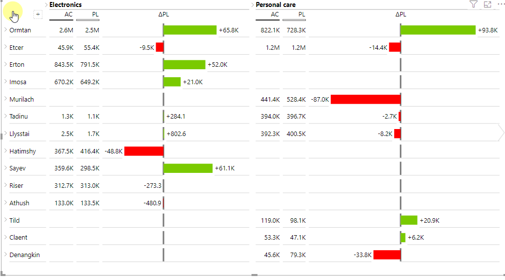
This setup doesn’t only let you drill down into the Category in the rows but also into the Product details in the columns as shown below:
Now you know how to add hierarchies to your Power BI report. This will lead to many additional insights for your end-users as they can now drill-down into the data and see exactly where the values are coming from.
Should your hierarchy be sorted in a specific order? How to add a custom sort order logic to a hierarchy.