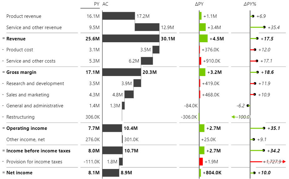
The income statement is part of every financial report but visualizing it can be tricky. With the Zebra BI visuals, creating a visual like the one below only takes a few steps.
If you are not the Zebra BI for Power BI user yet, you will have the best experience, if you start a free trial.
First of all, let’s look at how the demo data is structured:

This is what’s shown per column:
- AccountID: This number indicates in which order the accounts have to be shown in the visual.
- Account: This is the name of the account which will be shown in the visual.
- 2018/2017: Values for the respective years. Whenever your data is structured like this, you actually want to unpivot it to have only one column for the time dimension. In this article, we will not unpivot the table so we can focus on the actual topic. In a real-life scenario, we would definitely recommend unpivoting the data first so we recommend you look at the article about unpivoting to learn how this is done.
⚠️ Hint: If you load this data from Excel, make sure to calculate subtotals and totals in Excel. This will assure that totals are calculated correctly but of course, the report will also work if the totals are hardcoded. For Example row 3 (Revenue) is the sum of the two rows above.
The following steps lead to the visual shown above
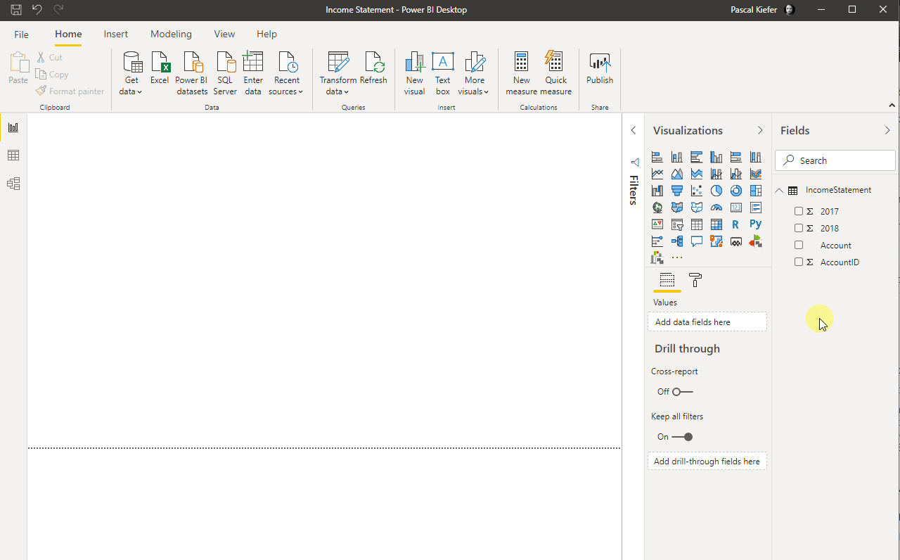
1. Load data from Excel to Power BI
If you need help, learn how to load data from Excel.
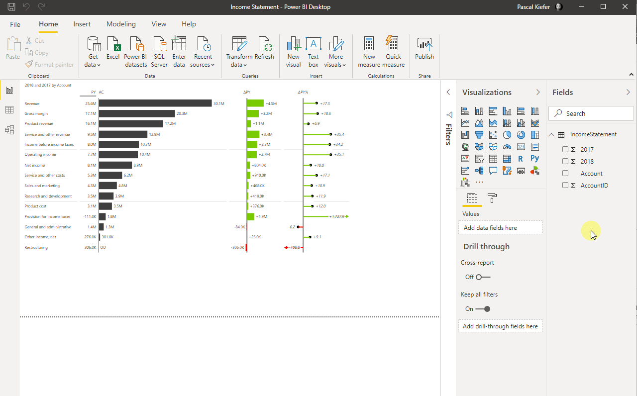
2. Insert a Zebra BI Tables visual and add the dimensions into the appropriate placeholder of the visual
The account goes into Category, 2018 goes into Values and 2017 goes into Previous Year. (In this article we focus only on how to create the income statement so we took a shortcut and didn’t create any measures. As you can see, we added 2017 and 2018 directly to the visual. This is not best practice so we recommend that you learn how to create basic measures and add measures instead).
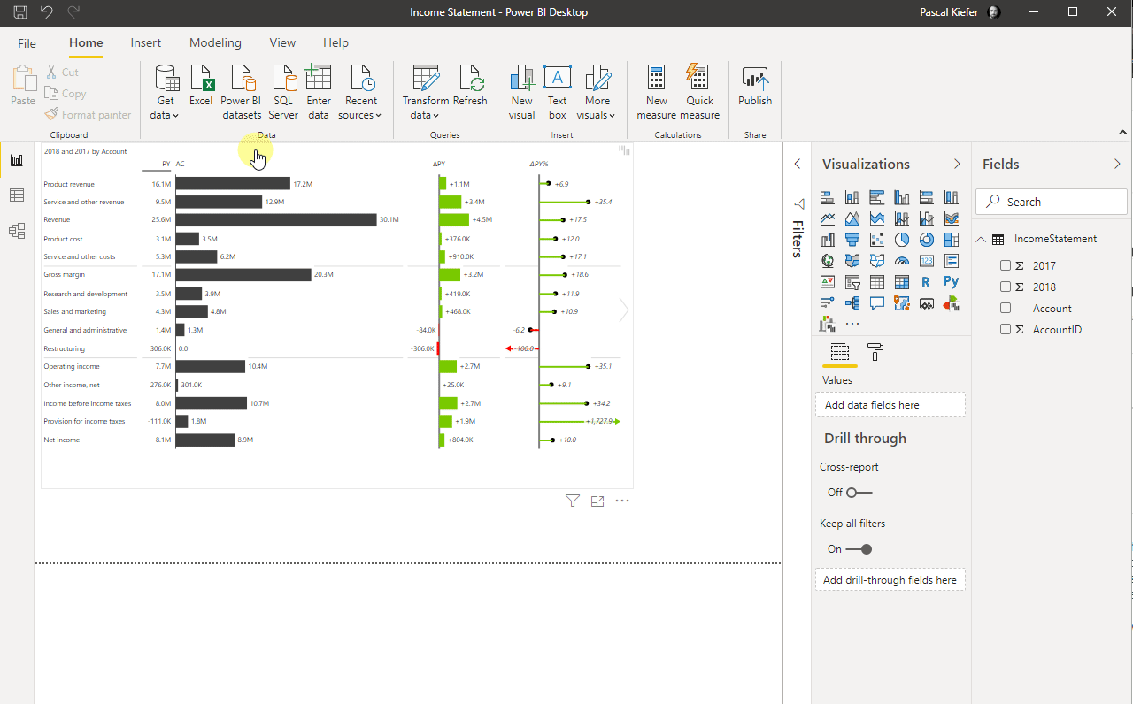
3. Sort the order of accounts
The default sorting is by AC values but since the Income Statement needs to be shown in a predefined order, the logic for the sorting needs to be changed. The order of the accounts is defined by the column AccountID. This numeric column is needed because without it, the accounts would be sorted alphabetically. There are a few steps that we need to perform to get the right sort order.
1. Select Account in the fields list and then change the Sort by column to ColumnID.
2. Select the visual and click the 3 dots to open the more options menu. Select Sort By Account.
3. The default sorting is descending but since we want to sort by ascending numbers in the ColumnID column, you need to change the sort order by selecting the visual, click the 3 dots and select Sort ascending.
⚠️ Hint: Whenever the visual is sorted by value, this is indicated with an arrow. To change the sort order or remove the sorting by the respective column, click on the header of the column.
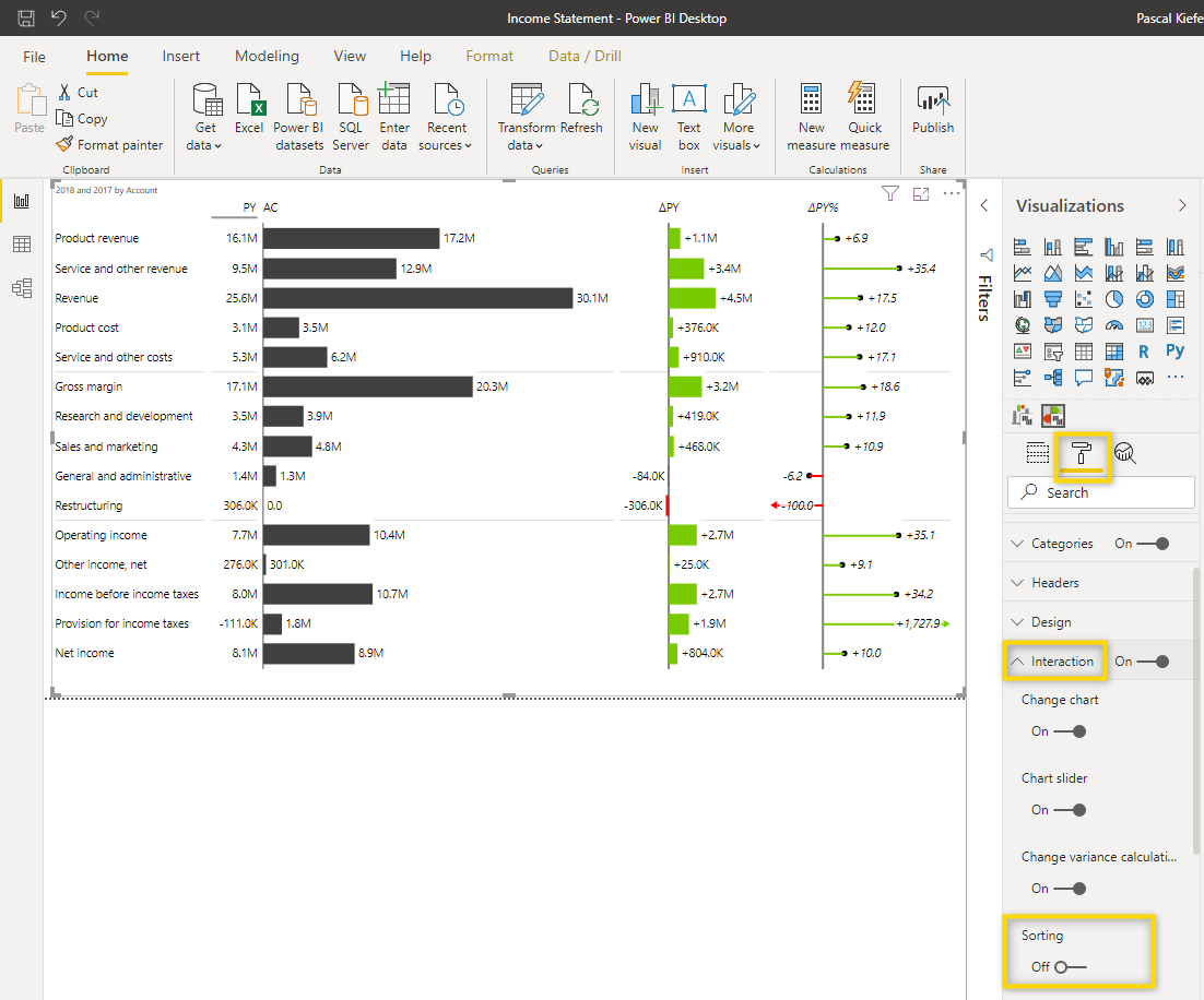
4. Make sure end-users won’t be able to change the sort order
Since the sorting is now correct (Product revenue on top and Net income on the bottom, which is identical to the source table), you need to make sure that the end-users can’t change the sort order once the report has been published to Power BI Service. To do this, select the visual and turn off the Sorting in the Interaction section of the visual format.
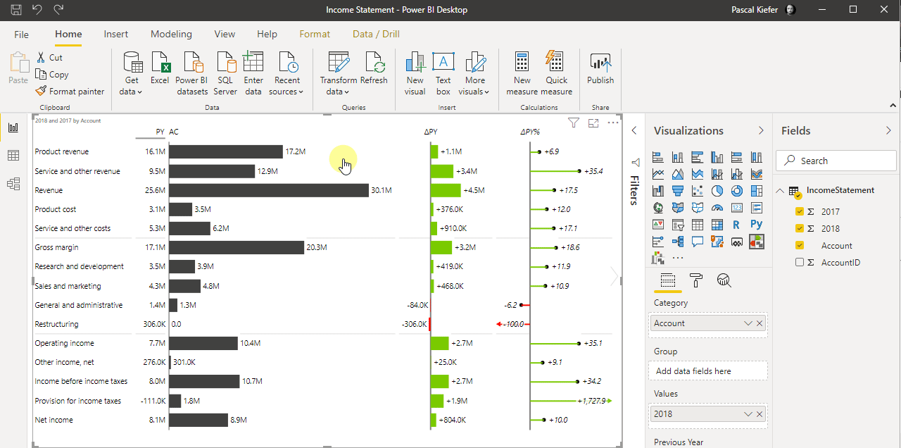
5. Change the AC column into a waterfall chart
When you hover over the header of a column, a little black arrow will show up. Clicking this arrow will allow you to change some settings of the respective column. Select the symbol for the waterfall chart to change the style of the column.
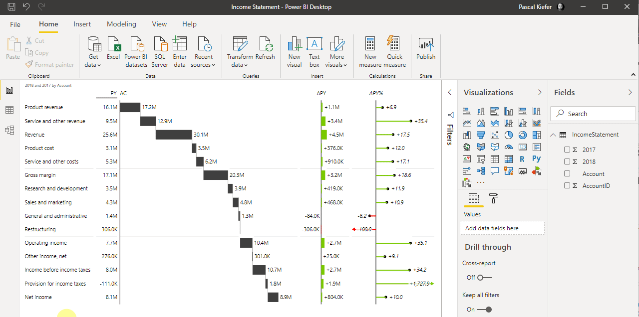
6. Choose between 3 different account types in an Income Statement
There can be 3 different account types in an Income Statement.
Income (positive values), Costs/Expenses (negative values) and totals. In the Zebra BI Tables visual the default is an income account so for all rows which are totals or negative accounts the setting needs to be adjusted. To do that, right-click on the respective account and select Invert or Result.
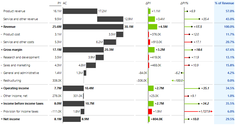
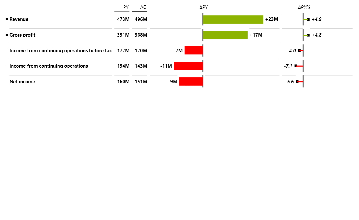
You now have a Zebra BI Tables visual showing your individual income statement structure.
Did you know that you can add columns with custom calculations to the visual? In the sample below, a column showing % of Revenue per account has been added. Take a look at this article to see how this can be done.
What you can also do is add a drill down to the account structure so the report looks like shown below. Take a look at this article to learn how this can be done
You’ve just learned something essential for every financial report. Surely, the end-users will be delighted to see a proper Income Statement in Power BI.
Start a Zebra BI for Power BI trial.