The Zebra BI Charts add-in can display a number of different chart types. The selection of charts depends on the chart selected in the chart chooser, mostly on the number and type of values you bring into the visual. In this article, we will take look at the following:
- Single-column column charts
- Waterfall charts
- Variance charts
- Small multiples and stacked charts
Charts with one value column
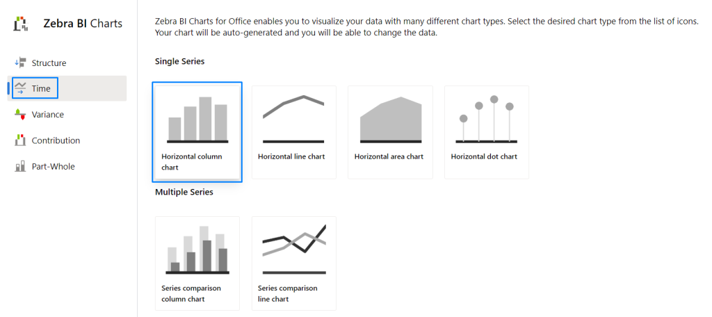
If you import the single-measure chart, you can choose between column, line, area, “hills & valleys”, pin and waterfall charts. Simply click on the chart slider (the right-arrow button) to switch between charts:
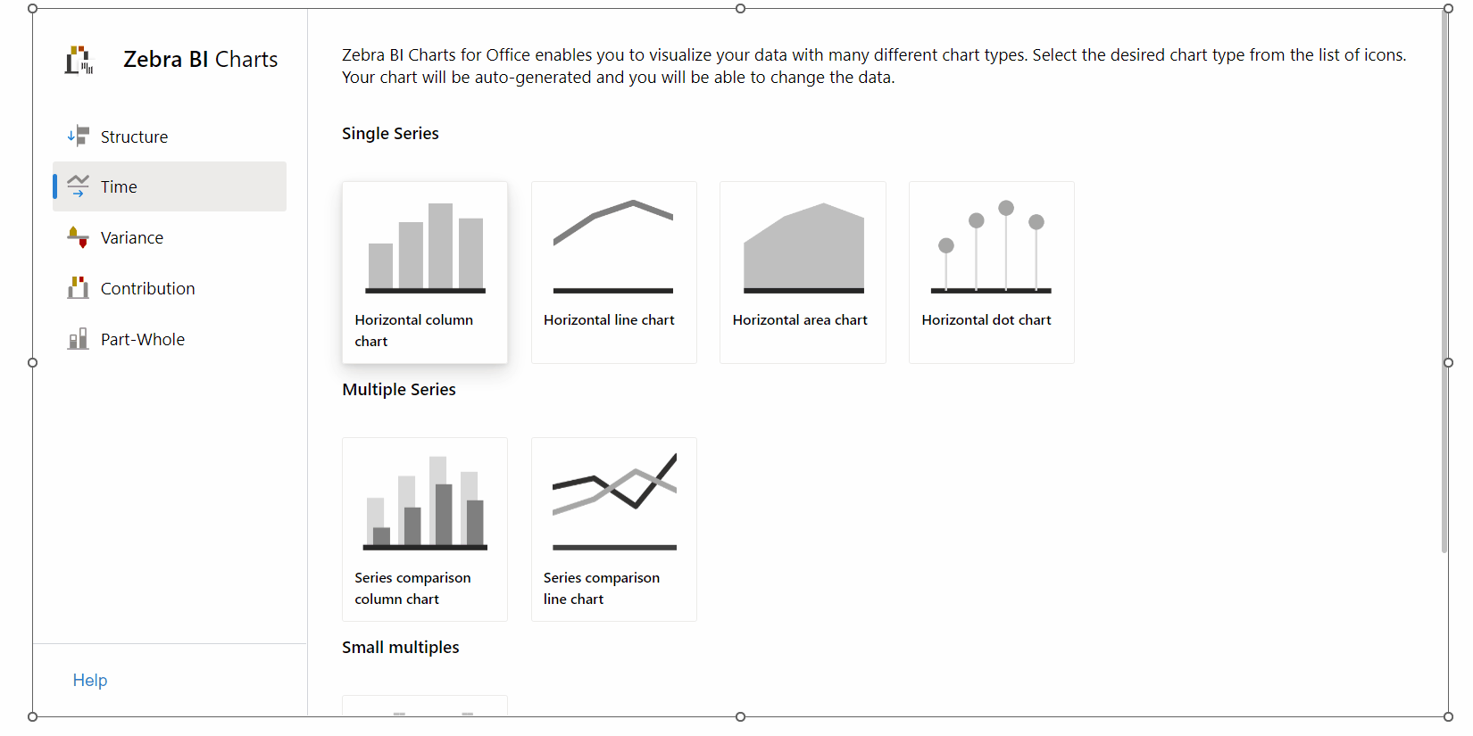
These are the most basic Zebra BI charts; therefore, you only need two columns, one for the category and one for the value. Some of the charts have additional layouts available which you can find in: Visual settings > Layout. For example, you can change the layout of the area chart from “Integrated” (the version with red/green areas) and “Actual” (plain area chart) like this:
You can customize any chart by changing the design (colors, font types, etc.), formatting numbers, and changing the difference in highlight appearance
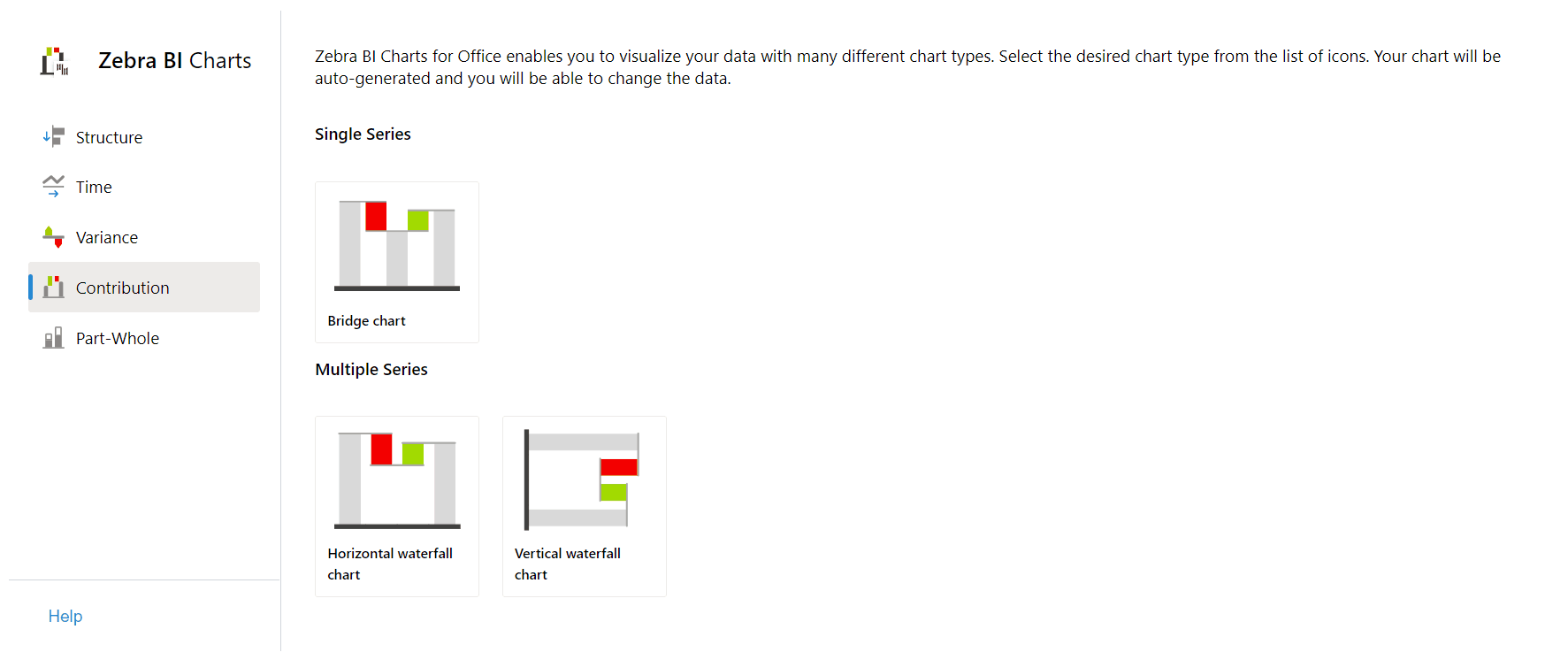
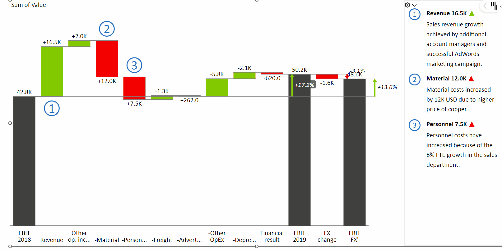
Waterfall chart
The waterfall chart is a special type of chart that is very versatile. It is used for displaying calculations or performing contribution analysis. It can display subtotals using the Result feature and allows you to Invert selected data points in your data series, for example, expenses data point:
- right click on the label -> Invert
- right click on the label -> Result
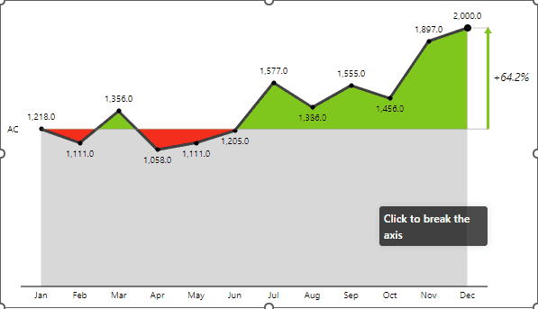
Apart from inverting and marking a column as a result of the waterfall chart, it is possible to highlight the specific column and break the axis scale.
- right click on the label -> Highlight
- click on the result column to Break the axis
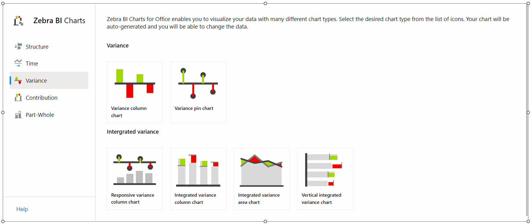
Charts with two values (Variance charts)
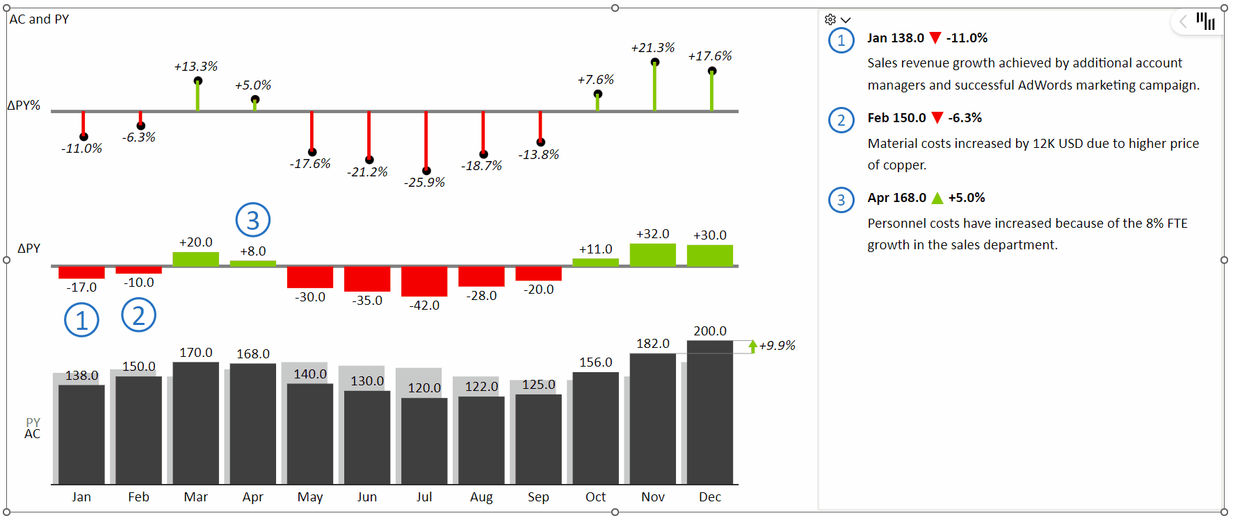
The Zebra BI Charts visual is especially powerful in situations where you need to compare two measures and/or display variances between those two measures. Sales vs plan, Costs vs budget, Revenue vs Previous Year, and similar comparisons can be visualized in a number of meaningful ways.To create a comparison chart simply select the Responsive variance column chart from the Variance chart category:
When you create a comparison chart, Zebra BI will automatically calculate the variances (differences) between your scenarios and display them in charts.
Again, you can use the chart slider to choose the most appropriate chart. You can choose between a waterfall chart, integrated variance column chart, area “hills & valleys” chart, and line chart:

Responsive layout, variance display
Comparison (variance) charts have many additional options. Among others, You can choose from a number of layouts (check the Layout options in Visual settings), change the display of variances (absolute or relative or both), break the axis, etc.
- Responsive layout -> resize the visual to switch the layout to integrated variances
- Variance display -> Click on the variance to switch between relative/absolute or both
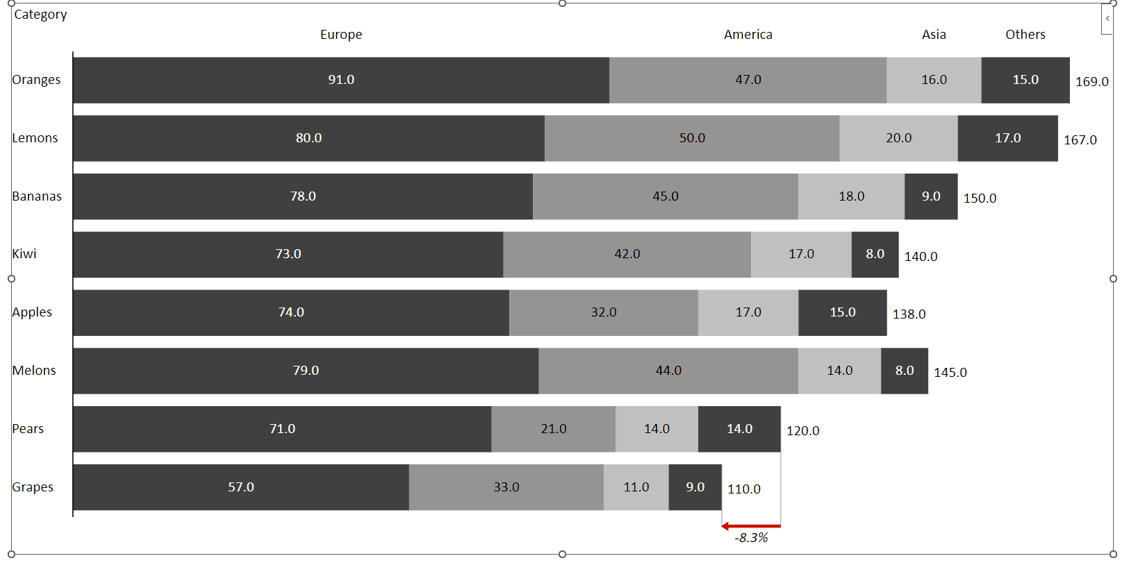
Stacked charts and Small Multiples
Last but certainly not least are stacked charts and small multiples. The last category in the chart selector:
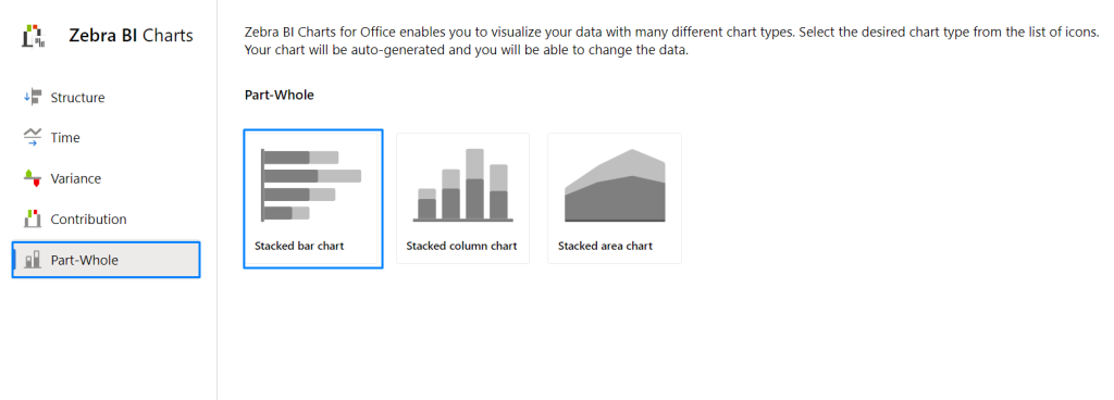
The stacked chart will be shown. By clicking on the small multiples you can switch it to the small multiples view.
Combo charts
Combo charts are a great way to display two measures with different types or units in a single visualization. For example, you can show Sales revenue $ alongside Gross Margin in % on the same chart. This helps you save space on your report or dashboard by combining both measures within a single Zebra BI Charts visual—just drag the second measure into the Actual placeholder.

The second measure placed in the Actual placeholder will automatically be displayed on the secondary Y-axis using a separate scale.

With the Zebra BI Charts visual, you can create combo charts using any supported chart type! This means you can build a variance chart or even a waterfall chart and then integrate an additional measure on the secondary axis. For example, you can combine a Sales vs Plan chart with Gross Margin % for a more comprehensive view.

You are now ready to start using your charts and bring your data in. Single-column, waterfall, responsive variance charts, small multiples, or combo charts are ready for your amazing reports.