Zebra BI Tables for Office is a versatile, powerful tool. We are also bringing a tool for visualizing tabular data in PowerPoint. It is capable of many features such as:
- Automatic variance calculation
- Variance coloring
- Integrated dynamic commenting
- Adding custom formulas
- Filtering by Top N datapoints
- Formatting options
- Waterfall chart
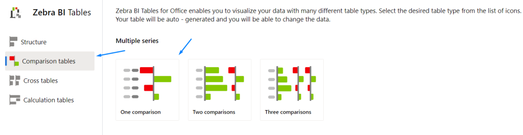
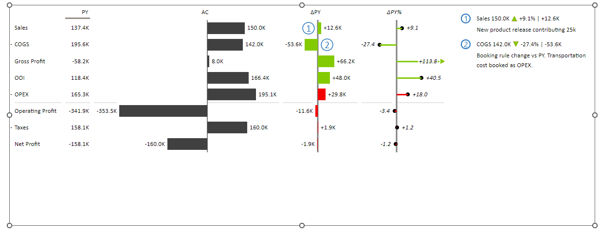
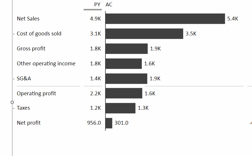
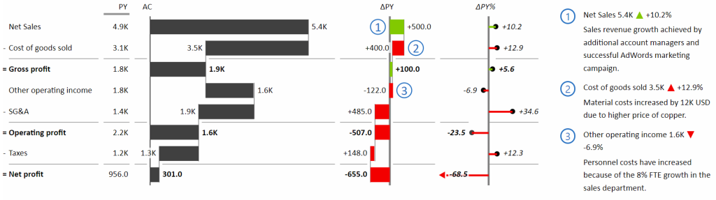
We will be using the One comparison table from the table chooser filled in with Income statement accounts.
Automatic variance calculation
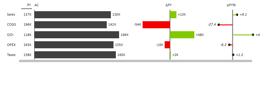
Variance analysis is the cornerstone of corporate planning and reporting processes. You can compare Actual data vs the Previous Year’s data, and Actual data vs Plan data for example. All Zebra BI visuals calculate both relative and absolute variances for you automatically, out of the box! No need to spend time checking your formulas or cell formatting.
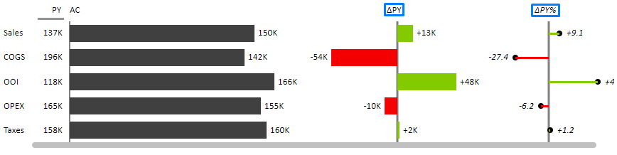
Ready for your and your team’s analysis? To make your analysis easier, we have supported automatic and consistent coloring.
Variance coloring
Green is good, and red is bad, simple as that. Looking at the table above you can notice that the negative variance is colored red, and the positive variance is colored green. This applies to both relative and absolute variances. The same color should have the same meaning regardless of its position.
It is possible however to invert this logic by right-clicking on the specific account if that is required. Let’s look at the expenses accounts (COGS, OPEX, Taxes) example:
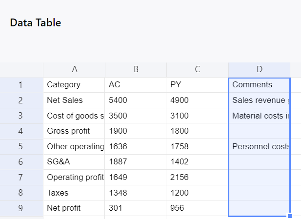
Commenting
A very convenient feature for collaboration, sharing information across departments with the top management for example. You must have a comment column in your data source. Insert the add-in to reflect it in the visualization as well:
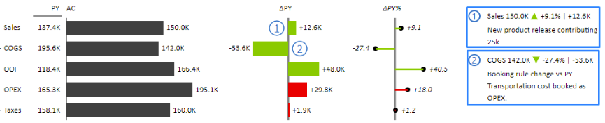
Entering new comments dynamically is also supported. Simply enter new text into the table. Also, by clicking on the variance number in the comment, you can show relative, absolute variances, or both. Slicking on the variance indicator (green arrow above) you change its shape:

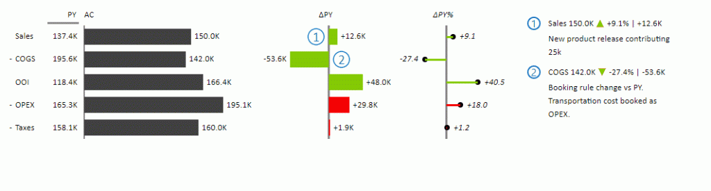
You can also change the size of the comment box. Hover over the line separating comments from the visualization and you’ll see a dotted line. Simply drag and drop it to adjust the box size.
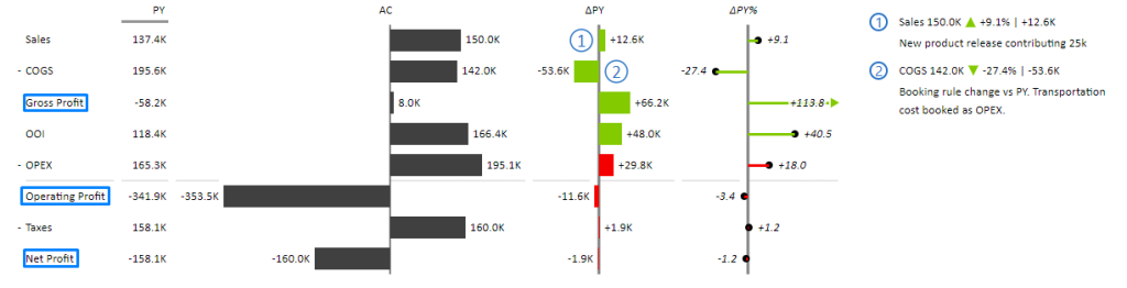
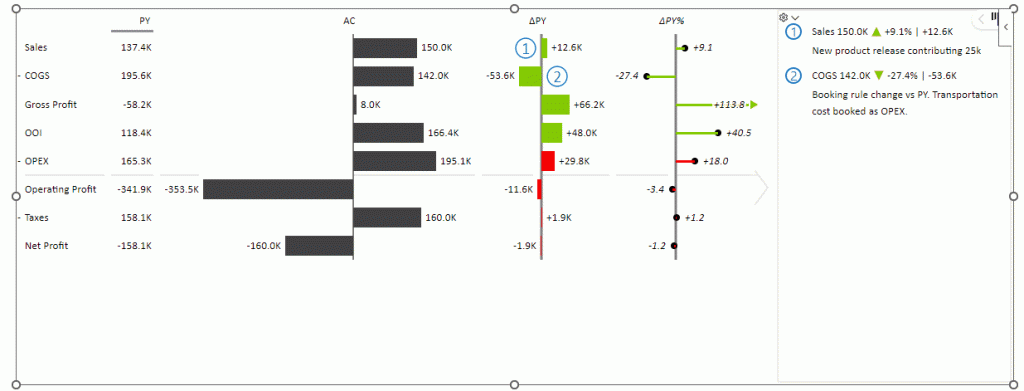
Adding custom formulas
By right-clicking on an Account on the visual, you can add a custom formula below it. Let’s add
Gross Profit = Sales – COGS
You can repeat this process for Operating Profit and Net Profit:
Operating Profit = Gross Profit + OOI – OPEX
Net Profit = Operating Profit – Taxes
Filtering by Top N data categories
Zebra BI for Office offers practical functions for displaying Top and/or Bottom N elements that will make your reports and dashboards much more focused and actionable.
We have a (add link) explaining the whole feature in detail.
Visual settings
Starting with the settings, here, among other settings you can change the font, font size, and layout, turn on/off comments boxes or change the Visual Design. Here is the overview of the settings available in the Zebra BI for PowerPoint Tables visual:
Some of the formatting options are available in the settings pane. To get more out of your visual, changing background color, or bolding specific categories or columns we need more formatting options.
Formatting options
Here we split between row formatting and column formatting of the Zebra BI for PowerPoint tables visual.
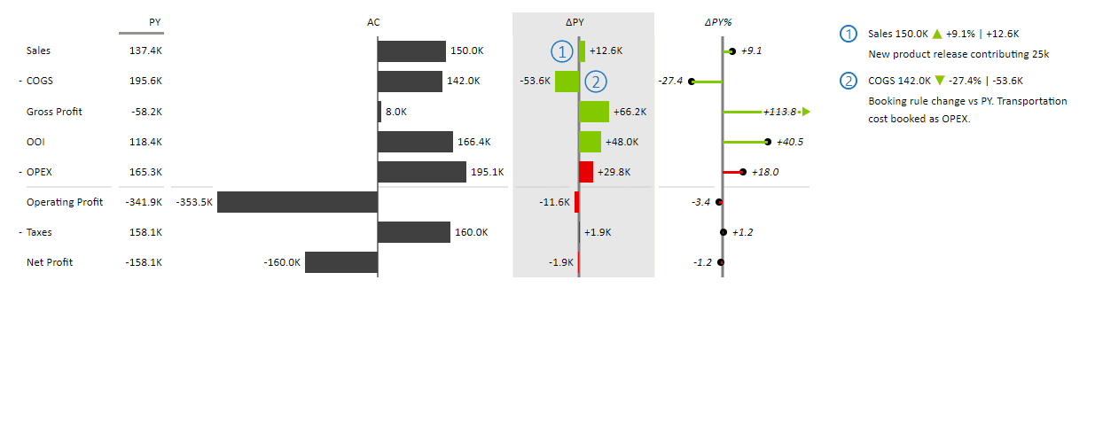
Starting with the latter, click on the top of the column name, and open the column formatting menu:
among other options, you can change the color background for example. Let’s apply it to the variance column, ΔPY.
Similarly, you can apply formatting to the data categories (rows). Right-click on the row to access formatting options:
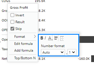
Here you can change the category label font color, make them italic or bold (or both). Additionally, you can change the bar chart color on that specific row, number format, decimal numbers, or borders. Let us bold the Profit Accounts so they can stand out.
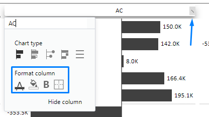
Waterfall charts
Last but certainly not least is waterfall charts within your tables in only a few clicks. To get a proper waterfall chart you need a result category/account. Let’s take our Gross profit, Operating profit, and Net profit as examples again.
Two steps are required:
- Change the chart type of the column to Waterfall (we will use the AC column)
- Right-click on the profit accounts one by one, and check the Result check-box
shown below:
the process can be repeated for the ΔPY column. This is the result:
You have learned how to start using Zebra BI Tables for Office in PowerPoint, and their key features: automatic variances, commenting, visual formatting, and settings. Even adding custom formulas and inverting values.