The Zebra BI Charts for Office can render many different types of charts in Excel. Column/bar charts, area charts, line, waterfall, variance, “hills & valleys”, dot, and lollipop charts are supported, and a user can switch between them by simply clicking on the chart slider. You can also add forecasts to charts, and above all, render small multiples of any chart type. It’s as easy as looking at pictures on your mobile phone!
The Zebra BI Charts add-in can display a number of different chart types. The selection of charts depends on the data that is added to the visual, mostly on the number and type of values you bring into the visual.
Charts with one value column
If you only add one single measure to the Zebra BI add-in, you can choose between column, line, area, “hills & valleys”, pin chart, and waterfall charts. Simply click on the chart slider (the right-arrow button) to switch between charts:
These are the most basic Zebra BI charts, therefore you only need two columns, one for the category and one for value.
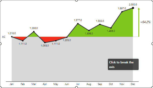
Some of the charts have additional layouts available in Visual settings > Layout. For example, you can change the layout of the area chart from “Integrated” (the version with red/green areas) and “Actual” (plain area chart) like this:
You can customize any chart by changing the design (colors, font types, etc.), formatting numbers, and changing the difference in highlight appearance.
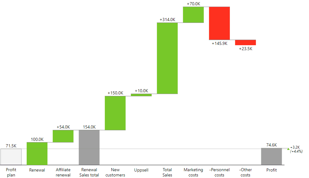
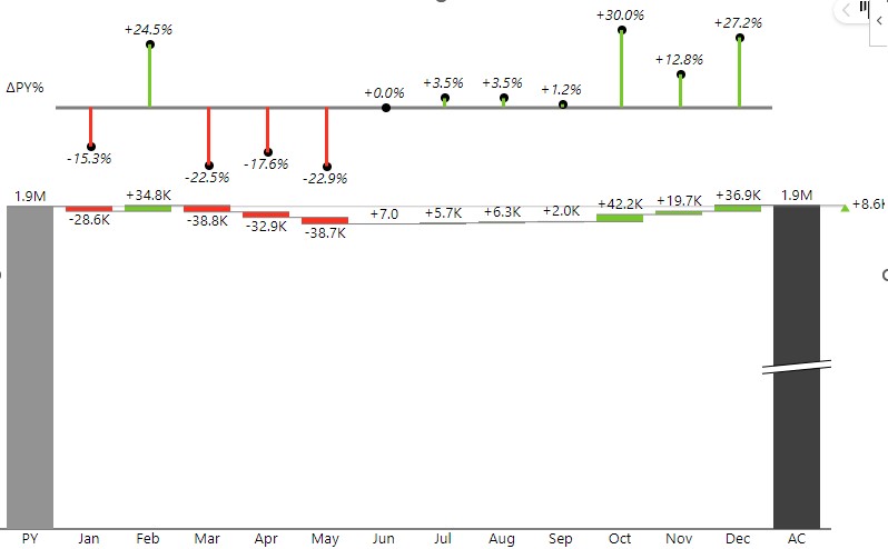
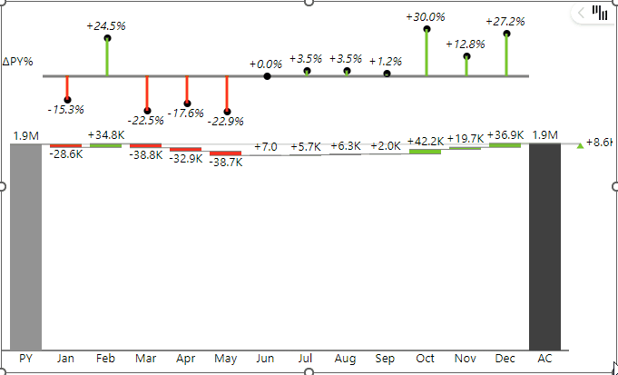
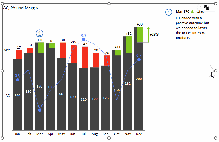
The waterfall chart is a special type of chart that is extremely versatile. It is used for displaying calculations or performing contribution analysis. It can display subtotals and allows you to invert selected data points in your data series:
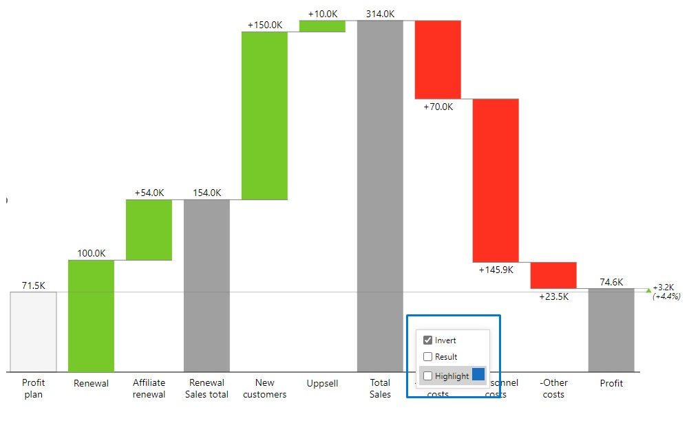
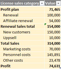
To create waterfall charts with subtotals from one single measure as shown in the picture above, you need to have your data table structured as the one below and subtotal values need to be calculated to appear correctly in the visual.
Click on the chart slider to get to the waterfall chart. After that, right-click on a category to select the type of calculation (Invert, Result). You can also Highlight each category with a different color.
Charts with two values (comparison or variance charts)
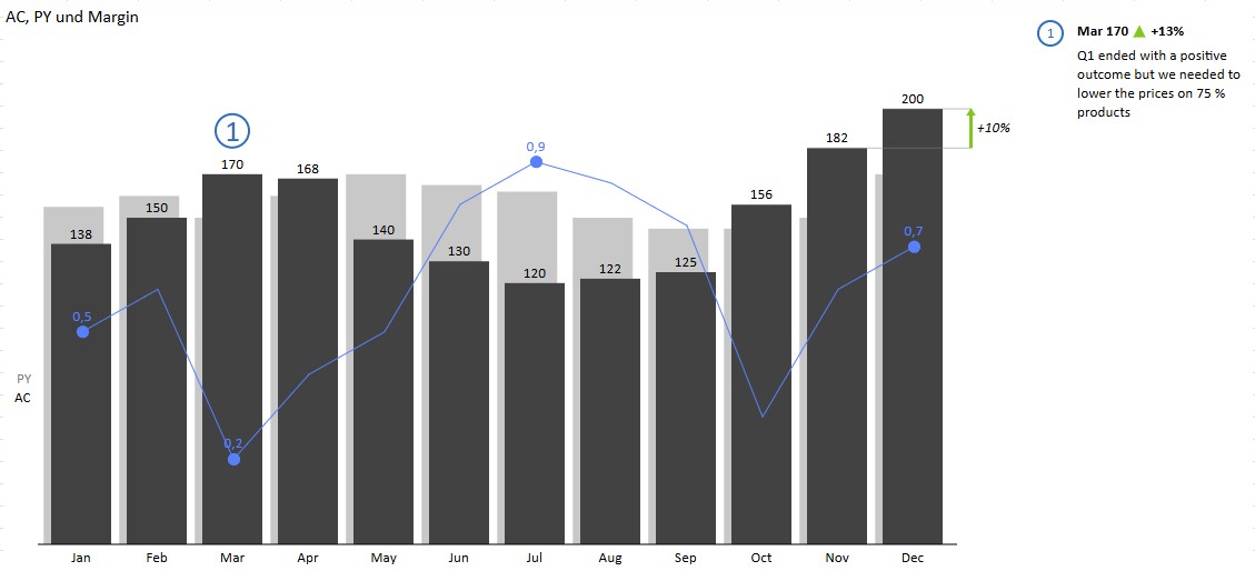
The Zebra BI Charts add-in is especially powerful in situations where you need to compare two measures and/or display variances between those two measures. Sales vs plan, Costs vs budget, Revenue vs Previous Year, and similar comparisons can be visualized in a number of meaningful ways.
To create a comparison chart your source table needs to contain one category column and (at least) two value columns.
A table formed as the one above will result in a chart like this:
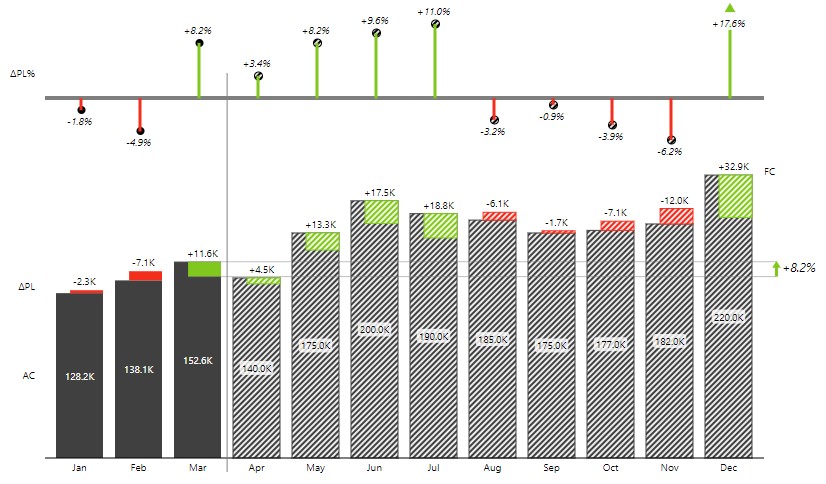
Similarly, you can create a comparison to a forecast by adding a Forecast (FC) column to your source table.
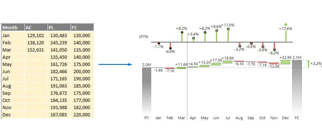
When you create a comparison chart, Zebra BI will automatically calculate the variances (differences) between your measures and display them in charts.
Once you drop two measures into the Zebra BI visual, you can use the chart slider to choose the most appropriate chart. You can choose between a waterfall chart, integrated variance column chart, area “hills & valleys” chart, and line chart:
Comparison (variance) charts have a ton of additional options. You can choose from a number of layouts (check the Layout options in Visual settings), change the display of variances (absolute or relative or both), break the axis, etc.
Charts with forecasts (segmented charts)
The Zebra BI Charts add-in offers extensive support for displaying forecasts. If you add a measure with a forecast to the visual, it will display the actuals up to the current period and then render the forecast for the rest of the time series (for example, for the rest of the year). All Zebra BI charts support the display of forecasts:
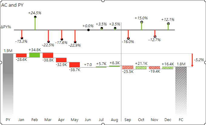
These charts are also called segmented charts.
Zebra BI will automatically detect the end of your actuals (the measure in the Values placeholder), so it is important that this measure has empty values for the periods after the current period.
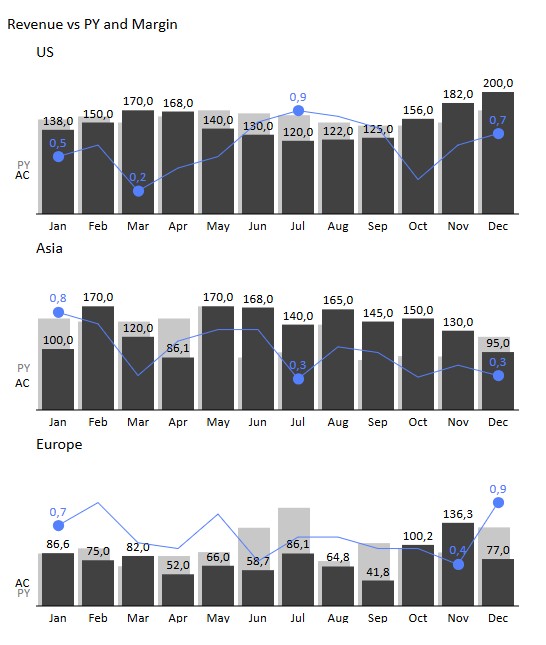
Small multiples
All the above-mentioned charts can be rendered as small multiples, meaning that the Zebra BI Charts add-in is able to display multiple charts in one single visual. Here’s an example where the performance of units is visualized in the same visual.
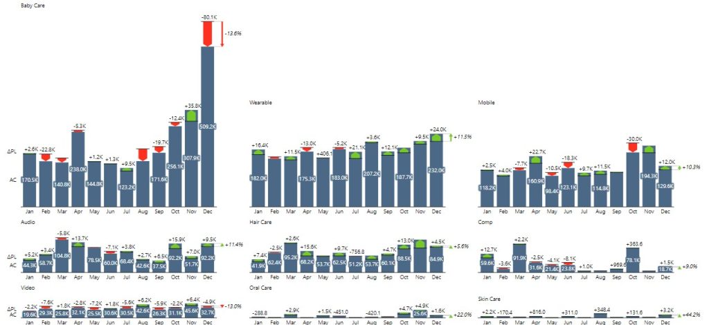
Small multiples are one of the most powerful data visualization methods and also one of the most powerful features in Zebra BI. You can create them from any Zebra BI chart.
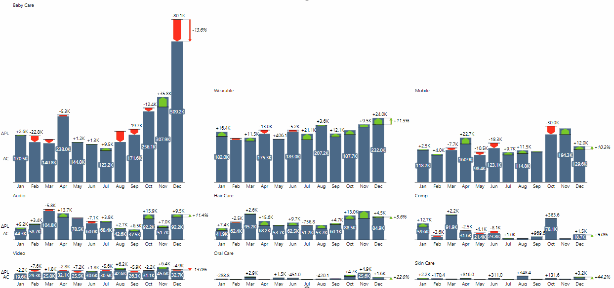
To get inspired and learn more about how small multiples can take your Excel reports and dashboards to the next level, read small multiples in Zebra BI for Excel.
Combo charts
Combo charts are a great way to display two measures with different types or units in a single visualization. For example, you can show Sales revenue $ alongside Gross Margin in % on the same chart. This helps you save space on your report or dashboard by combining both measures within a single Zebra BI Charts visual—just drag the second measure into the Actual placeholder.
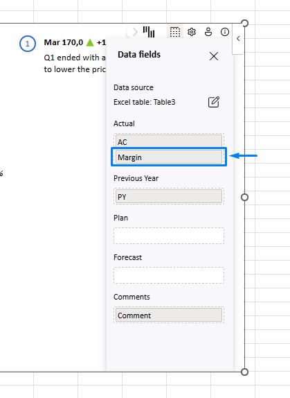
The second measure placed in the Actual placeholder will automatically be displayed on the secondary Y-axis using a separate scale.
With the Zebra BI Charts visual, you can create combo charts using any supported chart type! This means you can build a variance chart or even a waterfall chart and then integrate an additional measure on the secondary axis. For example, you can combine a Sales vs Plan chart with Gross Margin % for a more comprehensive view.
Finally, you can effortlessly create small multiples of combo charts in Zebra BI by creating a pivot table from your existing data table. For instance, you can display monthly sales trends alongside gross margins for several regions within the same visual.