A bridge waterfall chart is a special variation of a waterfall chart that allows you to create highly customizable visualizations by adjusting individual elements, adding subtotals and scenario notations, etc. It can be particularly useful in financial reporting. With Zebra BI for Office, you can create it in a really simple way directly in Excel.
Data inputs for this type of visualization are quite basic. Typically, they consist of one category column and one value column. Additionally, we can also add a column with comments. Let’s have a look at the example below.
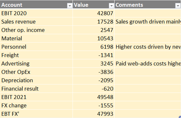
- Account: these are the accounts that will be shown in the chart. Of course, you could also set up a similar visual for countries, products, employees, or any other categories.
- Value: the values could be plain actuals, already calculated deviations between Actuals and Budget, Actuals and Previous Year, or any other calculation.
- Comments: This is an optional column that can be added if you want to include comments on your visual.
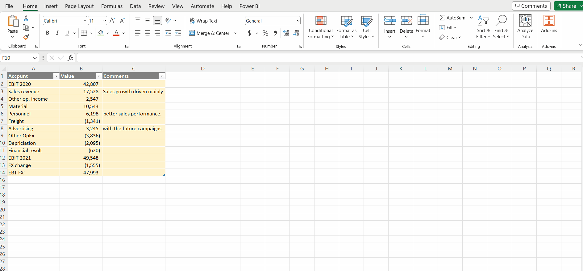
Next, we just need to click on the table (if formatted as an Excel table) or select the data range of all the cells and insert the Zebra BI Charts for Office add-in. By default, the column chart layout will be used. Next, use the chart slider and click on it until the waterfall layout is shown. The standard behavior of the waterfall visual consists of increasing values resulting in rising green bars and decreasing values in falling red bars.
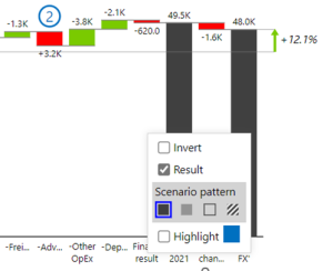
Next, we need to make sure every bar is defined correctly by using the Invert and Result features. Both can be accessed by right-clicking on the category label. The GIF below demonstrates how you can go about it.
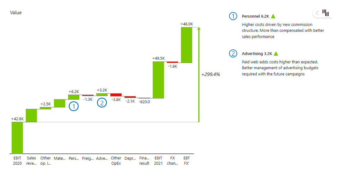
Bridge charts are also often used for comparing different data scenarios, like the previous year (PY), plan (PL), budget (BUD), forecast (FC), etc. In this case, different scenario notations can be applied by right-clicking on the Result feature.
This will make your visualization more actionable and aligned with IBCS reporting standards.
Congratulations, you successfully created your bridge waterfall chart. Enjoy the insights.