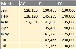
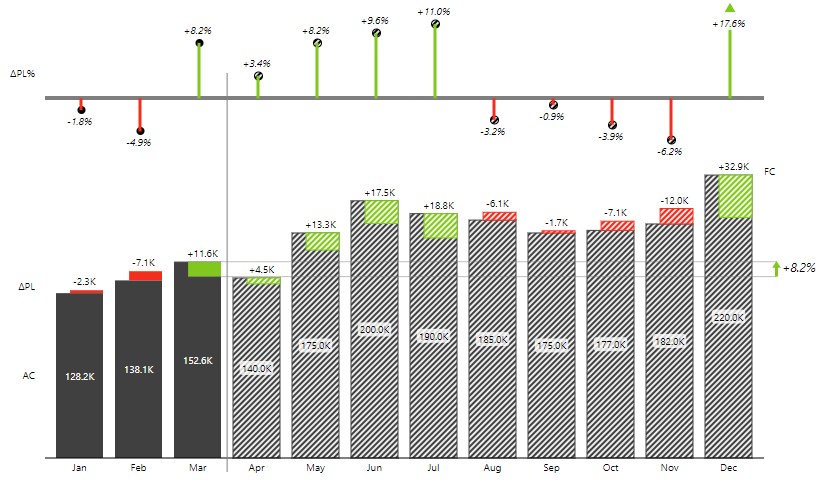
Create a simple variance segmented chart with only three value columns: actual sales to date (March in this case), sales plan for the year, and sales forecast for the remainder of the year.
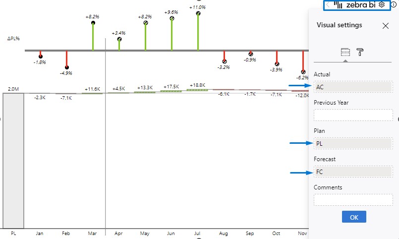
Insert a Zebra BI Charts for Office and it will automatically recognize the values along with the fields and place them into the visual. If necessary, you can relocate value columns to a different placeholder in the Visual settings. For the segmented chart to appear, the FC column needs to be placed in the Forecast placeholder. This will automatically display a segmented waterfall chart with absolute variances and a separate pin chart for relative variances. Forecast values are shown differently so you can easily distinguish them from other values.
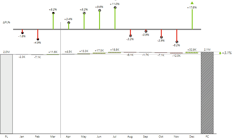
A waterfall chart is a good choice for reviewing this type of data – it shows totals, plans, and forecasts with variances. It is particularly well-suited for this purpose because it shows how individual values contribute to the end result. You can break the axis in a waterfall chart by simply clicking on one of the total columns. However, you should note that this might make monthly contributions seem larger than they really are.
Use the chart slider to select the proper chart for your case. The column chart is appropriate if you have a small number of categories, such as 6 to 12 months. When working with a larger number of data points, like a weekly time series or multiple years, it’s better to use an area chart or a line chart with highlighted differences.
Even though you can display column charts with integrated absolute variance, it’s better to use available space to expand the visual. Since Zebra BI add-ins in Excel are fully responsive, absolute and relative variances will then be shown separately to improve readability.
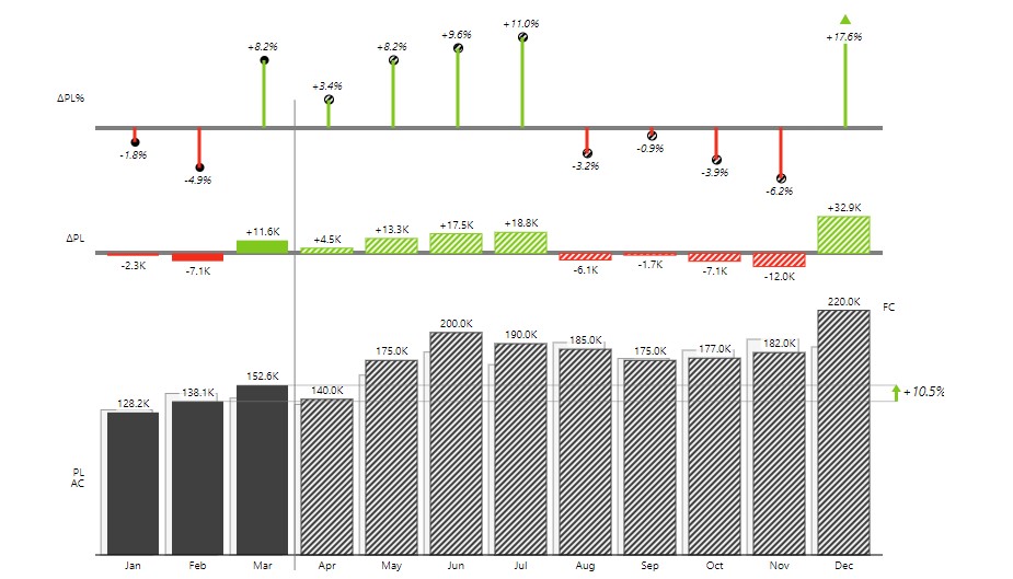
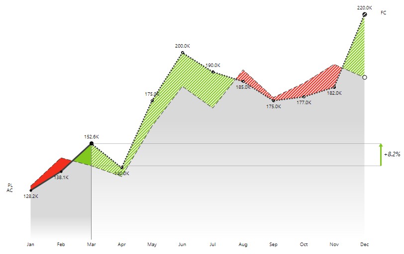
A great chart to use in this case is an area or a line chart. Bar charts tend to use a lot of ink as the bars grow over the year. The best practice is using minimal designs like the area chart shown below. This way, your eye is drawn to the actual variances and not to the overall chart size.