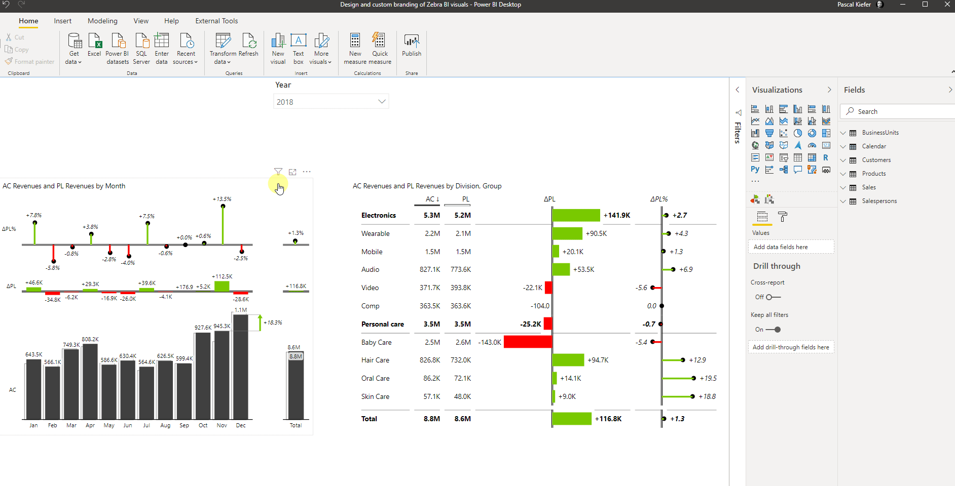
Zebra BI visuals offer extensive support for applying custom design. You can change the color, font type, font size, shape, etc. on practically every element in the Zebra BI visuals.
Let’s see some of the most important styling elements and how you can change them. Make sure to download the sample PBIX file to play around with all these features. If you are not the Zebra BI for Power BI user yet, you will have the best experience, if you start a free trial.
Changing Colors
The default colors in Zebra BI visuals are according to International Business Communication Standards (IBCS). If you haven’t heard about IBCS before or want to refresh your memory, find the advantages of having IBCS-certified visuals like the ones from Zebra BI. Nevertheless, you have full flexibility and can change any color you want. The Zebra BI visuals are delivered with some predefined color settings, which you can find in the Design section of the formatting pane. Simply select the visual that you’d like to change and select a Style from the drop-down.
If none of the predefined Styles works for you because of corporate design rules or personal preference, you can just select the Custom Style and change every color of the visual individually. Take a look at the report page with the name Custom in the attached file, where you can find visuals that have a custom-created style.

An important clarification is that the Neutral color, in this context, represents the base or primary color applied to the “Actual” value.

You will note that there’s also an option for More colors, and once it has been enabled, you can even change the color per scenario. The default is that the scenarios Previous year, Plan, and Forecast have the same color as the Actuals but are shown in a different pattern (the previous year is a lighter shade of Actuals, Plan is an outline, and Forecast is hatched). If you are using the scenario placeholders for something different than the actual scenarios, you might want to play around with More colors and Apply scenario pattern settings to get the desired result.

To clarify, let’s consider a specific example. In this instance, we’ve removed the Actuals, displaying only the Plan values. The first visual includes the pattern applied to the Plan, while the visual below shows the Plan without any pattern applied. This setting provides users with greater design flexibility, allowing deviations from the standard AC-PY-PL-FC approach.


Changing the design of text (Font, Size, Color, etc.)
The Zebra BI visuals contain different text elements that need to be changed in different places in the menu, but it’s important to know that there are a lot of options and you can change nearly every setting.
Titles
Can be modified directly in the visual by clicking on the dropdown arrow. Zebra BI Titles have the ability to dynamically change information based on the filter/slicer selection. To learn more about this feature, please navigate to the Dynamic Titles in Zebra BI visuals article.

Data labels
In general, data labels can be accessed through the settings; however, due to each visual’s unique specifics, some additional options are available directly within the visual itself.
Charts visual has data labels settings also available directly in the visual, allowing the user to manage everything by clicking on any data label within the visual:

Tables visual has some options to configure labels on particular columns by clicking on the dropdown arrow next to the column header.

If the column is defined as a table, you can even change the font color.

It’s important to note that, by default, negative variance numbers will appear in red, while positive variances will retain the neutral color. To emphasize positive variances by displaying them in green, you can adjust the column’s font color.

Cards visual has the ability to modify fonts by sections in the global toolbar. You can access it by hovering over the visual and clicking on the down arrow appearing at the top.

Change the gap between columns and rows
In both visuals, the Zebra BI Charts and the Zebra BI Tables visual, you can define the gap between the chart elements. You can find this setting in the Category section. This is what it looks like for the Zebra BI Charts visual. The functionality is the same for the Tables visual, just for the gab between rows instead of columns.

Change row height
Depending on the space you have in your report, you might want to change the height of the rows in a Zebra BI Tables visual. You can find the setting to do this in the Category section. The default setting is Auto but you can change it to Font sized to use less space or to Stretch to use the full height of the visual. If you want to manually define the height, just set to fixed and define the height in pixels yourself.

Styling the area chart type
In this specific chart type (explore all visuals that are available with Zebra BI), you can change the opacity of the base and variance. This can be found under the Design section.

Stacked chart
Stacked charts are particularly useful for analyzing values from multiple data series within a single chart. The series are distinguished by varying shades of the neutral color palette defined under the Design settings.

If you want to emphasize a particular data serie you can highlight it by clicking on the item name and selecting a highlight color for it.

As you saw in this article, there are not many things that you can’t change in the Zebra BI visuals, and with every new version we publish, there are even more advanced options to let you build reports that look exactly the way you like them. Ensure a consistent style and standardized visuals across reports to enhance their clarity and readability.
By the way: To make the styling process even easier, Zebra BI visuals support custom themes so you can define your design preferences in a central place and make them the default view which is shown when you add a new visual.
We assume you already are a Zebra BI for Power BI user. If not, feel free to start a free trial.