With Zebra BI’s flexibility, you can easily create basic reports that are simple to navigate and that efficiently display the most crucial data. You may dynamically switch between showing actual performance in comparison to the plan and actual performance in comparison to the prior year without having to deal with Power BI’s complex setup.
Create a new disconnected table for comparison scenarios
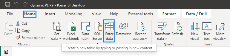
In order to identify the scenario we want to display, we will first need the table that will be used in the slicer. To create a new table of content click on the Enter data icon under the Home tab
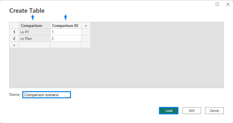
This will open a new window where you can manually fill in data or paste the data you’ve already prepared in advance. We need two columns for this purpose, the Comparison ID for a SWITCH statement and the Comparison name for the slicer selection. Don’t forget to name the table below and when you’re done click on Load to create the table.
Prepare the measures
Now we can move further and start preparing dynamic measures. First, we’ll create a very simple support measure to return the minimal value of Comparison ID, so we can use it for evaluation later on.
Selected comparison = MIN(‘Comparison scenario'[Comparison ID])
Let’s continue with the creation of the first dynamic measure called Dynamic PL – where a basic PL measure is used as a reference.
Dynamic PL = SWITCH(‘Comparison scenario'[Selected comparison],
1, BLANK(),
2, [PL])
The use of the SWITCH statement in a measure determines a calculation for every selected comparison ID. In this case, ID number 1 is a PY comparison so we don’t want to return any value for the Dynamic PL measure while ID number 2 is a PL comparison so we’re returning our base PL measure. We can apply this same logic to the Dynamic PY measure but with the difference of switching the returning calculation.
Dynamic PY = SWITCH(‘Comparison scenario'[Selected comparison],
1, [PY],
2, BLANK())
Change settings within the visuals
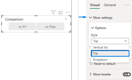
It’s time to put both measures into Zebra BI visuals and apply settings that will change their appearance. Add a Slicer visual to the dashboard and insert a Comparison field from the table we created earlier. Change the Style of a Slicer to Tile for easier navigation between comparisons.
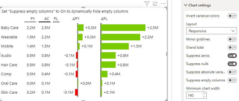
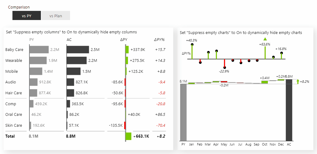
Select Zebra BI Tables and add a Category, AC measure, Dynamic PY measure and Dynamic PL measure. Since the dynamic measures were designed to return an empty value if not selected, we will get empty columns in the visual, but there is a setting called “Suppress empty columns” under the Chart settings which will exclude them from the view.
After turning this option to ON this will exclude all insignificant columns from the visual.
Next, we can also use this trick in the Zebra BI Charts visual:

We have reached the point where we can see how all this works with the dynamic selection of comparison via slicer. Initially, the PY comparison is selected and we can see Zebra BI Charts and Zebra BI Tables both display comparisons to the previous year, but as soon as we change the comparison to PL, both visuals shifted comparisons to plan even though we have both plan and previous year measures included.
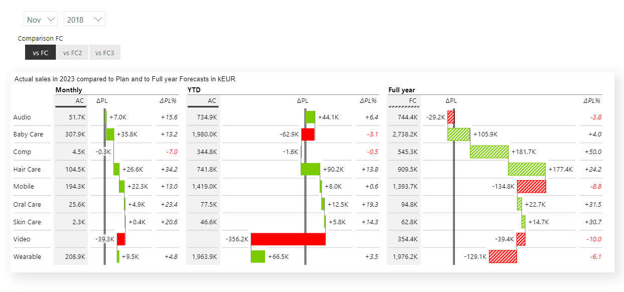
You can use this technique in many cases, for example, to shift between different versions of Forecasts.
This simple technique will make your report creation process easier, helping you avoid the need for unnecessary bookmarks and eliminating duplicated and hidden visuals.