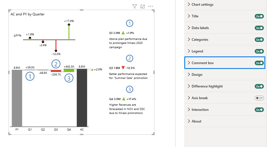
In both Power BI and Zebra BI you have a few commenting solutions available, but this is so far the most advanced one. It’s also completely integrated and dynamic. These comments generate the title automatically out of the category names, specific data points, and in the case of comparisons in your chart, the difference between measures is calculated automatically, too. These comments will change with filters and respond to resizing.
See how to add smart comments to your visual!
How to add integrated dynamic comments to your visual?
1. To comment on a chart, add a data field called Comment to your visual by placing it into the Comments placeholder.

Now you’re able to see two markers that mark the presence of the comments on specific data points. The users can hover with their mouse over the comment marker, and they will see the text of the comment in the tooltip.

2. Navigate under the Settings to the Comment Box and simply turn it on. What you have now is a new element on the visual that displays the comments.

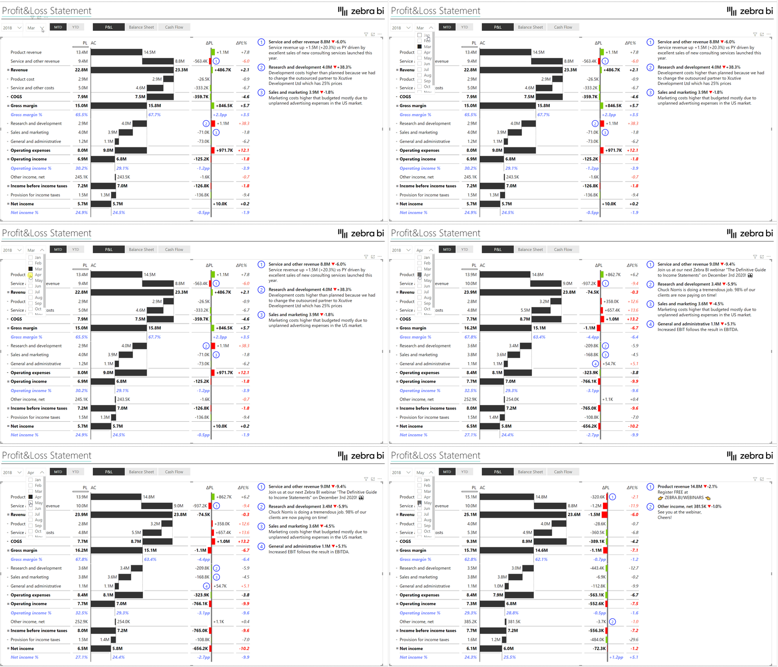
Example: Integrated Dynamic Comments in the Tables visual
This time we’re using the Zebra BI Tables visual.
The comments are completely dynamic: by switching the period from March and April to May, the comments on the right hand-side change according to the chosen month.

This feature was a part of the Zebra BI for Power BI 5.0 release. It works perfectly with the Zebra BI Tables, Zebra BI Charts, and Zebra BI Cards visuals.