A chart is a graphical representation of data with the use of bars, lines, dots, colors, shapes, symbols, etc. There are also different chart elements and features that can make visuals more organized, understandable, and presentable thus increasing the business value and benefits of the charts. In this article, we will present the most common chart elements.
Chart title
Let’s start with a Chart title. Oftentimes, chart titles are the first thing that users read when interacting with a report or a chart, just so that they get a basic understanding of what is being presented. Zebra BI Charts visual supports dynamic titles, meaning it can reference other fields to bring context into the visual. If you want to explore your options and start building reports with Zebra BI visuals immediately, you are welcome to try them in the free trial.
To add a filter context, navigate to Visualizations pane and scroll down to the last bucket called “Filters”, where you can insert a field or a measure.

The field or measure you’ve inserted will return a particular value in a title when a filter will affect the visual.

When you’ve inserted fields or measures in the “Filters” bucket, you can navigate to the title and start with the adjustments. You can begin to type the field/measure name, and the visual will immediately recognize and suggest the names that were placed in the bucket.

Learn more about the feature by following this link.
The title settings can be changed directly on the visual itself. Simply click on the dropdown next to the title, adjust the content, and specify the font style, size, and color.

Additionally, the chart title can also be turned off under the settings.

Categories
Categories can be formatted directly within the visual by hovering over the category row. A blue border will appear around the section when hovered over, indicating it is clickable.

Formatting options will be displayed, allowing you to customize the font, adjust color and size, modify item density for improved user experience and clarity, or define an alternative presentation for long labels.

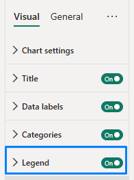
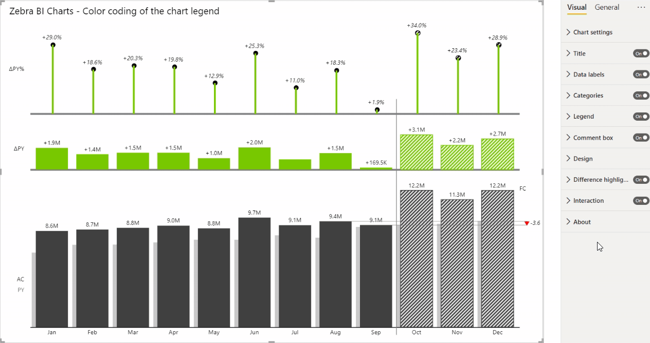
Legend
The chart legend is an important chart element for a better understanding of which measures are being displayed. Zebra BI uses an intuitive approach for displaying legends in charts and by default displays the scenario on the left, next to data series, therefore making reading more seamless and fluent. In small multiples, the legend is not multiplied in order to avoid pointless data duplications.

Legend can be toggled off by clicking the slide button under settings.
There is also a posibility to change the legend entry to the same color as the lines or columns, depending on the chart type. How to do that:
- Go under Visual > Design and choose Custom.
- Toggle on the option to use More colors.
- Apply the custom colors for Previous Year, Forecast, or Plan.
- Go under Visual > Legend and toggle on the “Use colored legend names” feature.
Users can rename the legend entry directly on the visual, to ensure a more seamless user experience and make reports even more interactive.
Hovering over a legend’s name reveals a dropdown icon. Click the icon to access the option to rename the field.
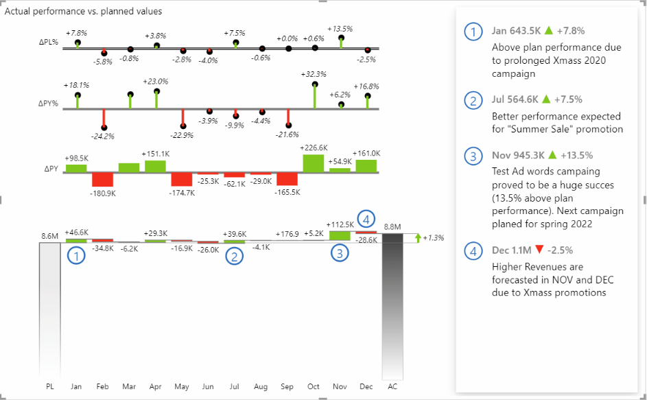
Chart design layout
Zebra BI enables you to switch between different predefined visualizations styles (Zebra, Zebra Light, dr. Hichert, etc.) in the Design section. Additionally, you can create your own custom style adjusted to your company colors for example. If this topic is of interest to you, make sure to learn more about custom branding.

Hide a chart type in view mode
To improve the end-user experience and reduce confusion, you can hide specific chart types from view mode in Power BI. This helps viewers stay focused on the main chart that was intended to be highlighted when the report was created.
While in Edit mode (either in Power BI Desktop or Power BI Service):
- Go to the top-right corner of the visual you want to hide.
- Click the “Eye” icon to hide it.

Note: Hiding a chart this way only affects the View mode in Power BI Service. The chart will still be visible when editing the report in Power BI Desktop or Power BI Service.
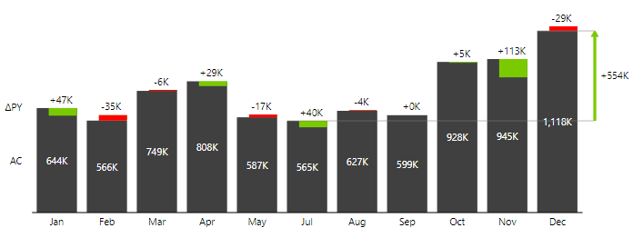
Difference highlight
Highlighting deviations is one of the most essential things displayed on a chart and usually the main message for report readers, therefore Zebra BI includes difference highlight in charts by default. Additionally, the user can choose different comparison point combinations, like:
- First to last (ideal for presentation of YTD results like growth/decline since the start of the year),
- Penultimate to last (to point out short-term result of new campaign/product/discount, etc.),
- Last to the corresponding (Actual vs. Plan, Actual vs. Previous year, etc.),
- Min to Max (comparing best to worst, lowest to the highest, etc.).
Along with Line width and Arrow style settings, charts can now be designed to really focus on deviations that require business actions to be taken.

Additionally, you can enable multiple difference highlight within a single measure waterfall chart.

Grand total column in a chart
Besides difference highlight, you can also use the Grand Total feature that can be very useful for displaying the top-level results, like Total year Revenues or Total year Sales. Sometimes this important message can be lost, therefore the additional Total column is being displayed, which uses different scaling to not mess up the proportions of your chart. In combination with difference highlights, two very important messages can be displayed simultaneously.

Data labels
Another very important chart element is data labels. They can be used for describing Y and X-axis elements, values, deviations, etc. By default, Zebra BI uses a clean and easy-to-read labeling approach that enhances your charts straight away. Have a look at how you can switch between absolute and relative variance deviations within a chart with a click of a mouse.
Additionally, a lot of powerful custom settings for labels can be applied to your charts. Find out more about controlling data labels and number formats. →
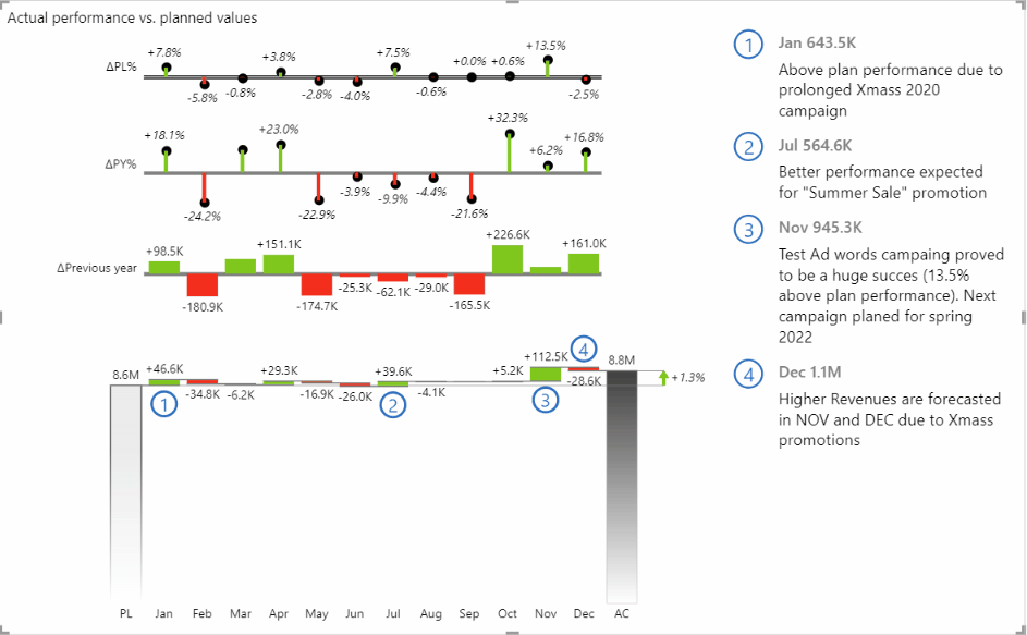
Integrated dynamic comments
One of the most powerful features of Zebra BI visuals is the integrated dynamic comments. They provide additional context behind the number and answer the question ‘WHY’.
With the 6.2 release of Zebra BI Charts visual, users can now adjust the comment box directly on the visual as a part of providing a more app-like and seamless user experience with interactive reports.
When the comment box is turned on and you add a comment, you can now hover over the top-left corner of the comment box and you will see a Settings icon. Click on it and feel free to adjust:
- the information in the comment title (only title, title & value, or title, value, and variance),
- the display of the variance (relative, absolute, or both),
- the variance icon,
- the padding between the comments,
- the gap between the comments,
- and apply shadow if needed.
We assume you are already a Zebra BI for Power BI user. If not, feel free to start a free trial.