We’ll guide you through the process of three different ways of presenting the data with the Zebra BI Cards visual. This is the first article in a series Preparing for Zebra BI Cards visual. Here you will get help on creating a basic single card visual.
Preparing data article series
- Single card
- Basic Card with a single Excel table
- Power Query (more advanced)
- DAX/Switch (the most flexible)
Watch how to create a basic KPI card
Let’s get started.
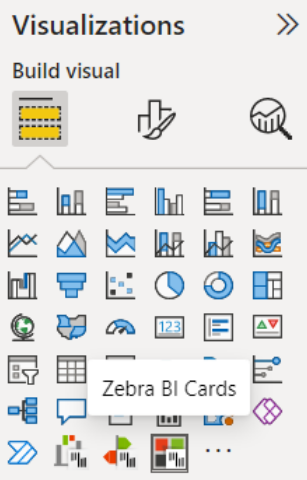
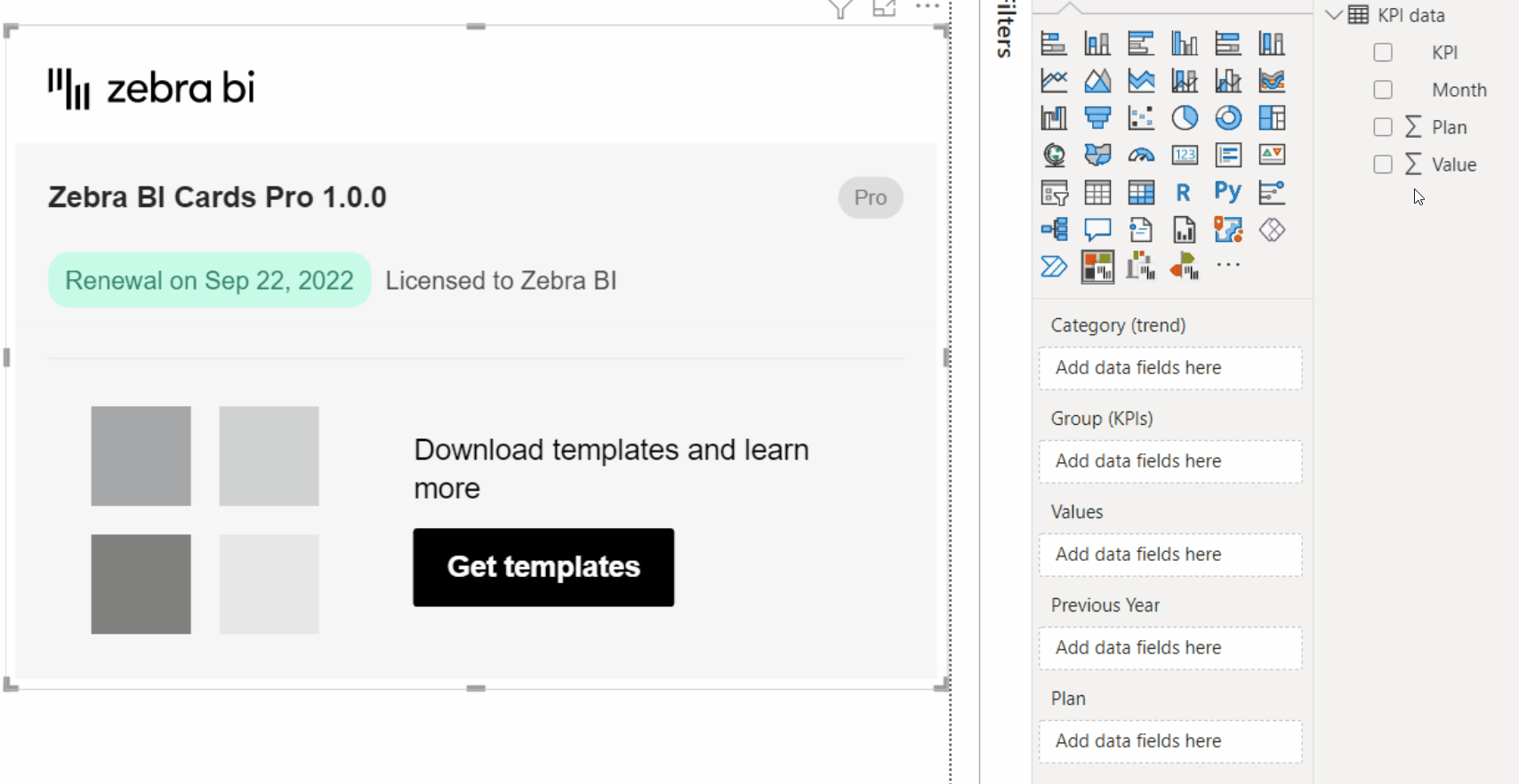
Step 1: Locate your Zebra BI Cards visual in the Power BI visualizations pane and add it to the report.
Step 2: Drag and drop the Values measure into the Values placeholder – a single card will show up with the value shown in the middle.
Step 3: Continue building the visual by placing any of the comparison measures (in our case the Plan measure) in the corresponding placeholder – now you will see the variance in numerical and chart form.
Step 4: Finish building a comprehensive single card by placing one of the dimensions (in our case Month) in the Category (trend) placeholder, adding the time component to the visual.
Now that you have a single card, learn how to add multiple KPI cards in one of the three ways:
- with a single Excel table,
- using a slightly more advanced way with Power Query,
- or the most powerful option using DAX with SWITCH statement.
You can also familiarize yourself with the rest of the functionalities in an overview of all Zebra BI Cards features. →