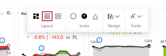
Zebra BI Cards for Power BI is the only custom visual on the market that lets you seamlessly switch between three different layouts when visualizing KPIs.
You can choose between a row, custom, or uniform layout with just one simple click. See below.
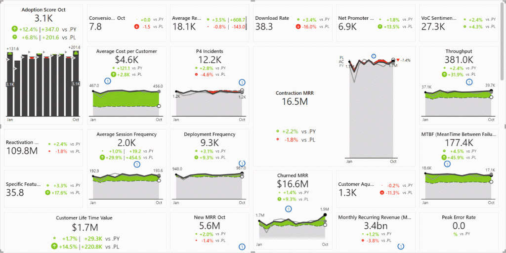
Custom layout
The custom layout lets you adjust the size of each card manually. This way, you can emphasize those KPIs that are more important by making their cards bigger and adjusting the size of the less important ones.
By changing the size of the cards, the amount of information will adapt automatically. Even with the smallest cards, you will still see all the needed information to know how a certain KPI is performing.
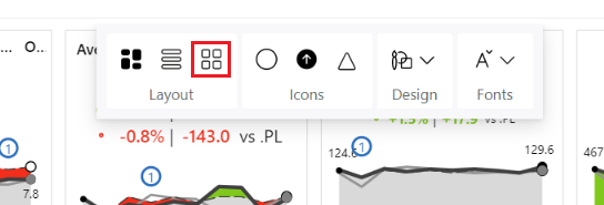
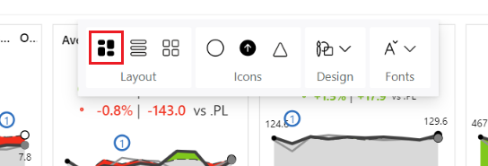
To access the custom layout simply go to the global toolbar on the top of the visual and under Layout choose the first option.
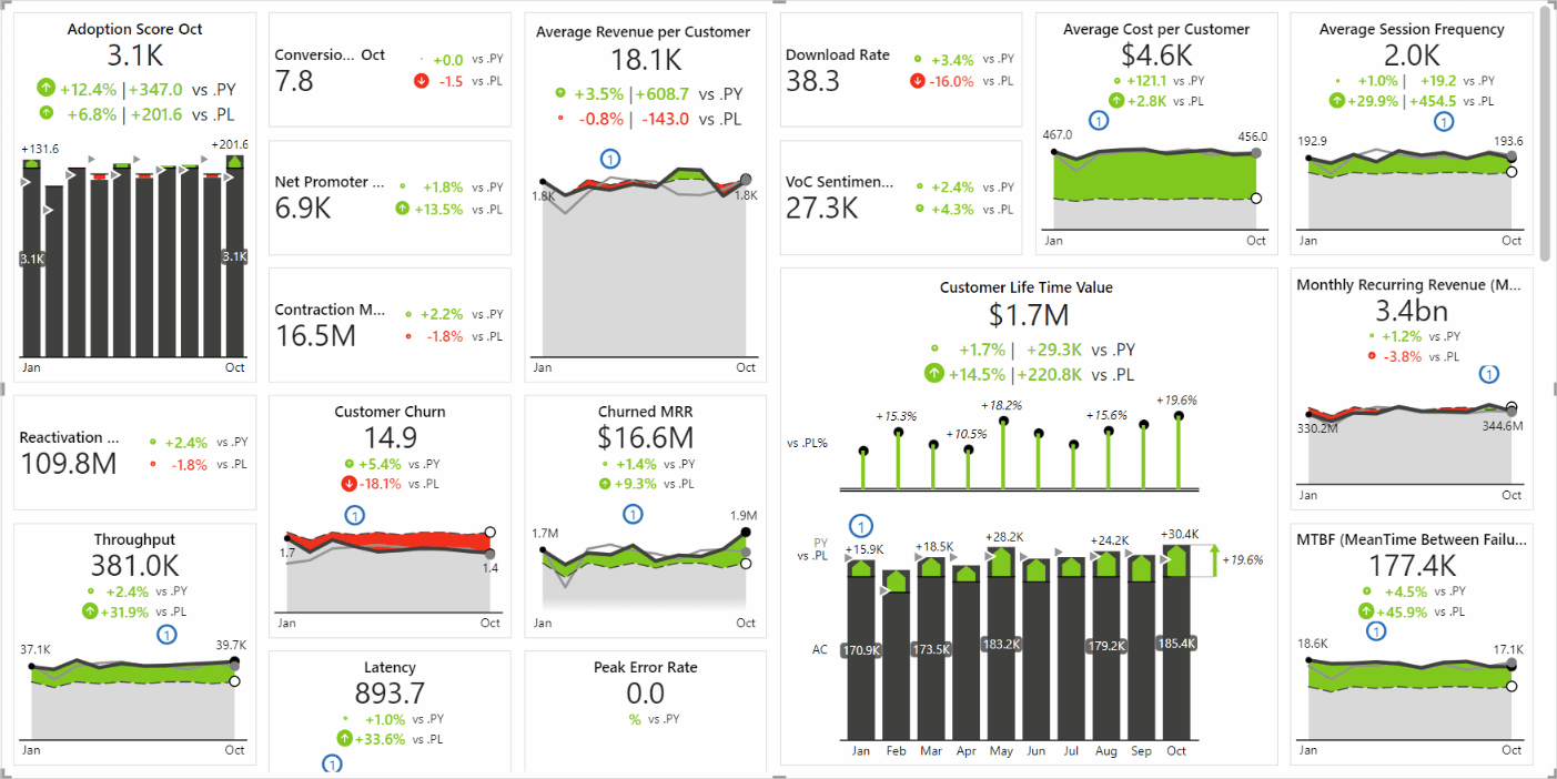
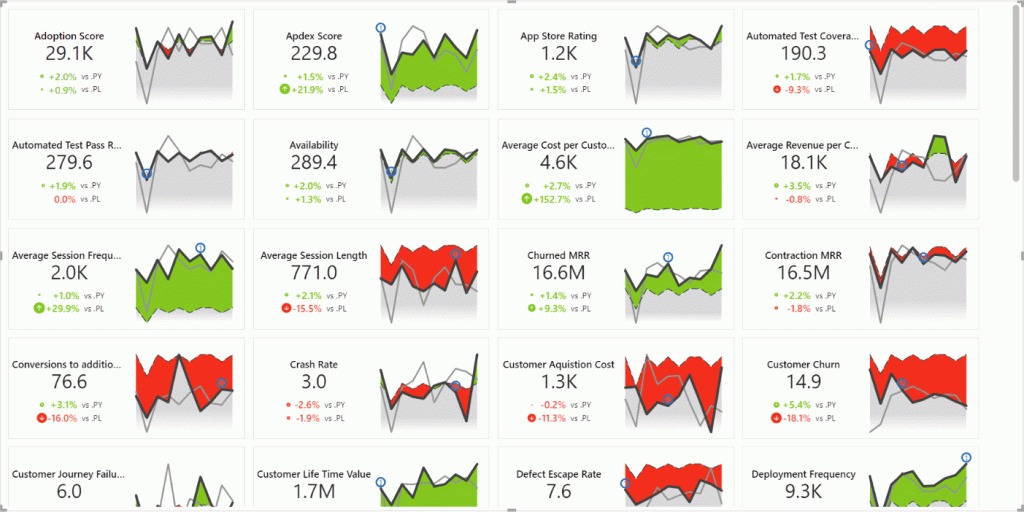
Row layout
The second layout you can choose to visualize your KPIs is the row layout. Even with this layout, you will still know at a glance whether your KPIs are performing well or badly, how good/bad, and what to do about them.
Each card will display variances for up to 3 comparisons, the performance will be visualized with sparkling charts, additional context can be provided with dynamic comments, and the visualization follows the IBCS rules.
To access the row layout, simply go to the global toolbar on the top of the visual and under Layout choose the second option.
Uniform layout
The third layout was added to Zebra BI Cards with the 1.3 update in September 2022. With this option, you can display all cards in the same size.
To make the cards bigger or smaller, simply drag one card at the bottom right corner and the rest will adapt to the change. When you will be adjusting the size, you will see a tooltip indicating the dimensions of the cards.
To apply this layout, go to the global toolbar on the top of the visual, and under Layout choose the third option.