The Zebra BI Tables visual lets you add hierarchies or groups to both axes of the visual. This provides even more insights as you can drill into more details and easily find the data which is most appropriate for you.
In this article, we will configure a visual so it looks like the one below where you have different Business Divisions, Units, or Products in the rows, including a hierarchy that allows you to drill down into the details. And to be able to also analyze this over time, we will add a time hierarchy with months and quarters to the columns. If you’re not yet a Zebra BI for Power BI user, you’ll have the best experience by starting a free trial.
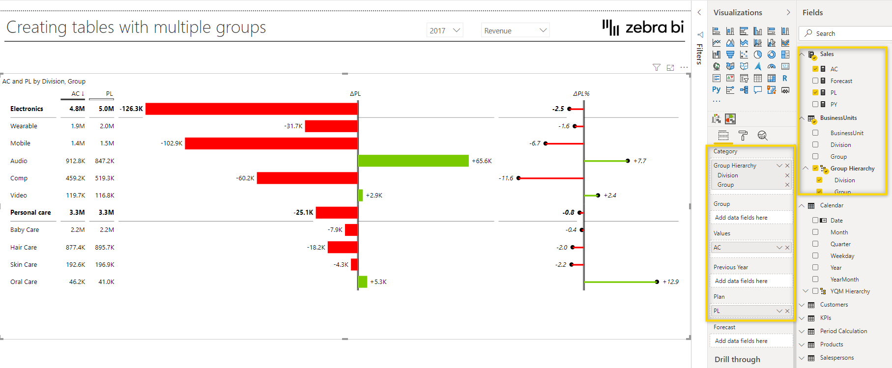
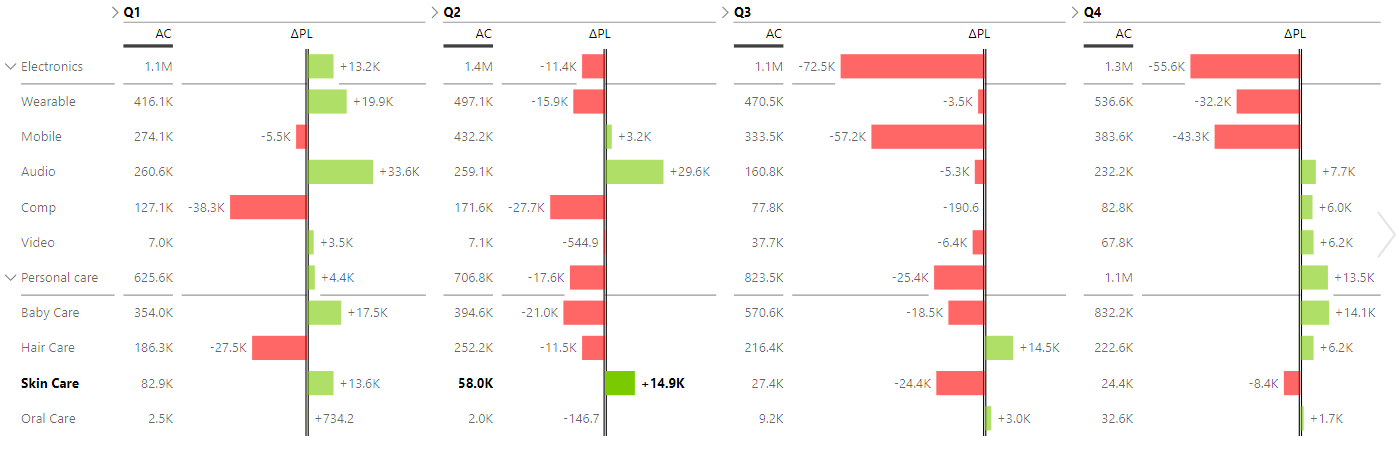
First of all, we add the Zebra BI Tables visual to the report and add the Group Hierarchy from the Business Units table to the Category placeholder. Also, we add the AC measure to the Values placeholder and PL to the Plan placeholder. If you need help, learn how to create a hierarchy in Power BI. As you can see, now you already have a drill-down functionality in the rows which means you can collapse or expand the groups to see more or fewer details.
Now let’s add the quarter and month fields to the Group placeholder. Of course, you could also create a new hierarchy and just add the hierarchy but you can also just add the individual fields. It’s important that the order of elements in the placeholder is correct. In this case, the quarter needs to be on top, followed by the month. Now you can also expand and collapse the Quarter/month hierarchy group in the columns.
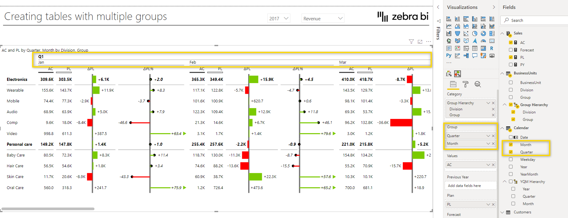
To use the expand/collapse functionality, just click on the little arrow in the column header.
The main functionality has now been set up, but let’s look at some more tips and tricks which you can use to better style the visual and make it more user-friendly. One thing you can do is to hide columns that are not important and change the chart type.
See how to hide columns and learn how to change the chart style of each column. →
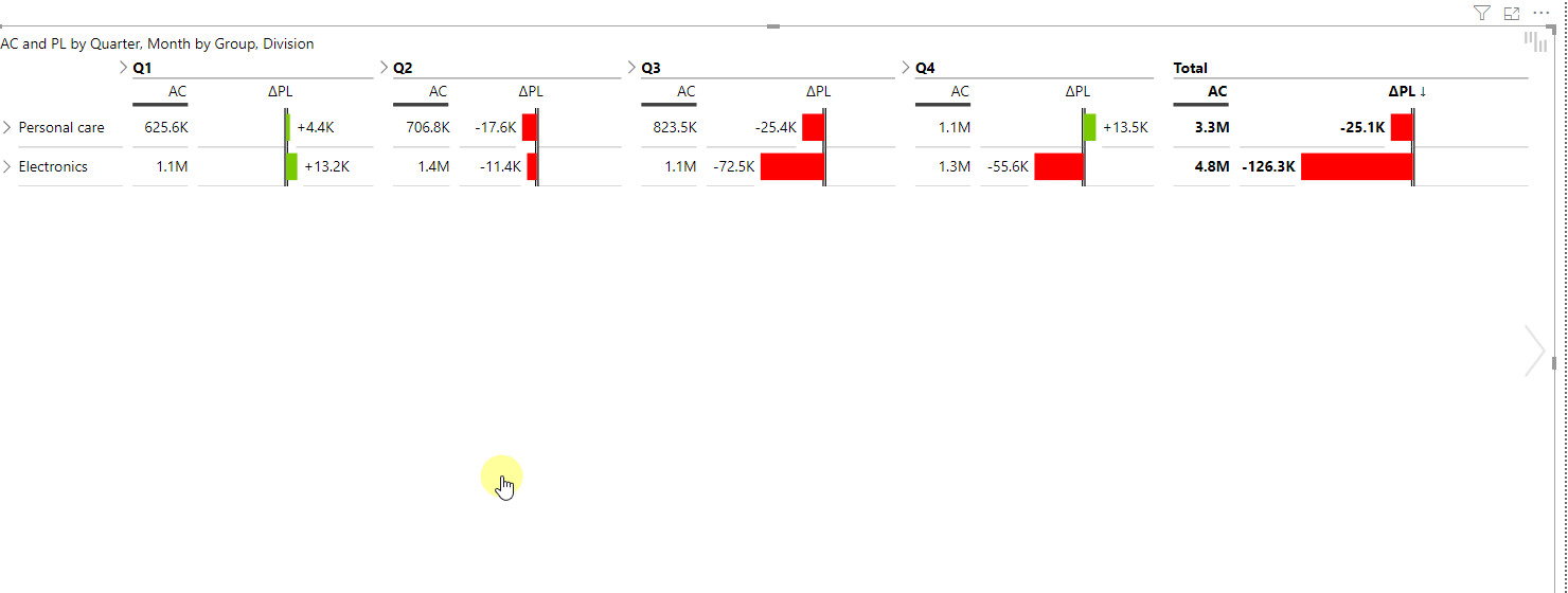
With some of the columns hidden, the report now looks like this.
What’s missing is the grand total, showing the result of the full year. To add the total for the year, click on the plus (+) symbol, which appears when you hover with your mouse in the top left corner of the visual, and select Show grand total.
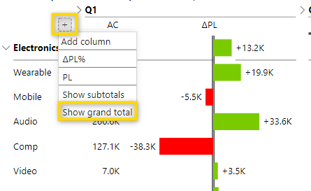
The name of the newly added group is Total but this can be changed by selecting the arrow next to it and just replacing the name Total which is the desired description. Let’s rename it to Year.
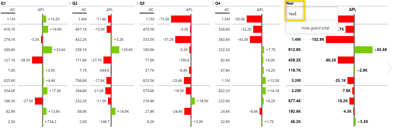
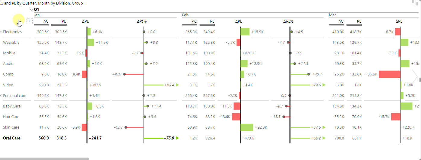
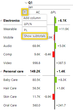
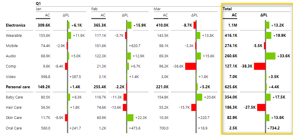
Now that we have a total for the year, you might also want to add subtotals for the quarters. These totals seem to be shown already in the screenshot above. However, you can only see them when the quarters are collapsed. Once they are expanded and you see the months, then there’s no more total for the months as you can see in the screenshot below where there’s no total for Q1.
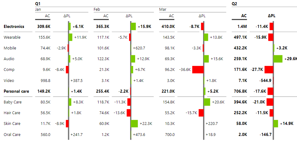
To add subtotals, just hover over the plus (+) symbol in the top left corner of the visual and select subtotals.
After that, you see the totals of quarters, even when they are expanded.
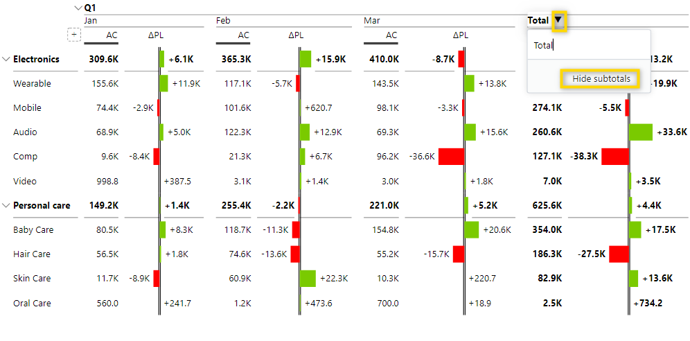
To hide a total or a subtotal column, just click on the arrow in the header and select the hide option.
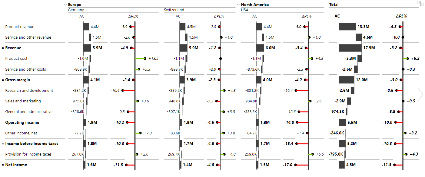
Of course, there are tons of other great ways of how multiple groups can be used. One other great example is the one below, which can also be found in the sample file. In this report, the Income Statements of several regions are compared.
How to create a report showing a proper income statement. →
If you found this article useful and want to learn more about the Zebra BI Tables visual and how to deal with it, check out Displaying forecast with Zebra BI Tables. This article also explains some more design options you have and also how to add different views to just one visual using the chart slider.
If you’d like to explore your options and start building reports with Zebra BI visuals right away, you’re welcome to try them with a free trial.