Creating a forecast and showing it in reports can add valuable insights as the budget or plan numbers might be outdated. But sometimes, adding forecast data to a report can also be tricky because you need to decide which other scenarios you want to compare with the forecast. Find out how to do it easily in Zebra BI Tables.
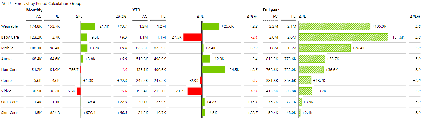
In this example, we compare monthly sales per product group to budget, and the same comparison is needed for the YTD figures. On top of that, the full-year budget is compared to the full-year forecast.
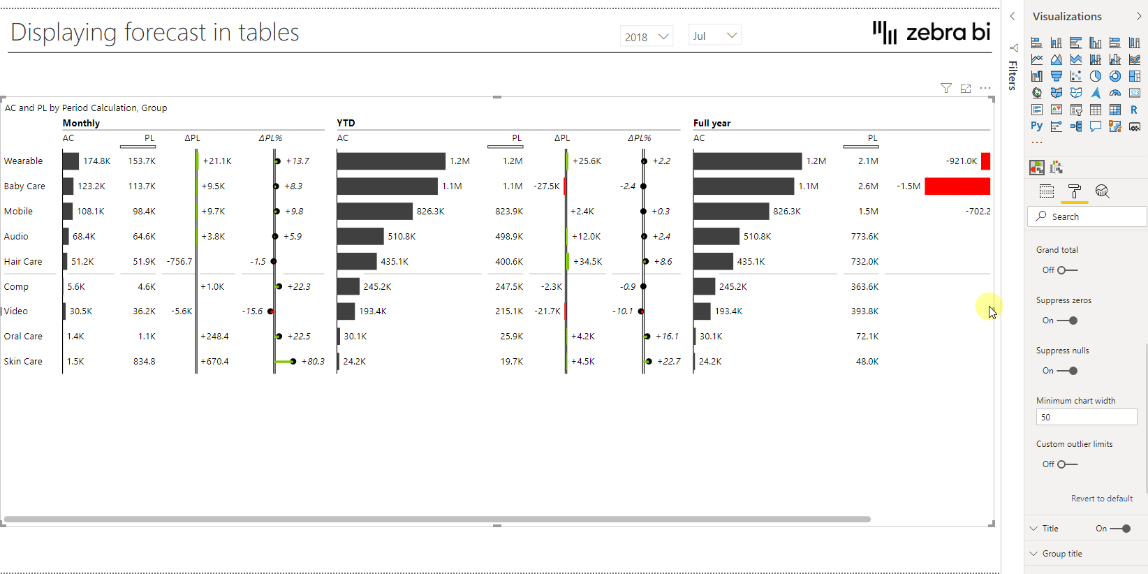
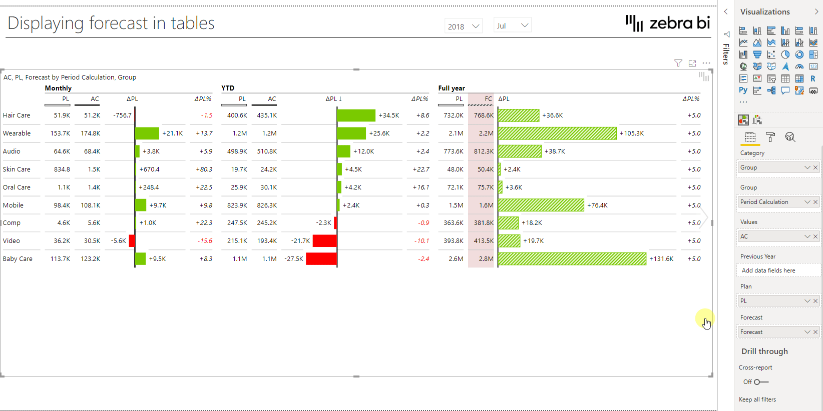
Not sure how you would do this with native Power BI visuals but with the help of the Zebra BI tables visual, you can do all this in just one visual without creating a mess. This is the view we will show as an example of the end result:
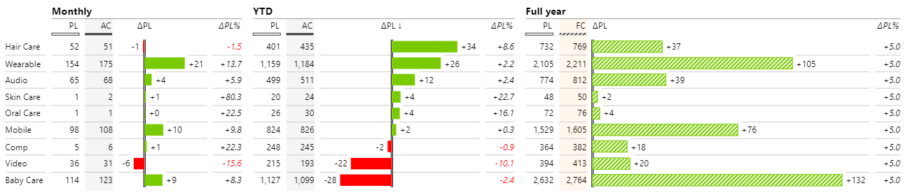
You can see that in the monthly and YTD section, AC (Actuals) is compared to PL (Plan) while in the Full-year section, FC (Forecast) is compared to PL (Plan). Because this is one single chart, all the data bars are scaled and can therefore be compared to each other.
Add Zebra BI tables visual
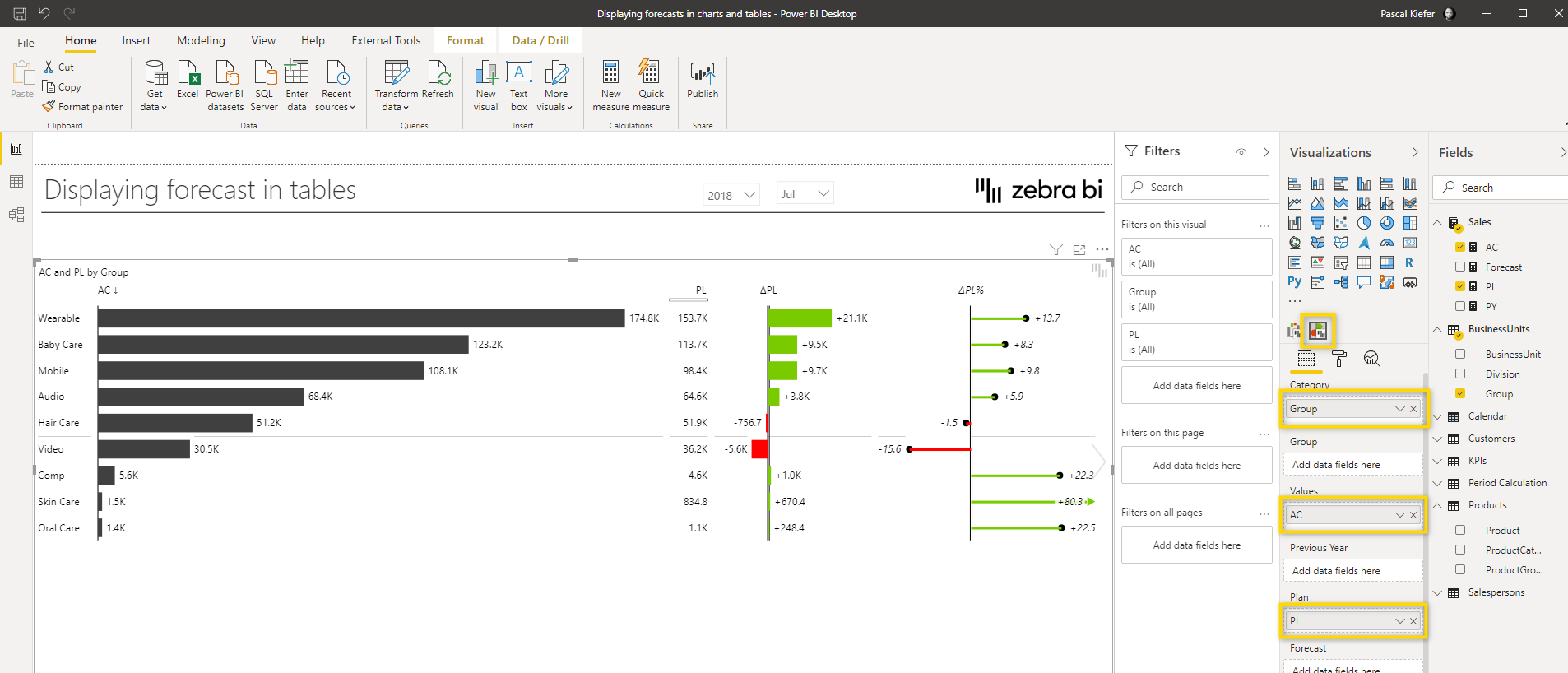
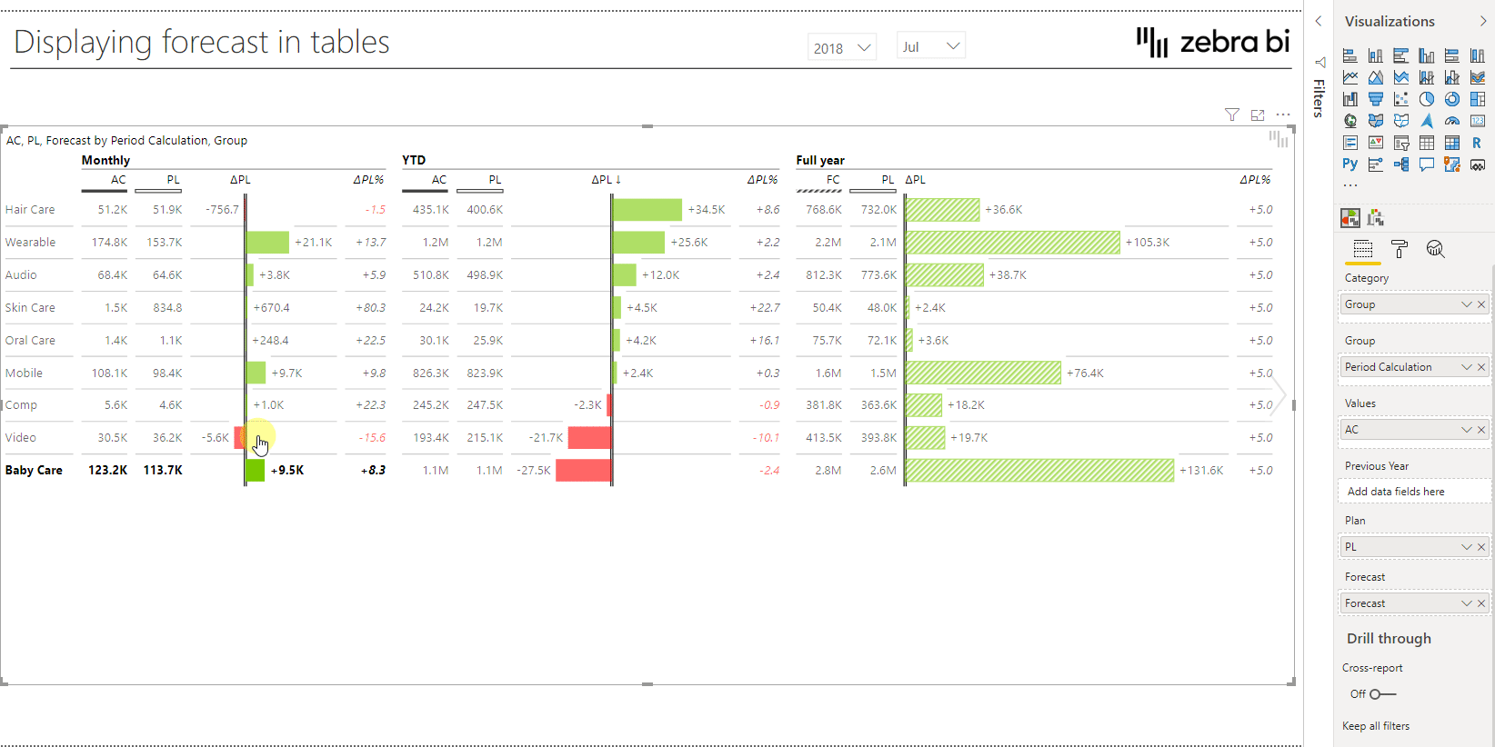
First, we insert the visual, increase the size of it, and add the following fields to the visual: The Group field from the BusinessUnits table goes into the Category placeholder. The AC measure goes to the Values placeholder and the PL measure goes into the Plan placeholder.
We have already created the measures for you in the sample report. In case you need help creating the same measures in your report, take a look at the Basic Measures explanation article.
Create the split between Monthy, YTD, and Full-year
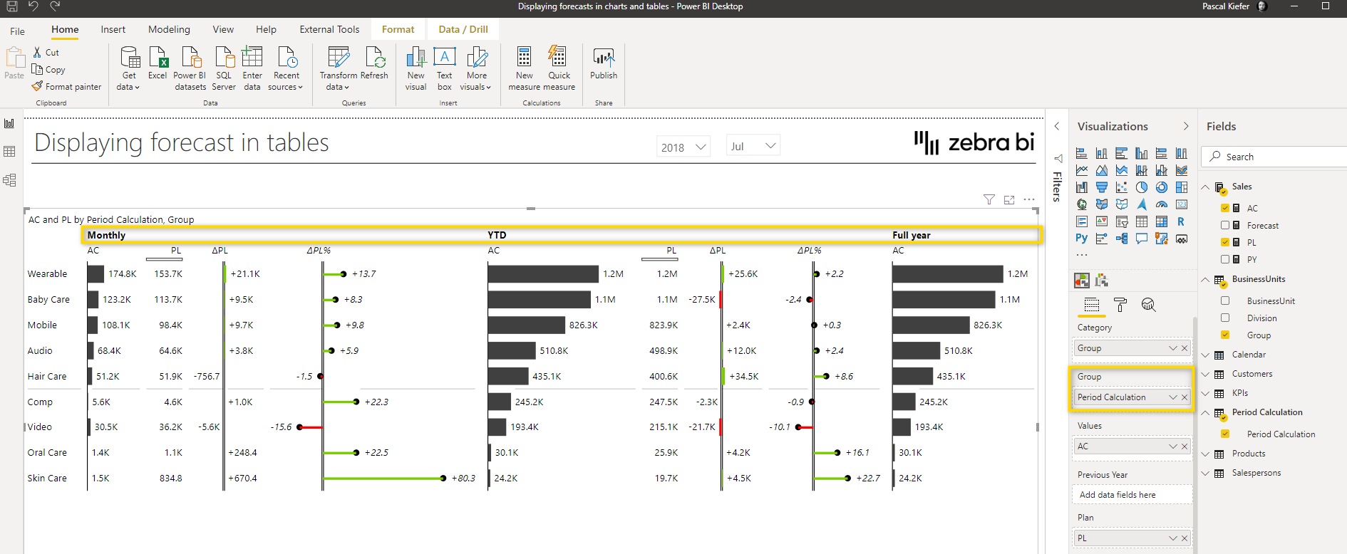
To do this, add the field Period Calculation from the Period Calculation table into the Group placeholder. You will see that once you do this, you have the visual split into 3 parts. This only happens automatically because we have prepared the measures which make this happen. If you want to learn more about the SWITCH functionality, we highly recommend taking a look at the article about Dynamic Measures.
Make the visual smaller
The visual is now taking up more space than necessary. One way to reduce the size of the individual columns is by changing the Minimum chart width setting located in the chart settings.
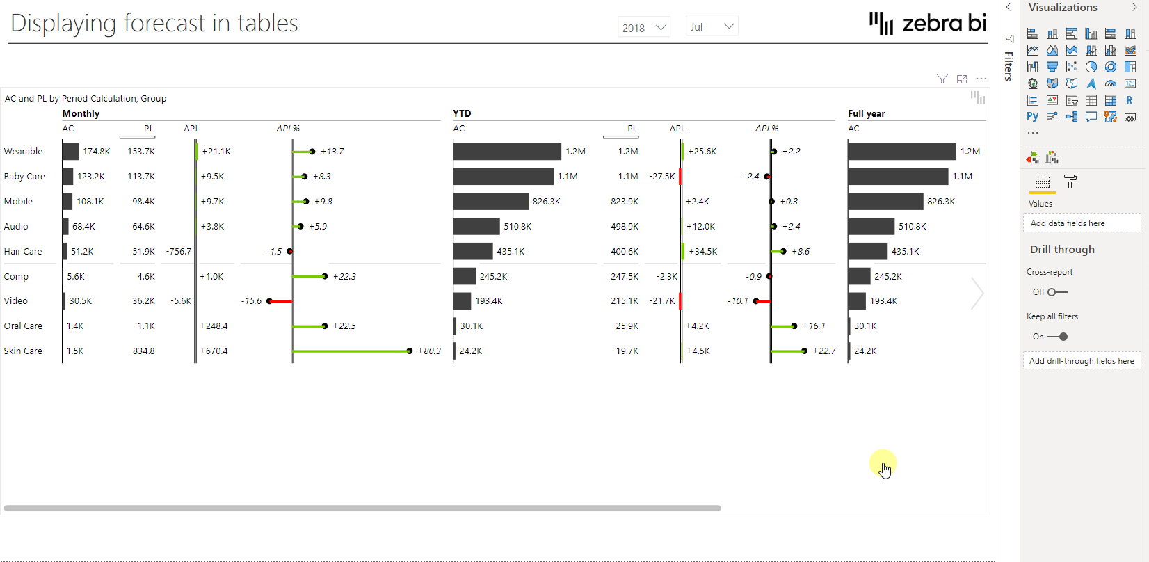
The visual now still takes up a lot of space. Luckily, we can use the chart slider to switch to a completely different view which shows all columns in table format and therefore uses much less space.
Add the forecast
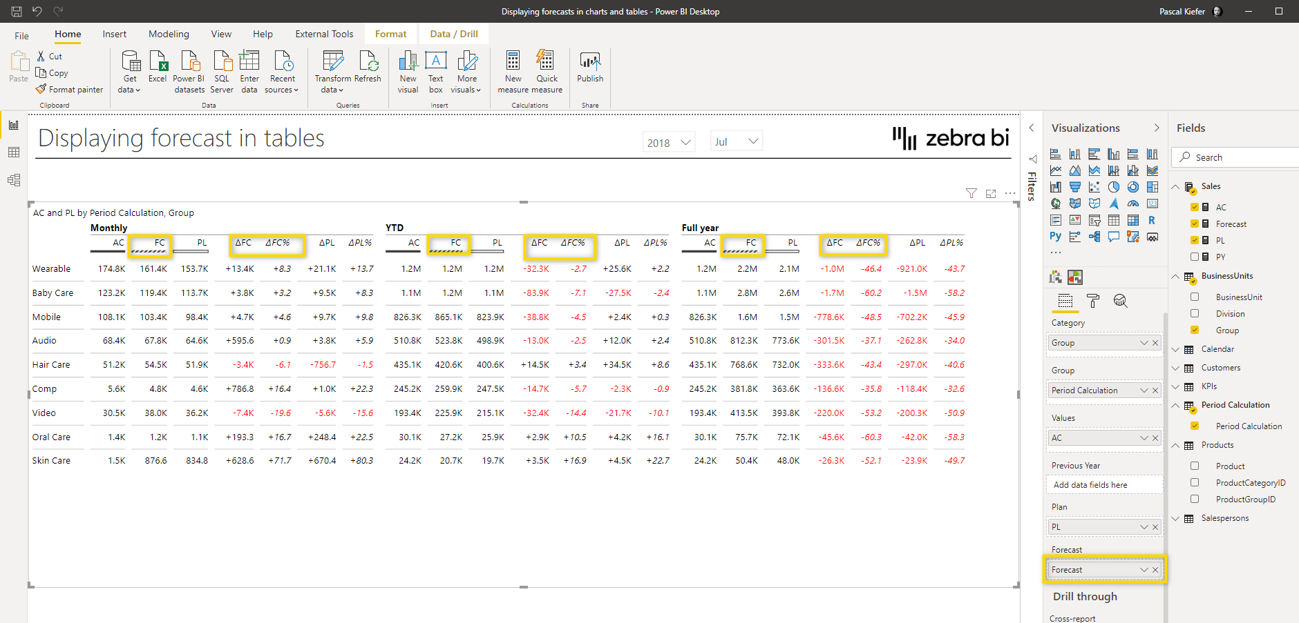
Once you move over to the other view, you cand use the chart slider to change to the table view and add the Forecast measure to the forecast placeholder. This will add many more columns to the visual.
Hide some of the columns
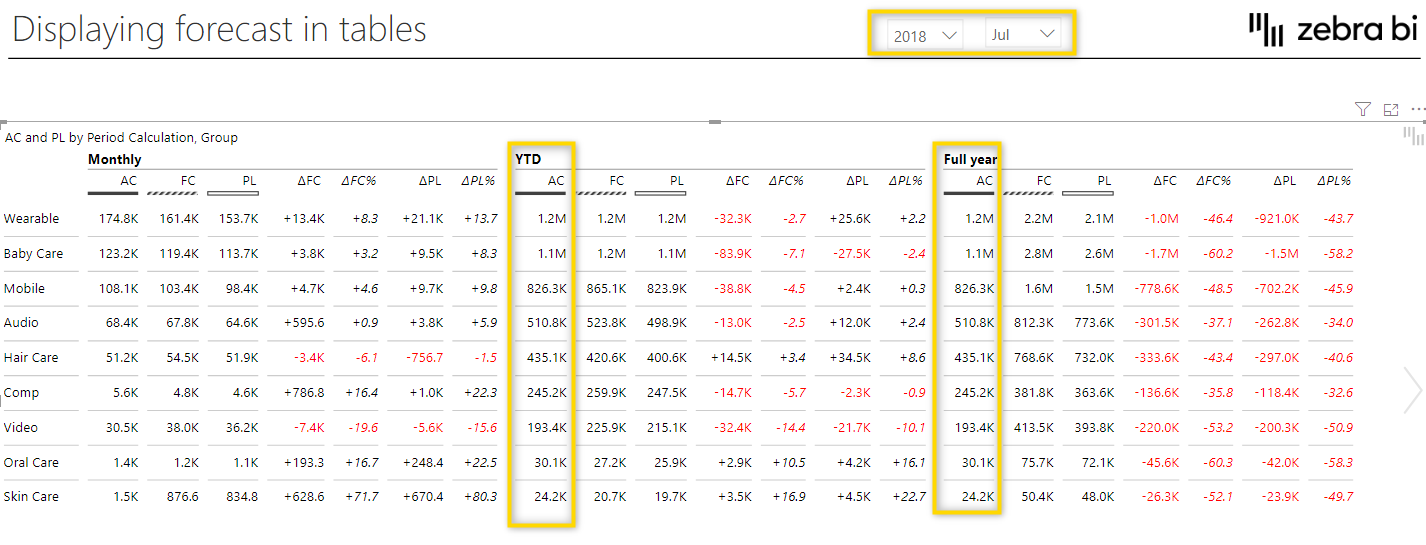
Now that the FC is added to the visual, some columns become unnecessary or simply don’t make sense due to the data we have. As you can see in the slicer on the top of the report page, we have currently selected July 2018, because this is the last month that contains actuals. This is also why AC data in YTD and Full-year is identical. There simply aren’t any actuals for the months August – December yet and that’s also why the variance between AC and PL doesn’t make sense for the Full-year section. So the AC to PL comparison for Full-year definitely needs to be removed.
To hide a column, select the arrow symbol in the header and navigate to the Hide column. There you have two options. You can either hide a column from one specific group or from all groups. Because we want to still see the AC to PL variance in the Monthly and YTD, view, we only hide it from the Full-year group.
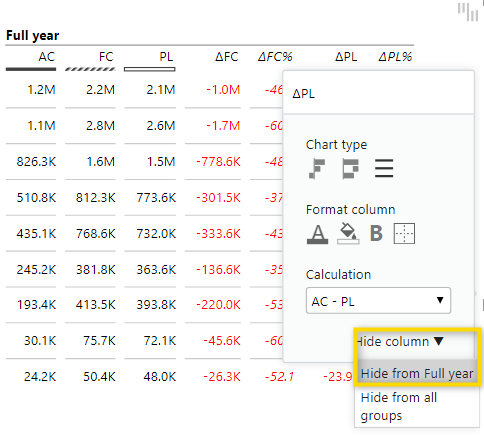
Now that ΔPL is removed, we can do the same for ΔPL%.
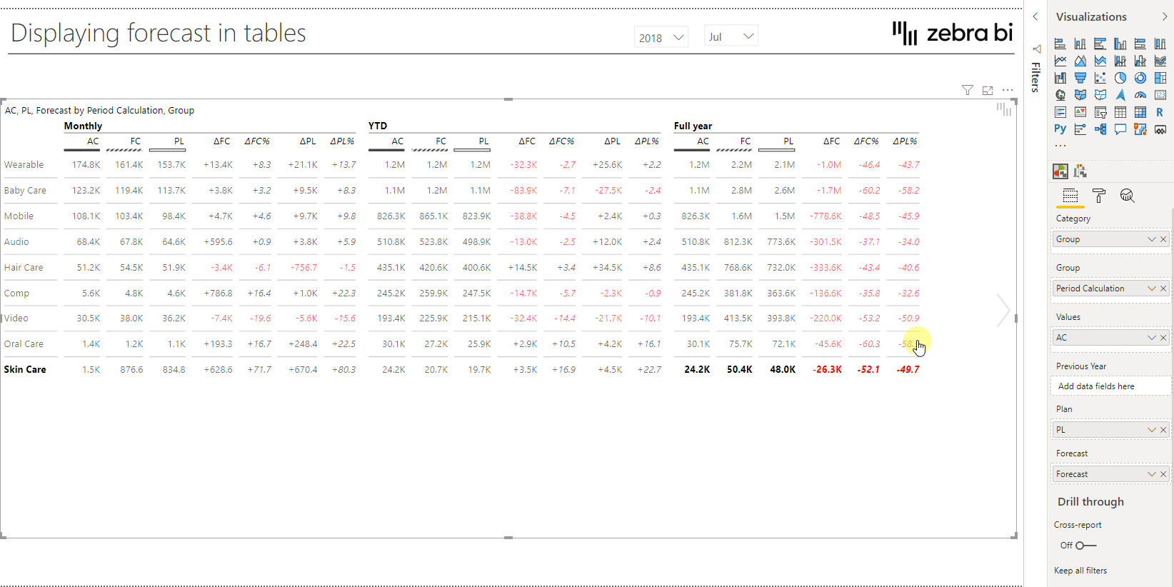
When we look at what we see now and what we want to achieve, there are still many columns that need to be removed to achieve the final view.
The following columns should be removed as well:
Once these columns are removed, the report looks like this:
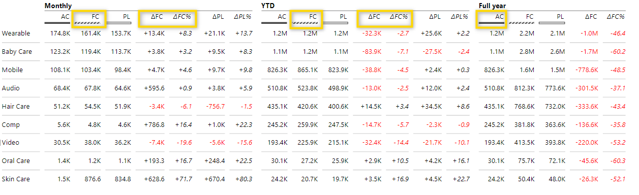
Change the chart type of each column
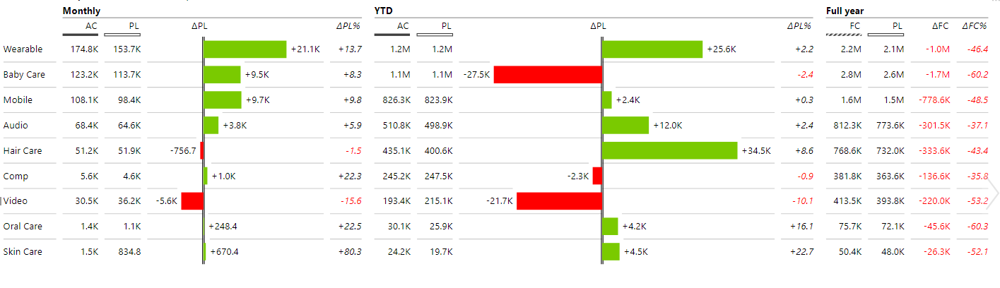
You can now change the absolute variance from the table to plus-minus by selecting the arrow next to the column header and select the new chart type.
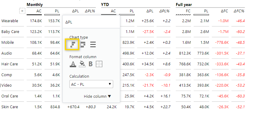
The AC – PL comparison now has a new look but as you can see from the screenshot, the FC comparison is still in table form so this also needs to be changed to a plus-minus chart.
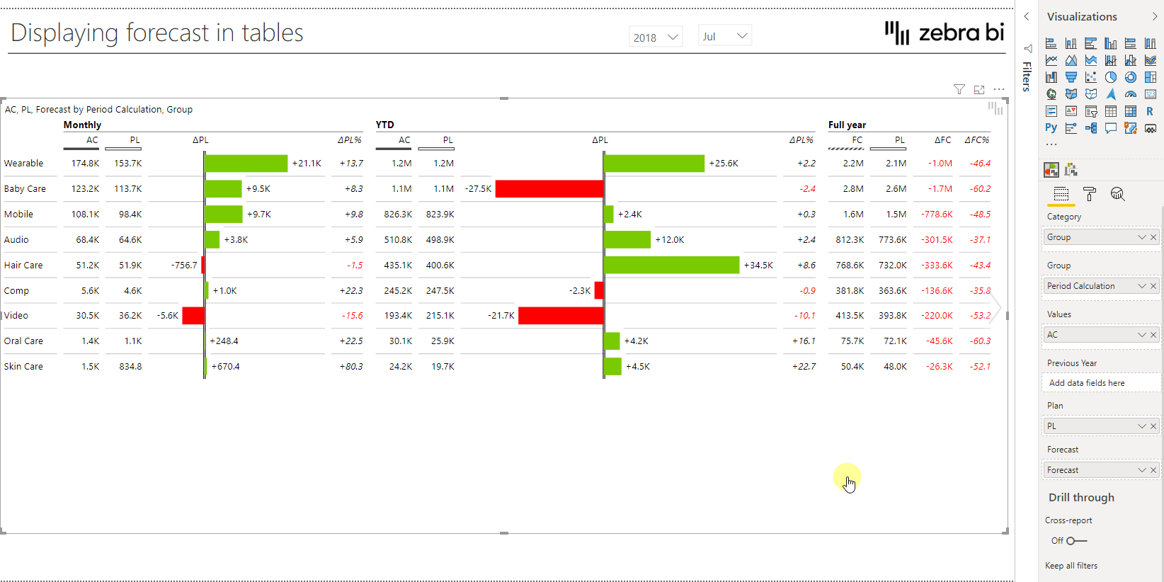
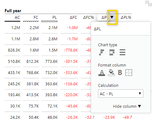
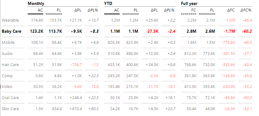
Change the calculation
After the FC variance has been changed, you will note that there are huge negative variances. The reason is that the default calculation which is used in the visual is not the one we need for this specific case. What we actually want to show is the comparison between Forecast and Plan. To change the variance calculation, click on the arrow next to the column header and change the calculation to FC – PL.
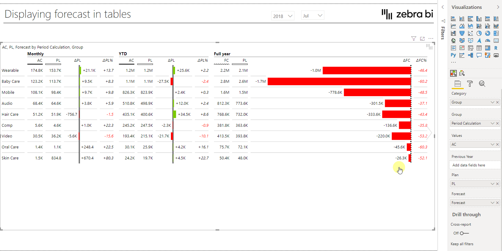
The visual now shows exactly the columns we want and the calculations are also correct.
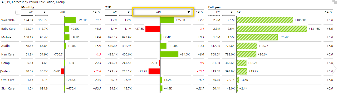
Change the sort order
Here you can change it to whatever makes the most sense for your specific report and what data you would like to highlight. In this case, let’s sort by the absolute variance between AC and PL YTD by clicking on the header of the respective column.
Rearrange the columns
With the correct sort order applied, all that is left now is some more fine-tuning. One thing we can do is to customize the order of columns by using drag and drop.
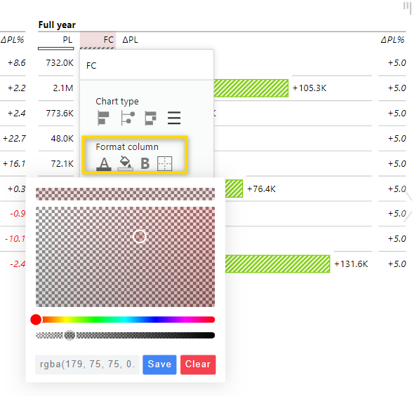
Highlight the columns
If you want to emphasize a certain data column, you can do so by changing the format. Just click on the arrow next to the column header and give the column a unique style under the Format column. With these options, you can customize your report in many different ways and determine what will stand-out the most.
Note that you can still use the chart slider to move between the two different views. With this, you could have one view showing only the most important columns and another view showing more details.
There are different ways how to show forecast data in a report and with the skills you’ve just learned in this article, you should be able to individually create and style a report showing forecast according to your needs. Find out the best way to build reports and how to add forecast data to a Zebra BI Charts visual.
With the 5.2 version of Zebra BI Tables (or higher) you can also display multiple forecasts (or plans) within one table. This will help you stay agile and always have multiple scenarios at hand. Learn more.