Field Parameters in Power BI are a powerful feature that enables users to dynamically select and toggle between different dimensions or measures within a report visualization. This feature enhances user interaction by offering a simplified way to explore data without requiring complex DAX calculations. In this guide, we’ll delve into what Field Parameters are, why they’re important, and how to effectively use them in your Power BI reports.
How to Enable Field Parameters
Before using Field Parameters, you need to enable the feature in Power BI, as it’s still in the preview:
- Navigate to Options: Go to File > Options and settings > Options
- Enable Preview Features: Under the “Preview features” section, check the “Field parameters” option and click OK
- Restart Power BI: Save your work and restart Power BI Desktop to apply the change

Creating a Fields Parameter with dimensions
Once enabled, creating a Fields Parameter is straightforward:
- Go to the Modeling Tab: In Power BI Desktop, navigate to the “Modeling” tab and select New parameter > Fields.

- Name Your Parameter: In the dialog box that appears, provide a name for your parameter. This will be the name of the new table created in your data model.

- Select Fields: Expand any table from the box on the right, select any field, and drag and drop it into the box on the left. You can reorder these fields to optimize the user experience. The hierarchical order you’ve set will also be shown in the visual when you insert the parameter.

- Create and Add Slicer: After selecting the fields, click “Create.” By default, a slicer will be added to your report canvas, and your data model will create a new table with the parameter name. If you don’t want to insert the slicer right now, unmark the “Add slicer to this page” below the field window. You can always delete/create a new slicer for the parameter.

Using Field Parameters in Visuals
To use the newly created Field Parameter in a visual:
- Add a Visual to the Canvas: Start by adding a visual, such as a Zebra BI Tables visual to your report canvas
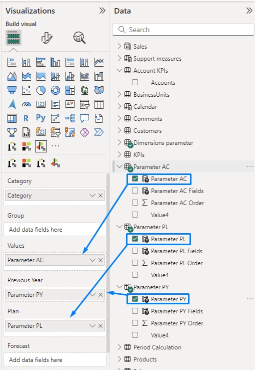
- Apply the Field Parameter: Drag the Field Parameter from your data model in a Category placeholder. This allows the visual to toggle between different fields based on user selection.

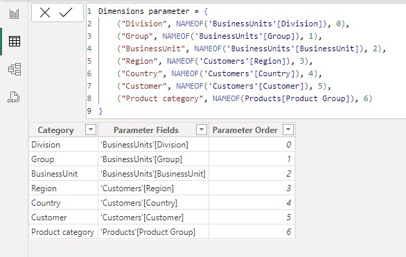
Below is what the fields parameter table and DAX behind it look like when created with the described process. The table includes three columns: the display name for the slicer, the column to be used, and the sort order. If you need to modify the parameter later, you can do that directly in DAX.

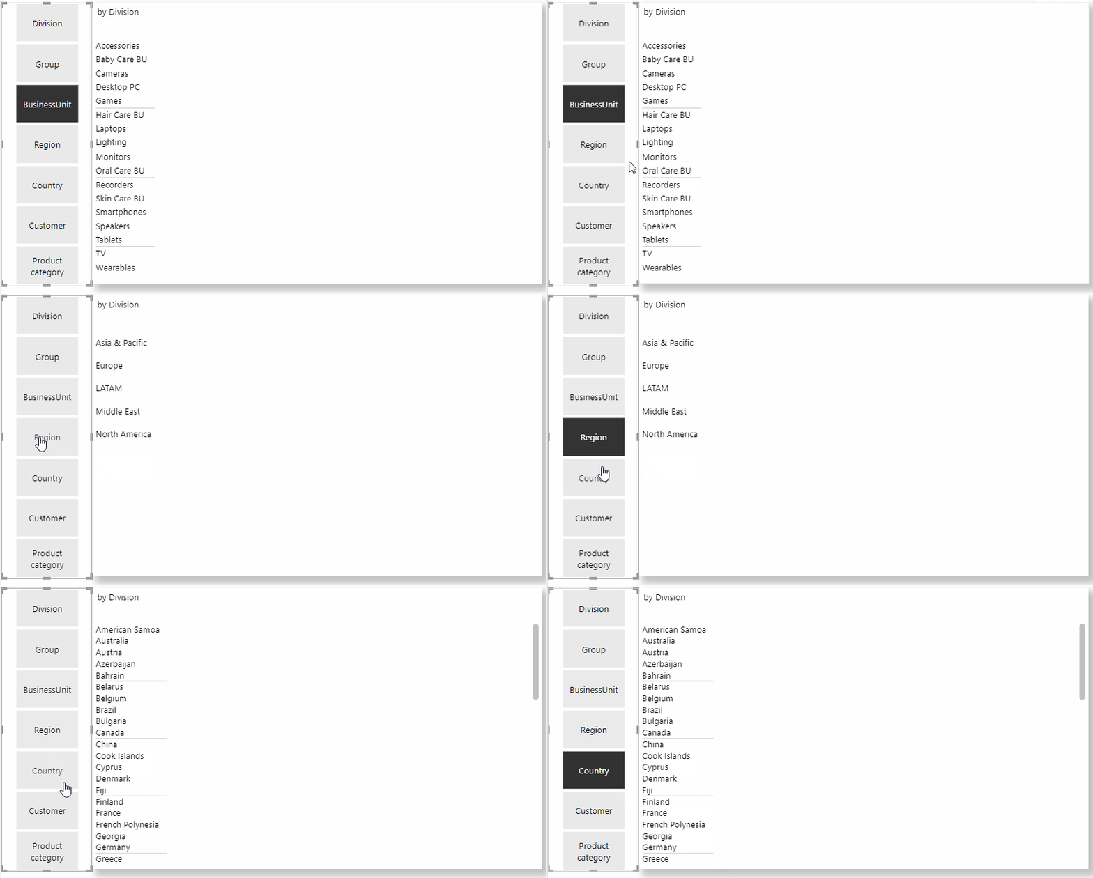
- Interact with the Slicer: Use the slicer to dynamically change the fields displayed in the visual. For example, you can switch between “BusinessUnit”, “Region” and “Country” fields.

Creating a Fields Parameter with measures
Besides dimensions, the field parameters can also be used to control measures.
We can upgrade the existing scenario by creating field parameters for measures. The process of creation doesn’t differentiate from creating a parameter with dimensions. When creating a parameter, drag and drop the measures from the table on the right into the box on the left. In our example, we’re preparing a sales dashboard showing values based on several KPIs.

Above, we demonstrated the creation of a parameter to switch between the Actual values of each KPI. Since Zebra BI Tables allows you to add comparison measures into the visual, we need to prepare a parameter for each comparison: Previous Year (or period), Plan(s), and Forecast(s).

Now, we have gained a parameter for each measure, and we can slice the KPIs by selecting a value in each slicer.

To avoid the extra work of selecting a KPI in each parameter, let’s make one additional step and simplify this for the end users. We can create a new table for KPIs to join all the parameters we created for measures.
Click on Home – Enter data – Type in header name and the KPIs in the column – Chose the table name and lastly click on Load

This table will help us connect all measure parameters and, once we’re done with the setup, will be used in a slicer.
Now, we need to Edit each parameter and Add a column, which will then be connected to the Account KPIs table. Click on the “Parameter AC” table, and we’ll modify the DAX. To add a column in a parameter, we’ll add general KPI descriptions at the end of each row after the order number.

This will add a new column named “Value4” to the existing table.

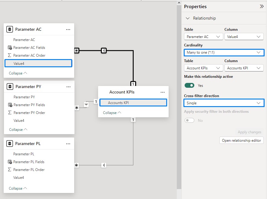
After doing this on each fields parameter we created with measures, we can now create relationships between the Account KPIs table and parameters. Connect the Account KPI field with the “Value4” column on each parameter. Make sure you select Cardinality Many-to-one from the Account KPI table toward the parameter table with a Single cross-filter direction.

Now, we can return to our report canvas and delete the original three slicers we had for parameters and replace them with an Accounts KPI field in a slicer, which will slice the KPIs in all the parameters.


Zebra BI Tables are now fully constructed using field parameters, providing a wide range of dimensions and KPI combinations within a single visual.

Hint: To get original measure names in the column headers, select the “Use measure name” option on the drop-down of the header. This way, the header will display the selected measure (KPI) in the parameter and display the KPI name on the selection.

Summary
In conclusion, Field Parameters in Power BI offer a versatile way to enhance report interactivity and user experience. By enabling users to seamlessly switch between different dimensions and measures, they empower deeper data exploration without complex calculations. Whether you’re working with dimensions or measures, Field Parameters streamline the creation of dynamic, user-friendly reports that adapt to your audience’s needs.
As you continue to explore Power BI’s features, leveraging Field Parameters will undoubtedly become a key tool in your data visualization toolkit, driving more insightful and impactful reports.