



The Conditional Variance with Neutral Color feature lets you define a tolerance range where variances are shown in a neutral color instead of positive (green) or negative (red).
This helps you reduce noise and focus attention on meaningful deviations.
Introduction
In many scenarios, small differences are expected and shouldn’t stand out.
With a neutral zone, you can:
- Highlight only material variances
- Reflect real business thresholds
- Make reports clearer and easier to interpret
Configuration
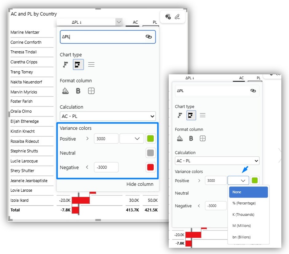
Zebra BI Tables
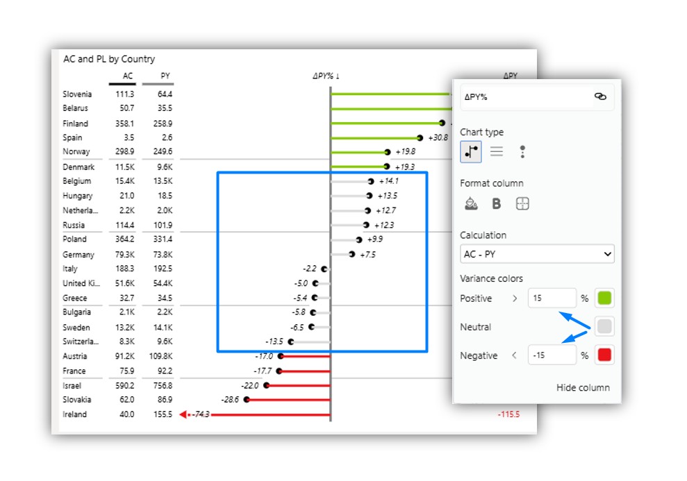
- Within the visual, open a dropdown menu by the header of any variance column.
- Set the right units (relative variance has % predefined)
- Set Lower and Upper thresholds
- Choose a Neutral variance color
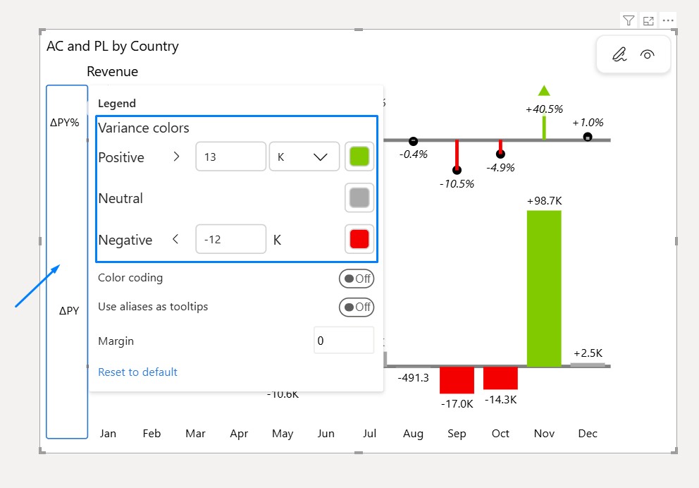
Zebra BI Charts
- Hover over the legend segment on the left side of the visual
- Click inside the blue rectangle
- Set Lower and Upper thresholds
- Choose a Neutral variance color
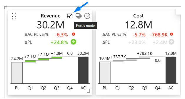
Zebra BI Cards
- Hover over a particular Card/KPI so the icons at the top left corner appear
- Click on the Focus mode icon
- Navigate to the Variance colors button in the top ribbon
- Set up thresholds and select a Neutral variance color
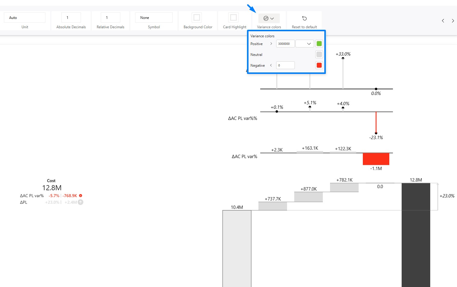
Values within the thresholds will appear neutral; those outside the thresholds will retain positive/negative colors.
Common use cases
Directional (red → neutral → green)
Use when direction matters (e.g., Revenue vs Plan):
- Small differences (e.g., ±15%) → neutral
- Larger drops → negative
- Larger gains → positive
Symmetrical (red → neutral → red)
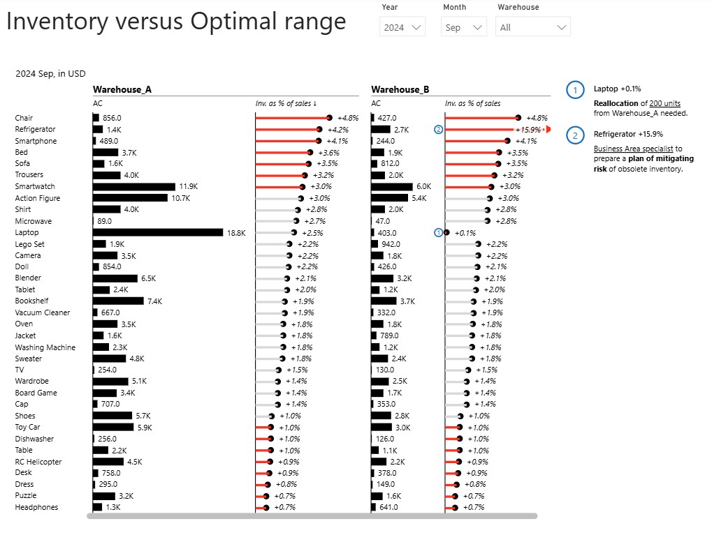
Use when staying within a range matters (e.g., Spend vs Budget):
- Inside range (e.g., 1–3%) → neutral
- Outside range → alarming
Shifting the breakpoint
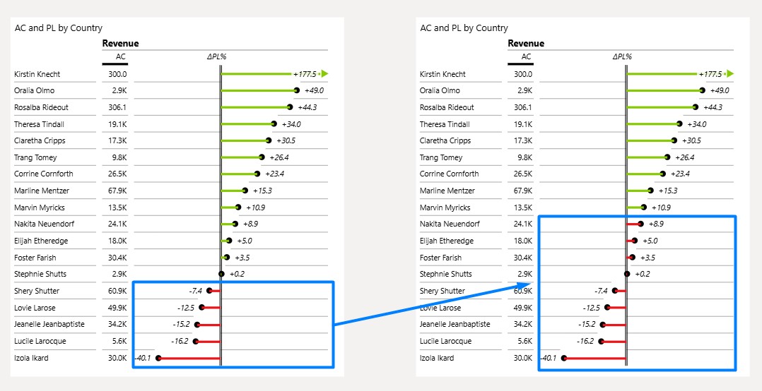
If you set both thresholds to 10%:
- Values below 10% → negative color
- Values above 10% → positive color
This effectively moves the point where colors change from 0% to 10%.
Understanding thresholds
- You can use % or absolute values
- The neutral zone is defined by lower and upper limits
- Lower threshold must be ≤ upper threshold
Default behavior
By default, thresholds are set to ±0%, meaning the feature is turned off.
What gets colored
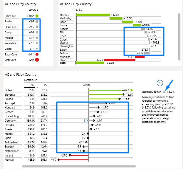
Tables
– the relative variance chart
– the absolute variance chart
– indicators of variances in the comment box
– the sized dots for variances
⚠️The configured conditional variance settings in Tables apply only to the selected column and do not affect other variance columns in the table
ℹ️Text in data labels will not be colored
Charts
– the relative variance chart
– the absolute variance chart
– indicators of variances in the comment box
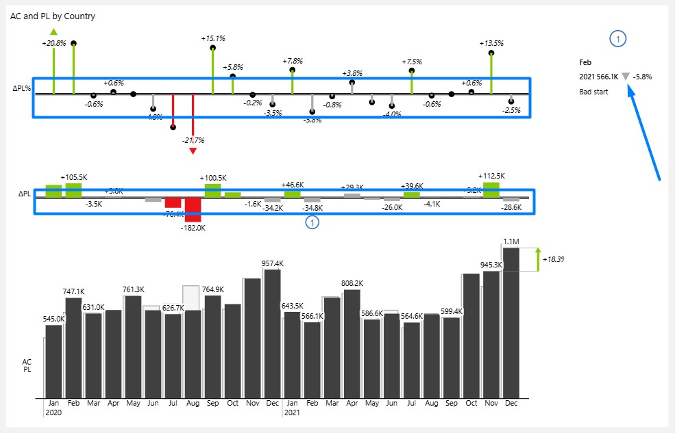
⚠️The configured conditional variance settings in Charts apply to all variances included.
Cards
– the chart part of the visual
– the number part of the visual
– thresholds get applied everywhere inside the individual KPI
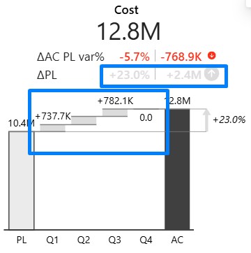
Summary
Use Conditional Variance with Neutral Color to define what “acceptable” means in your business and keep focus on what truly matters.