


Layered waterfall charts show a variance bridge with every segment on its own row. Where a Stacked waterfall chart compresses all segments into a single row to show how they combine into the total, the Layered view gives each region, product, or business unit its own line — so each segment’s story reads independently, and stays readable in static exports such as PDF and PowerPoint.
Both views come from the same setup: Stacked and Layered are two views of the same stacked waterfall chart, and you switch between them with the chart slider.
Access a layered waterfall chart
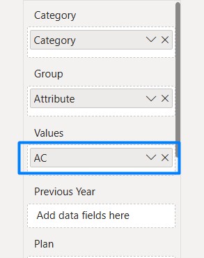
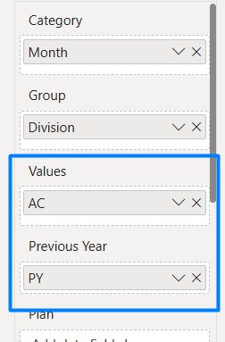
- Add a measure (or measures) to the visual.
- Fill the Category and Group fields with a dimension. Small Multiples appear — one mini-waterfall per group.
- Navigate through the Chart slider to access the waterfall chart.
- Hover over the visual and click the Stacked chart icon in the top-right chart controls. The Stacked view is shown first.
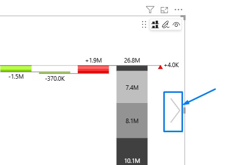
- Use the chart slider again on the right of the chart to switch from Stacked to the Layered view.
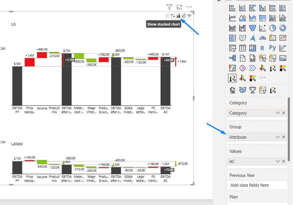
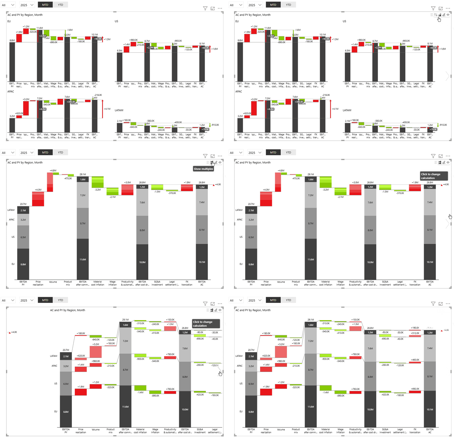
You can access a layered waterfall from a single measure (AC) or from a multiple-measure (AC, PL, PY, FC) setup.
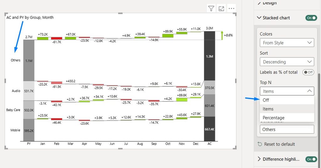
Top N + Others. Like other stacked charts, switching into stacked mode groups your segments into Top N + Others by default. You can increase or decrease the number of groups, or remove the grouping entirely.
How to read a layered waterfall chart
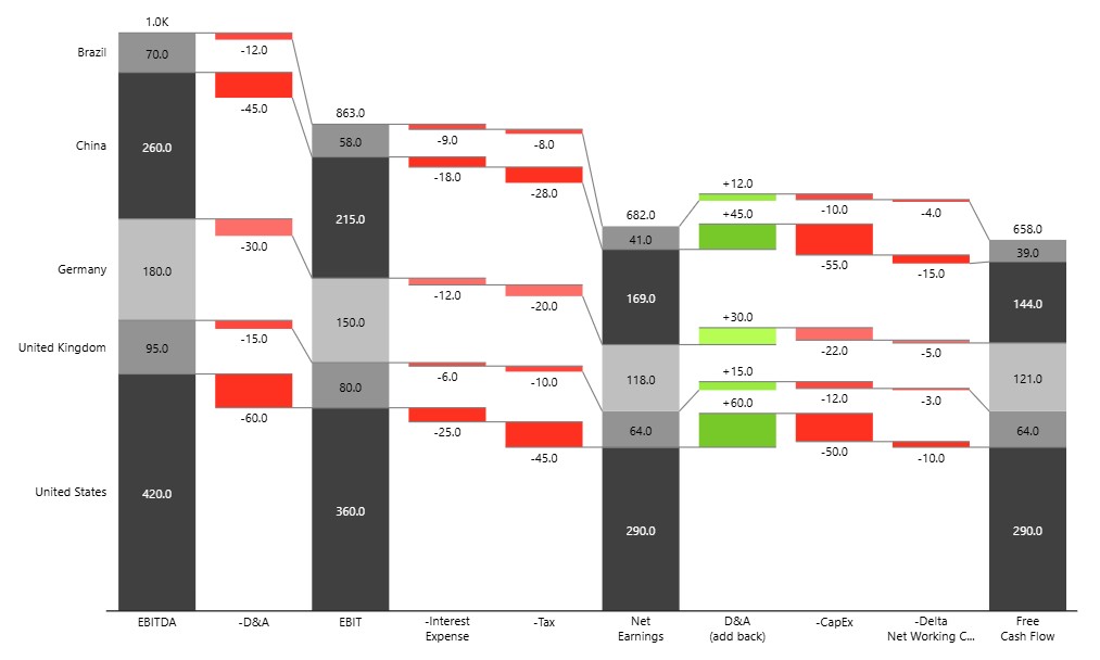
The chart is made up of several waterfall charts stacked on top of each other
- Data labels at the top of the total columns show aggregated totals.
- Each of the following charts below is one group. Its bars show the group’s own contribution across the bridge.
- Total columns — each row shows that segment’s share of the total. The columns connect visually across the rows, so you can see how the segments make up the totals.
- Variance columns — each row shows that segment’s variance contribution. Position relative to the baseline gives the direction: above the baseline is positive, below is negative.
- Connectors — every group has its own connector tracing that group’s flow.
Layered waterfall charts handle mixed positive and negative segments without any configuration — segments sit above or below the baseline according to their sign, so no bar height is inflated and segment order stays consistent from period to period.
Colors
Colors follow the same conventions as other Zebra BI stacked charts, and stay consistent between the Stacked and Layered views:
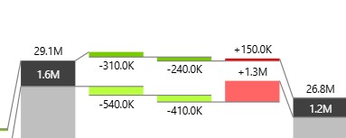
- First and last columns (totals) use a greyscale palette, with a distinct shade per segment. Totals describe structure rather than direction, so they stay neutral.
- Middle columns (variances) use green shades for positive contributions and red shades for negative ones.
- Shade intensity identifies the segment. The grey segment that gets in the totals columns maps to the same intensity of green or red in the variance columns — the darkest grey segment is also the darkest green or red — so you can follow one segment right across the chart.
As with the Stacked view, each group can be given a distinct color using the Highlight option. The highlight color applies to all of that group’s bars, variances included. See Highlight groups in the Stacked waterfall chart article.
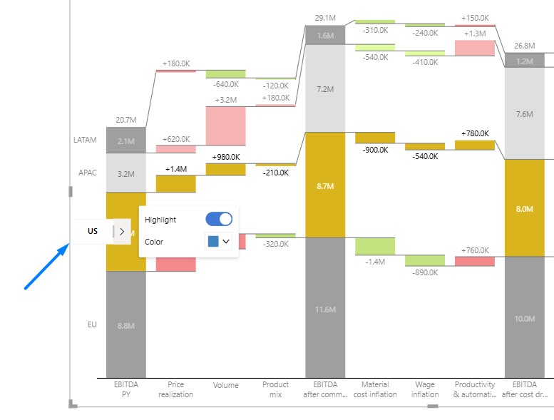
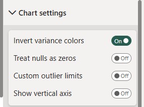
Inverted measures. For measures where a decrease is good — costs, churn — enable the Invert setting. Variance colors and labels flip to match, so gains and losses read correctly.
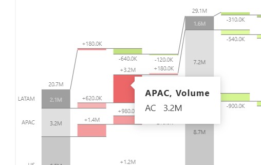
Tooltips
Hovering a segment shows its breakdown with values and percentages, including a mini stacked waterfall for extra detail on demand.
Stacked or Layered — which view to use
| Stacked | Layered | |
|---|---|---|
| Layout | All segments in one compact waterfall chart | Several waterfall charts stacked on top of each other |
| Answers | “How did the segments combine to move the total?” | “How did each segment perform across the bridge?” |
| Total at a glance | Immediate | Read from the top row |
| Comparing segments in one period | Good | Good |
| Space needed | Compact | Taller, grows with segment count |
| Best for | Executive summaries and dashboards where the aggregate story leads | Presentations and analysis where each segment’s contribution must be independently readable |
Both views work in static exports — you don’t need to hover a tooltip to see the breakdown, so the full picture survives in PDF and PowerPoint.
Business examples
EBITDA bridge by region
Typically used in quarterly/annual financial reviews when leadership wants to know not just “EBITDA moved from 15.3M to 18.2M” but which regions pushed it up or down. Benefit: each region gets its own readable row instead of being buried inside one compressed bar, so a region that swung hard (positive or negative) doesn’t get visually flattened by the others — useful when a report needs to survive being printed or dropped into a PowerPoint slide, where a single dense stacked chart would be hard to read.
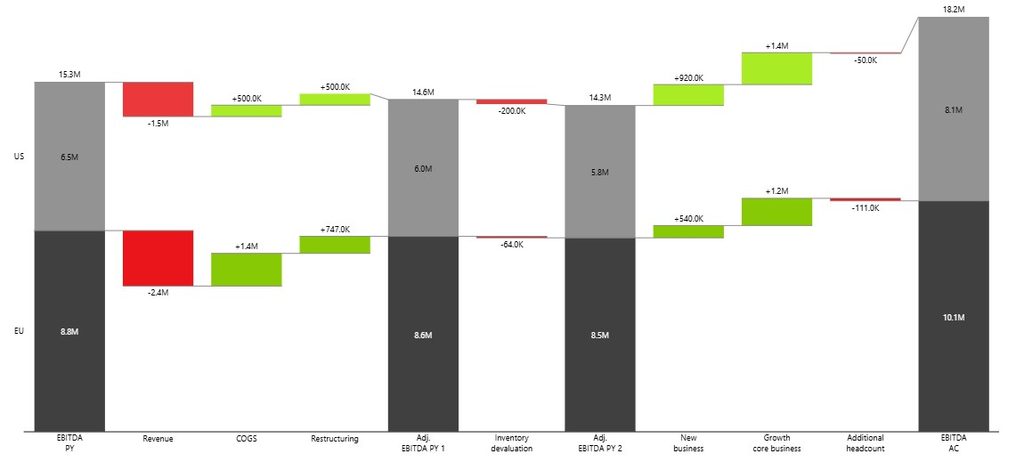
Contribution to EBIT
When reporting to regional/country leads or in a board pack that tracks performance across the full P&L (EBITDA → Free Cash Flow → EBIT → Net Earnings), not just one line. Benefit: each segment’s entire path down the income statement stays intact as its own row, so you can compare them against each other on equal footing across multiple metrics at once — without numbers distorting or hiding another’s in a shared bar.
Summary
The layered waterfall chart makes it easy to see which regions, products, or business units are driving a financial movement — not just that the total changed. Each segment gets its own row, so it can be read and shared on its own terms, and remains clear when printed or dropped into a report or presentation.