Stacked Waterfall charts extend traditional waterfall analysis by showing not only how a total value changes from one step to the next, but also which categories, segments, or drivers contribute to those changes. By combining the strengths of waterfall and stacked column charts, users can analyze both the overall impact and its composition within a single visual.
How to access a stacked waterfall chart
- Add a measure(s) to the visual
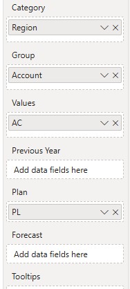
- Fill the Category and Group fields with a dimension. Small Multiples appear.
- Navigate through the “Chart slider” to access the waterfall chart
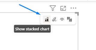
- Hover over the visual and click on a “Stacked chart icon”
- You can access a Stacked waterfall from a single measure (AC) or from a multiple-measure (AC, PL, PY, FC) setup
- Once you switch to the Stacked Waterfall chart, you’ll notice that the contributions for each category are separated into two columns: one for positive values and one for negative values. Hover over a column to view a tooltip that identifies the corresponding group.
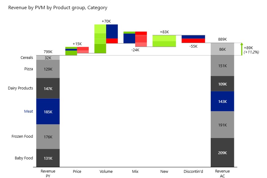
Highlight groups
To further improve readability, each group (stack) can be assigned a distinct color using the Highlight option. This makes it easy to visually distinguish between contributors at a glance, especially when multiple groups are present in the same column. Color-coding groups is particularly helpful in dense charts where differentiating individual segments quickly is essential for analysis.
- Hover over any group, and the arrow for the additional menu will appear on the right.
- Turn the Highlight option to ON.
- Select any color from the color picker and confirm your choice.
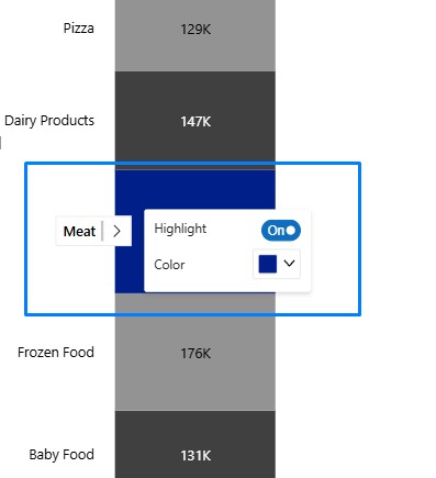
- The highlight color gets applied to all stacks including the variances
Business examples
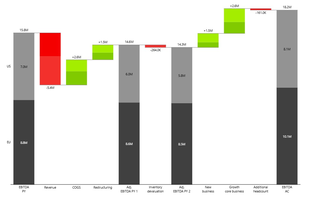
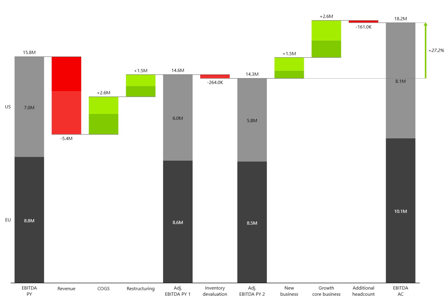
EBITDA Bridge Analysis
In this example, EBITDA increased from 15.3M in the prior year to 18.2M in the current period. The bridge shows the impact of key business drivers, including revenue decline, COGS improvements, restructuring activities, inventory devaluation, new business growth, and additional headcount investments.
While the overall waterfall explains the movement in EBITDA, the stacked structure reveals how each driver affected individual regions. Users can immediately see whether changes were driven primarily by the EU, the US, or both, providing deeper insight into business performance without the need for separate regional analyses.
A stacked waterfall chart is particularly useful for management reporting, variance analysis, and executive presentations, where understanding both the total impact and its underlying drivers is essential.
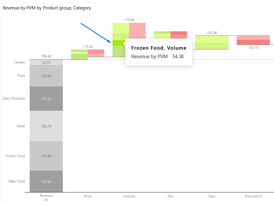
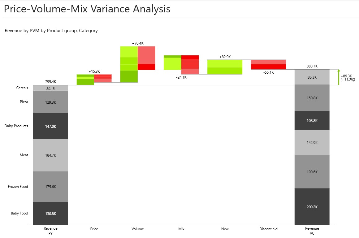
Price-Volume-Mix (PVM) Analysis
Traditional Price-Volume-Mix analysis showing both the overall impact of each variance driver and the contribution of individual product groups. The chart explains how pricing, volume changes, product mix, new products, and discontinued products contributed to this result.
While a standard PVM analysis highlights the impact of each driver, the stacked structure reveals how different product groups contributed to those movements. It’s easy to identify which categories benefited from higher volumes, which were affected by mix changes, and which drove overall revenue growth.
This provides a more detailed view of business performance and helps commercial teams understand the underlying drivers behind revenue changes, making it valuable for sales, product, and revenue management reporting.
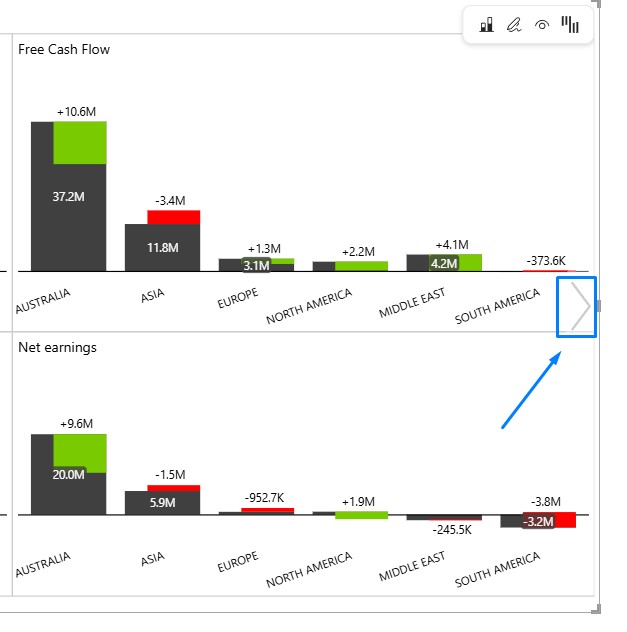
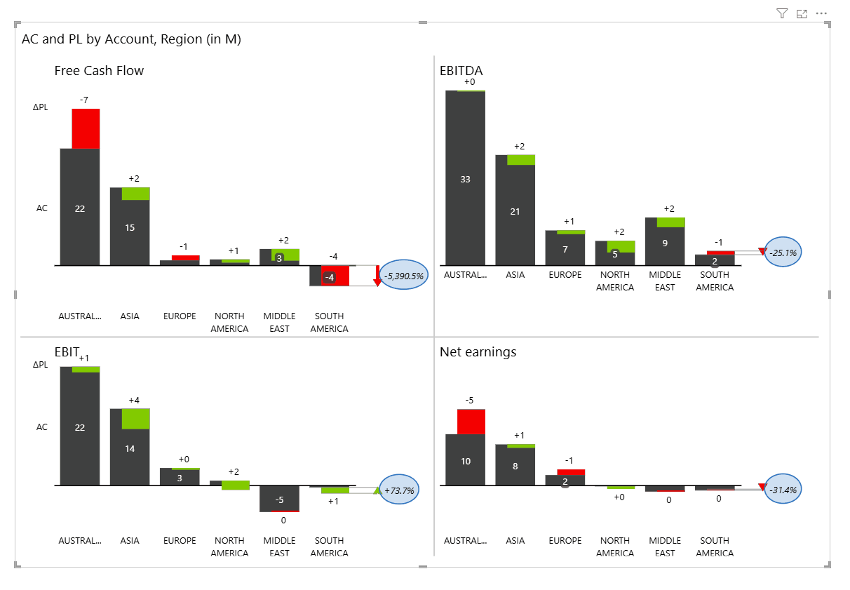
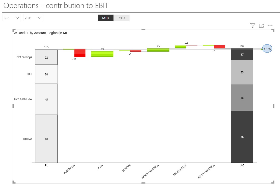
Contribution to EBIT Analysis
Operational performance is often the result of many teams, regions, or business units working together. A Stacked Waterfall chart helps uncover how each part of the organization contributes to the final result.
In this example, regional contributions are visualized as a bridge from planned to actual performance. While some regions negatively impacted results, others delivered gains that more than compensated for those declines. The chart makes it easy to identify where value was created and where performance fell short.
Because the start and end totals are broken down into EBITDA, Free Cash Flow, EBIT, and Net Earnings, users can evaluate contributions across multiple financial measures at once. This provides a comprehensive view of operational performance and supports more informed management discussions around accountability, investment, and growth opportunities.
Summary
Use a Stacked Waterfall chart when you need to explain both what changed and why it changed. The visualization preserves the intuitive flow of a traditional waterfall while adding visibility into the individual contributors behind each movement.
By bringing total impact and composition together in a single chart, Stacked Waterfall charts help decision-makers identify key drivers, uncover offsetting effects, improve accountability, and communicate business performance more effectively. This makes them a powerful tool for variance analysis, bridge reporting, and executive-level performance reviews.