Power BI is considered a self-service BI tool, so you want to enable the end-user to interact with the report. This way, the end-user can decide what information is most relevant and gives each user the chance to make some analysis on their own. One way to do this is with buttons and the SWITCH function.
For this article, we reuse the data from the article about creating Basic Measures. We suggest you check it out for a proper understanding of the techniques below.
Watch how to use the SWITCH function to make reports more understandable.
Let’s assume you have two accounts ( Revenues and Costs) and you want to show Actuals vs Budget for both of them. What you also want to show is a periodic and a YTD view. Of course, you could add 4 visuals to the report to show everything at the same time, which would look something like that.
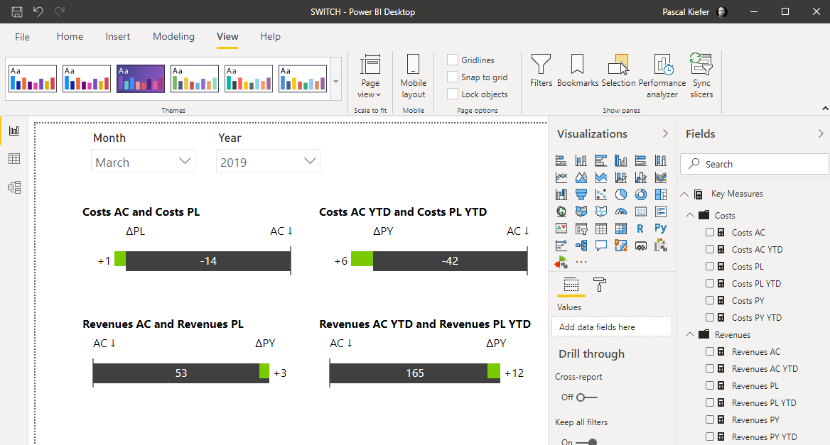
But in this view, the end-user will have to look at each header to figure out what each visual shows. A smarter way would be to have all possible combinations in one visual and have the user interactively select what should be shown.
You will learn how to do this kind of switch:
Create the SWITCH to change between Periodic and YTD view
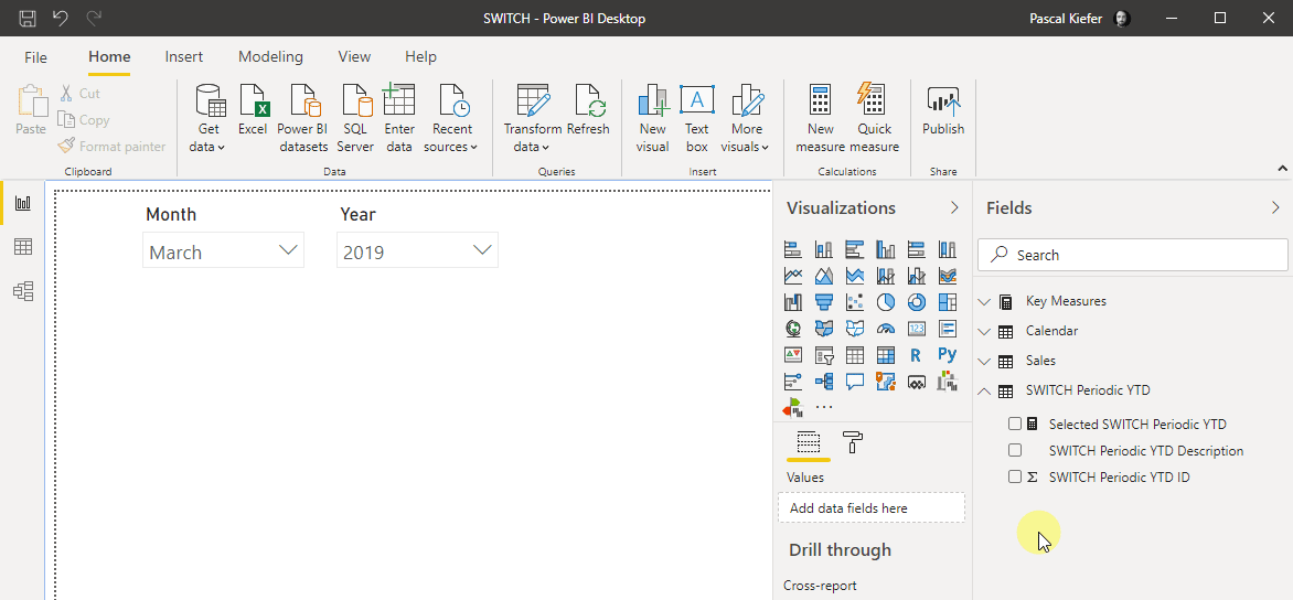
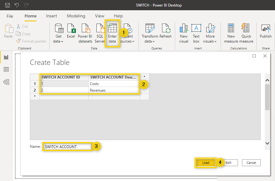
First, create an additional table that shows the options that the user can select.
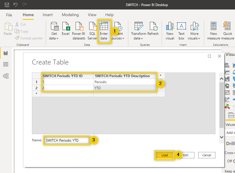
Click Enter data to create a new table and manually type in the text as shown above in steps 2 and 3. After that, click Load to add the table to the report.
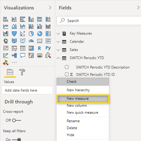
Then, add a measure to the newly created table.
To make it simple, use the DAX formula below:
Selected SWITCH Periodic YTD = MIN('SWITCH Periodic YTD'[SWITCH Periodic YTD ID])
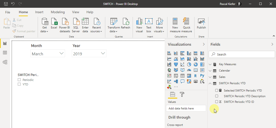
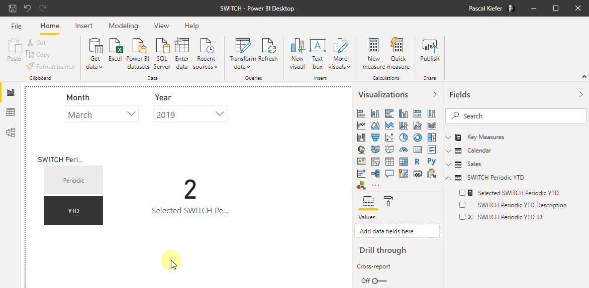
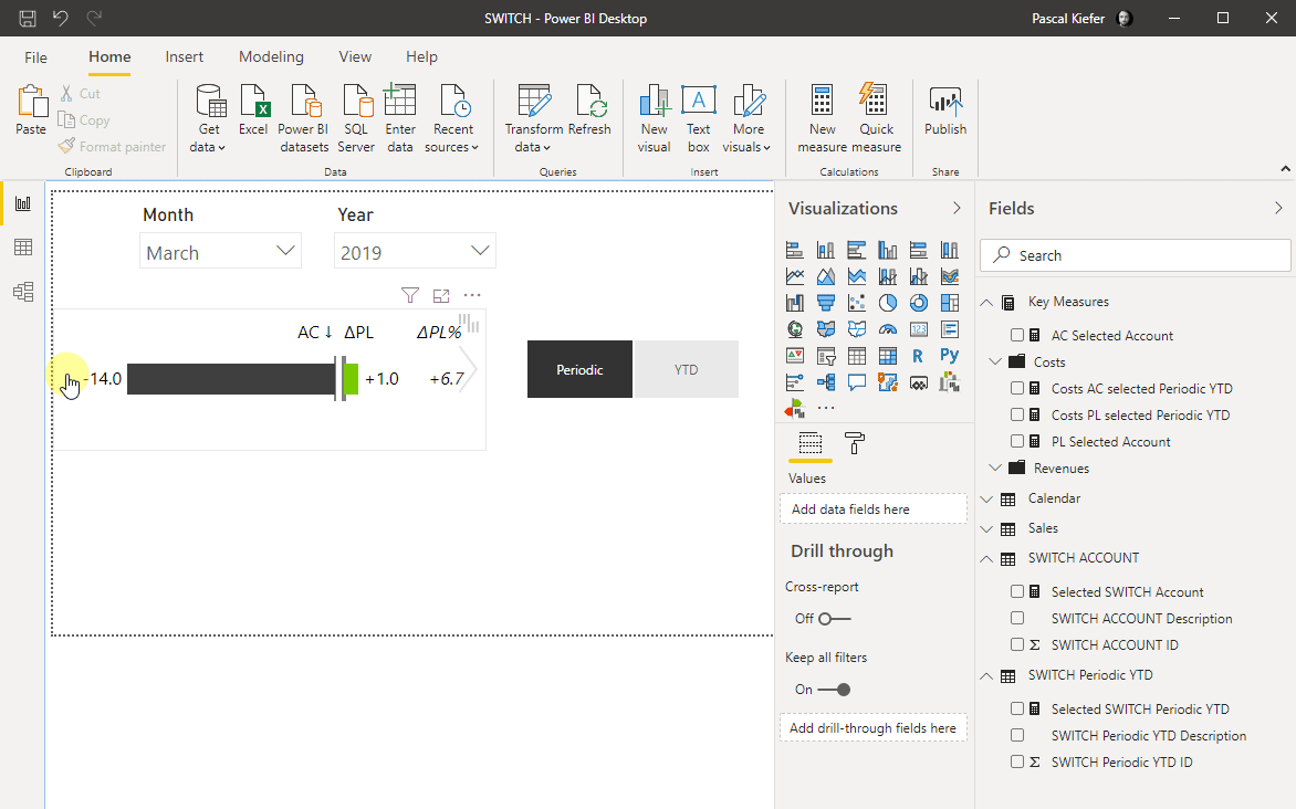
In order to illustrate what this measure does, let’s add a slicer and allocate the field SWITCH Periodic YTD Description to it.
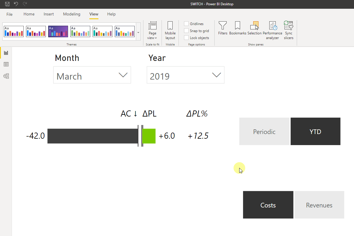
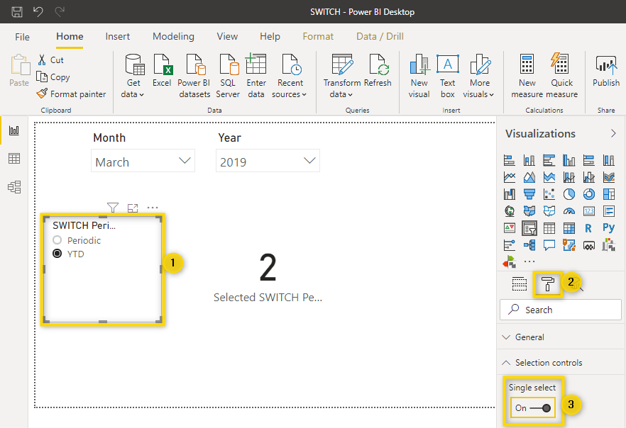
Now you can insert a card visual and add the measure Selected SWITCH Periodic YTD to it. After that, use the slicer to switch between Periodic and YTD and you will see that the number in the card visual changes depending on what you have selected. When you select Periodic, the card shows 1 and when you select YTD, the card shows 2.
Right now, a user could select Periodic and YTD at the same time (by pressing Ctrl and then make a selection). Since this doesn’t make sense as a calculation always must be either of the two options, you need to enable Single select for the slicer.
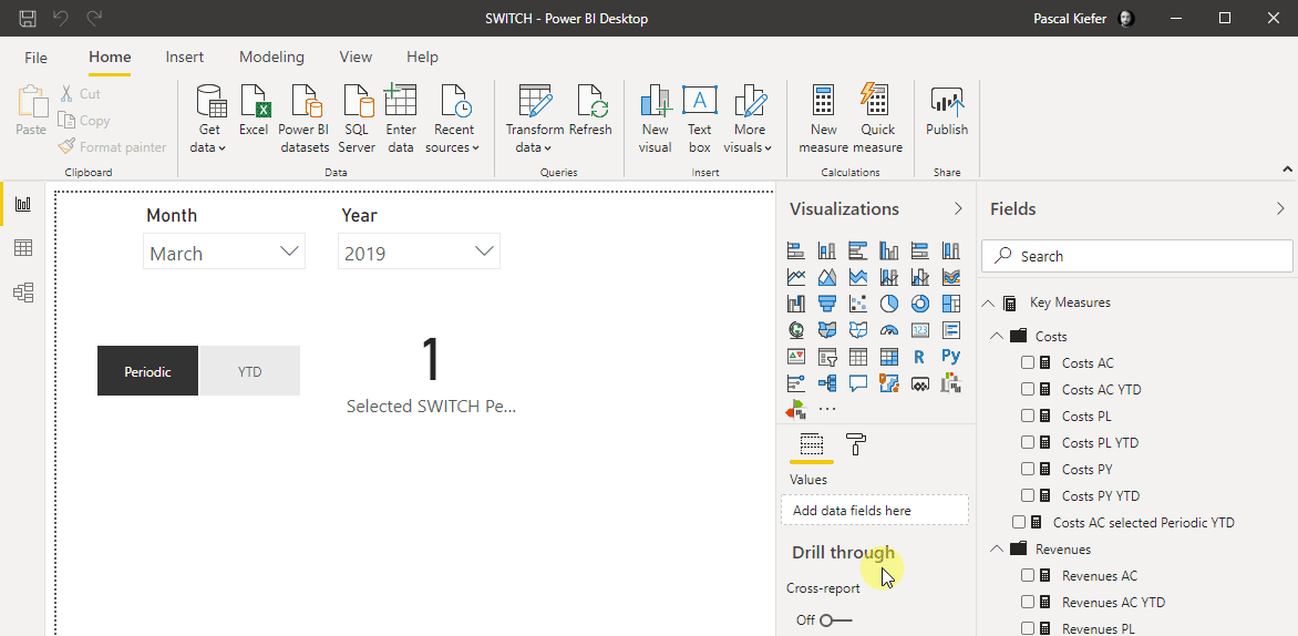
Now let’s turn the slicer into buttons by changing the orientation to horizontal.
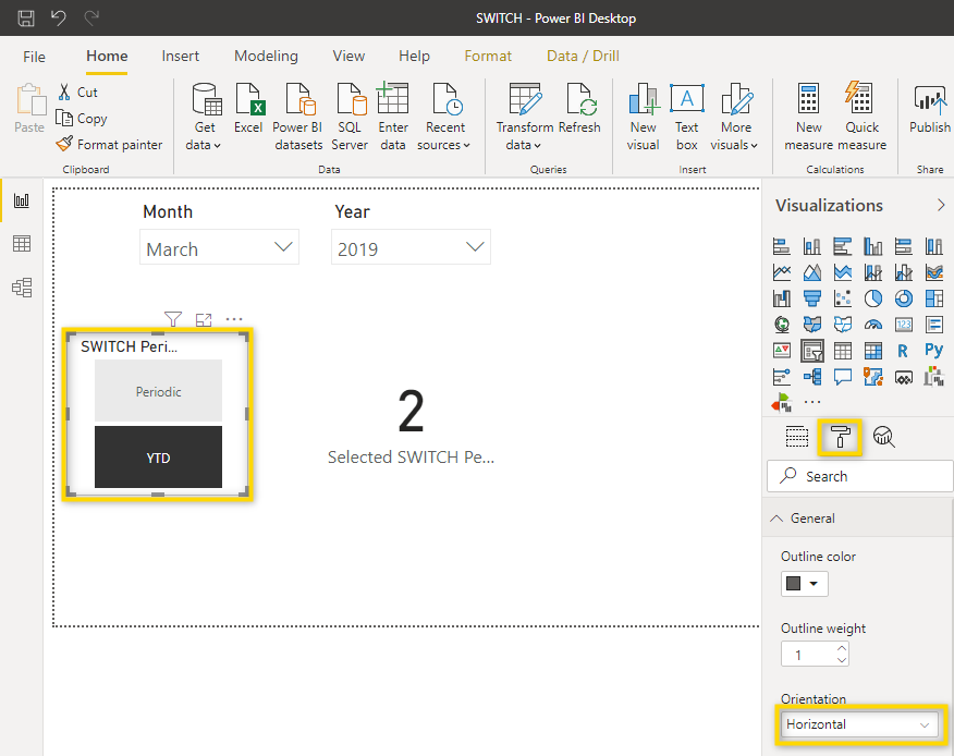
Turn off the slicer header and resize the slicer in order for the buttons to be next to each other.
Now you can create the measure which, depending on what is selected in the slicer, shows either Costs AC or Costs AC YTD. Both of these are measures that are included in the download file and were covered in the Basic measures. This is the syntax of the new measure:
Costs AC selected Periodic YTD =
SWITCH([Selected SWITCH Periodic YTD],
    1, [Costs AC],
    2, [Costs AC YTD])
What this measure does is to look at what the value for Selected SWITCH Periodic YTD is (This is the measure that you added to the card visual). If it is 1, Costs AC is shown, if it’s 2, Costs AC YTD is shown.
You can do the same for the Costs plan measure. Whenever you need to create a measure that has a similar syntax to an existing measure, you can copy the existing measure by selecting it, go to the formula bar, type Ctrl + A to select all, type Ctrl + C to copy the formula and then press Esc to close the formula bar. Then, paste the formula into the new measure and adjust it.
Below is the syntax for the Plan measure.
Costs PL selected Periodic YTD =
SWITCH([Selected SWITCH Periodic YTD],
    1, [Costs PL],
    2, [Costs PL YTD])
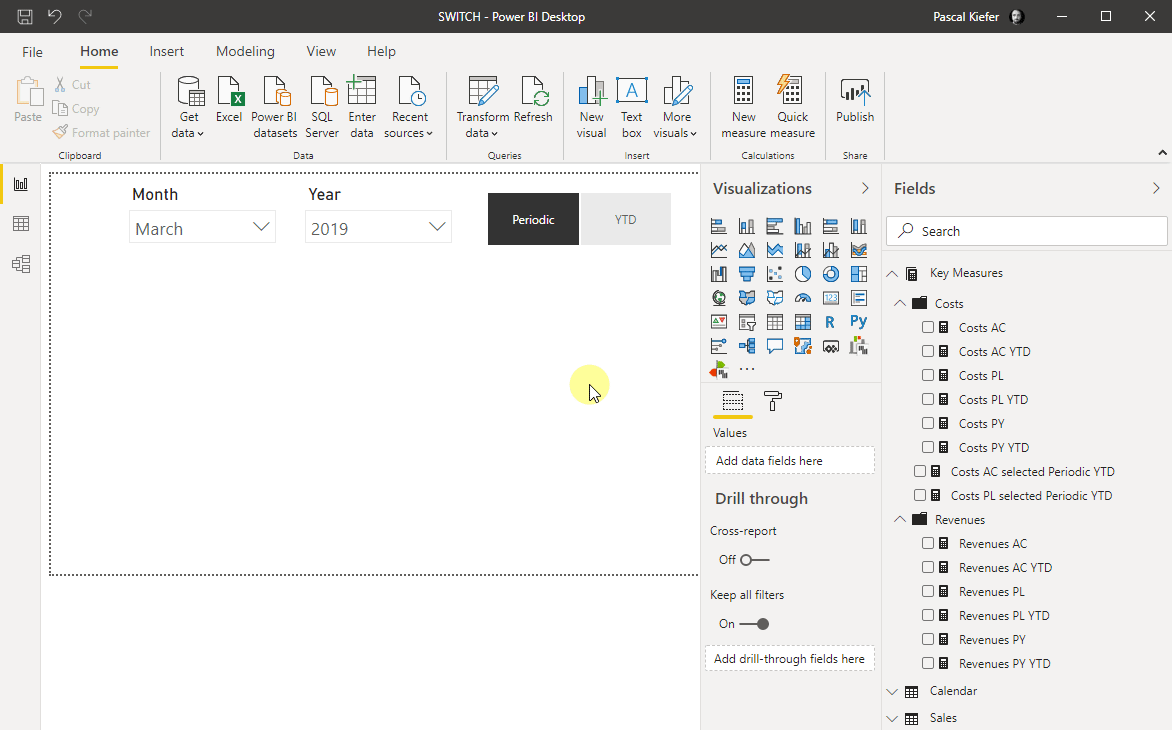
You can now add a Zebra BI table visual, add the new measures to it and see the switch in action
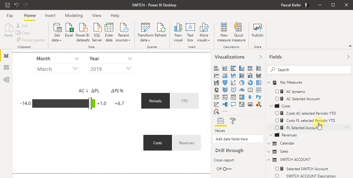
Create a SWITCH to switch between accounts
The first couple of steps are the same as for the first switch. First, you should add a new table.
Create a measure that shows either 1 or 2 depending on what you have selected in the slicer. The correct formula is shown below:
Selected SWITCH Account =
MIN('SWITCH ACCOUNT'[SWITCH ACCOUNT ID])
You then need to create 2 more measures (1 for AC and 1 for PL) that show the value for the selected account. The AC measure looks like this:
AC Selected Account =
SWITCH([Selected SWITCH Account],
    1, [Costs AC],
    2, [Revenues AC])
Next, you can add the measure for PL. Because the syntax is similar to the AC measure, you don’t have to type in the whole formula but you can copy the formula, paste it into the new measure and make the relevant adjustments.
PL Selected Account =
SWITCH([Selected SWITCH Account],
    1, [Costs PL],
    2, [Revenues PL])
At this moment, you should add an additional zebra BI visual and slicer. Since the formatting should be identical, you can Copy (Ctrl + C) and Paste (Ctrl + V) them and just change the fields in the placeholder. The new slicer should filter by SWITCH Account Description and the Zebra BI table should show the new measures which switch the accounts. Now you can use the second slicer to interact with the second Zebra BI table visual.
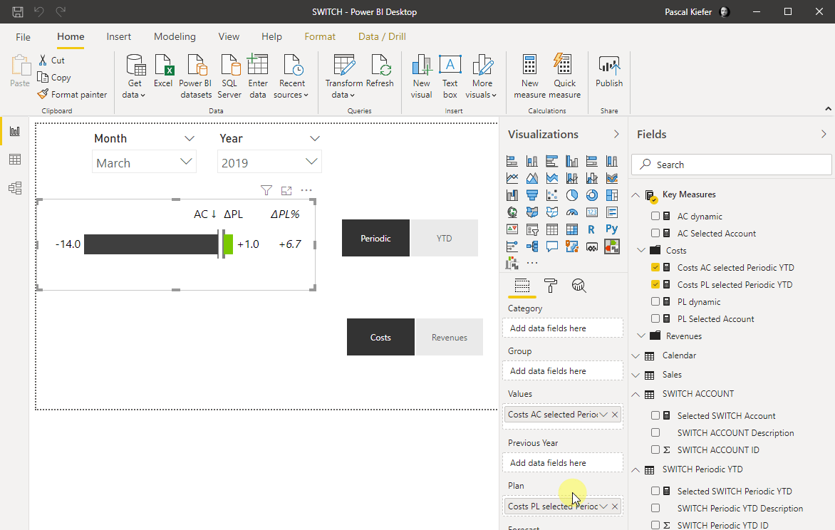
Create one dynamic visual
Let’s combine what we have created so far in order to have only one visual which is fully dynamic.
The only thing needed on top of what we already have is two more measures. This is because each of our SWITCH measures only takes into account the selection of one slicer. The measure for AC, which is filtered by both slicers, looks like this:
AC dynamic =
SWITCH([Selected SWITCH Periodic YTD],
    1, [AC Selected Account],
    2, CALCULATE([AC Selected Account],DATESYTD('Calendar'[Date])))
Depending on what is selected in the Periodic/YTD slicer, this measure shows either AC Selected Account (which is periodic) or calculates the YTD of the AC Selected Account, using a combination of the CALCULATE and DATESYTD function. To create the same measure for Plan, you can once again copy the existing AC measure, paste the code into a new measure, and adjust the parts needed.
Now add the new measures to the visual and see that you can interact with it from both slicers.
Great! You now have one visual which can show several combinations depending on what the user selects. This makes it much clearer for the user to see what is actually shown in the report.
In this example, we have only used slicers with two options but of course, the same can be done when there are three, four, or more accounts to choose from.