The main purpose of different layouts in the same visual is to achieve data to be presented accurately. The goal of Zebra BI visuals is a diverse selection of layouts to cover the needs of as many industries as possible.
Layout change can be done in the visual itself as well as the Visualizations pane. There are also options to make your visual non-responsive.
All Zebra BI visuals are primarily responsive, which means their layout change with increasing/reducing size, so the end-user can get the best experience out of every visual no matter the size. The benefits of the responsive visuals are that even the size reduction won’t affect the quality of data presented, variances integrate into the main field, and we also get all values in the tooltips.
If you want to explore your options and start building reports with Zebra BI visuals immediately, you are welcome to try them in the free trial.
A lot can be done within the same visual. Clicking on the chart slider (>) allows you to switch between different types of layouts.
Although all Zebra BI visuals have similar layout features, there are some specifics regarding each visual so we will focus on that further in this article.
Zebra BI Tables
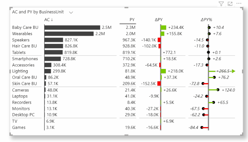
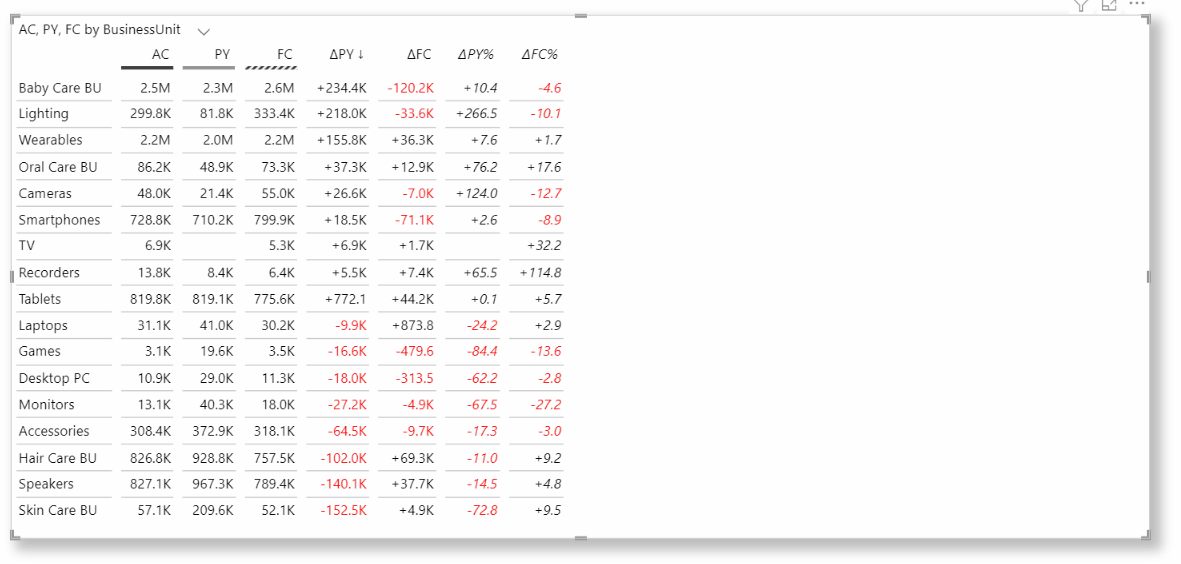
When we decide to use a table for presenting our data, we want all our values in tabular format, which is great for displaying exact and detailed information. However, we might want to see the highlights immediately. We can quickly transform our detailed table into a table with charts that will instantly point out the values that need our attention.
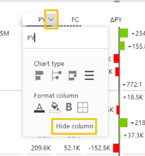
We can hide columns from a current layout, and it will not affect the other layout.
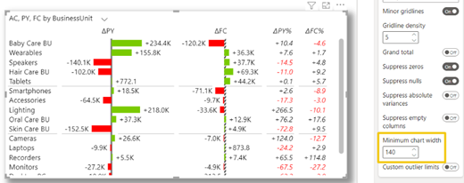
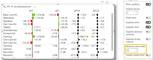
As mentioned, the visual is responsive and there is also a possibility to determine at which width we want it to respond. To change the minimum chart width, go to Chart settings – Minimum chart width and type in the desired number. The example below shows us two scenarios happening with reducing or increasing numbers.
The higher the number the wider chart in a column appears, but when the threshold is reached, the column will switch to a tabular view. Learn more about Zebra BI Tables.
Zebra BI Charts
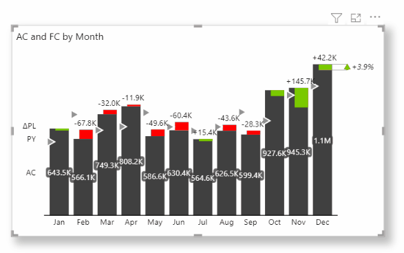
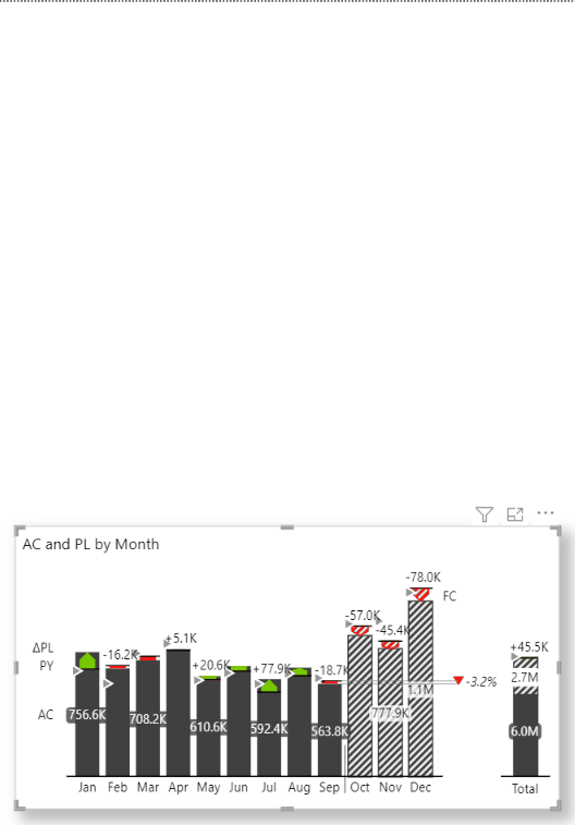
What makes Zebra BI Charts visual useful is its responsiveness to height changes. The height expansion of a visual gives us more charts for better and deeper insight into our data within just one visual. If there is a lack of space for expanding the visual, it will respond by integrating the variances into the main values.
As all situations require responsive visuals, we can easily make it static by selecting a suitable layout in the Visualization pane – Chart settings – Layout. We will find various choices of layouts that all serve a certain purpose.
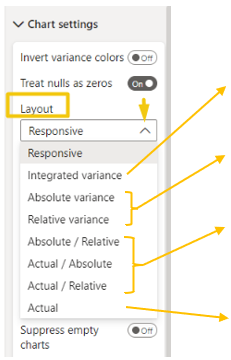
Integrated variance allows us to get main values and variances all merged within one chart
Absolute variance and Relative variance help us focus on variances only and we can choose between both types.
Absolute/Relative, Actual/Absolute, and Actual/Relative are there to combine two single layouts, it can be a scenario of variances or actuals with one of the variances.
Actual is used when our primary aim is only main values, they are shown in joined visual with a total variance at the end.
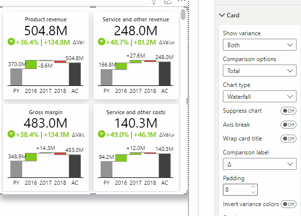
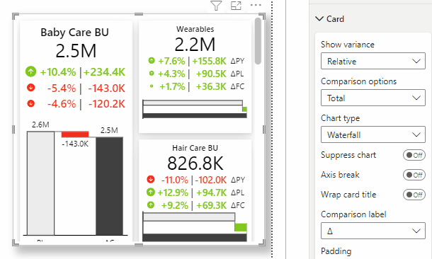
Zebra BI Cards
Now that we have learned all about using layouts in the Zebra BI Charts visual, we can move on to the Zebra BI Cards visual where most of the chart characteristics are already included but this visual has a few additional features we want to expose.
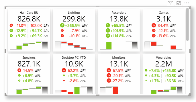
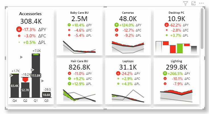
The layouts in Zebra BI Cards visual can be customized on a visual level or on each individual card.
Individual Cards in a visual can be shuffled and resized and the content (charts) will automatically adjust to its size.
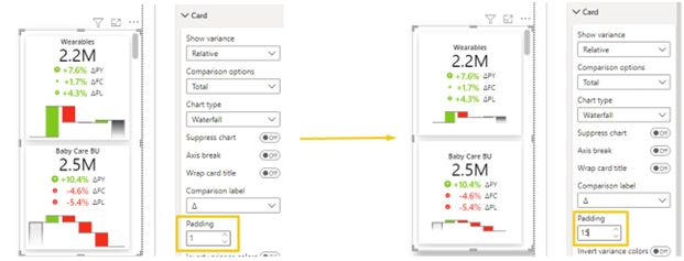
If we want to maintain the appropriate space between elements in the visual, we can simply use the Padding option in the Card section. This feature raises the readability of cards with a lot of information.
When we hover over the visual, an activator arrow on top appears and it expands to a global toolbar which gives us a few other options like changing the layout of cards, icons, styles, and fonts.
Primarily, charts are included in the Zebra BI Cards visual but supposing that we want only numbers to be presented, we can easily exclude charts in the Visualisation pane -> Card -> Suppress chart.
We addressed many different choices with layouts and there are still other options to explore. The key to choosing a good layout is in understanding your data and how you need to analyze it.
A visual can look great but if it does not present the information the end-user can make a sense of it, a poor choice of layout is one of the factors we failed.
Start building your own reports with Zebra BI visuals immediately. Try them in the free trial.