Sometimes it might be difficult to understand stacked charts, especially when there is a lot of data series. Charts are usually difficult to read – often you’re not able to even read the names of the data series. In order to bridge the gap in the data visualization, Zebra BI has developed the Stacked Column Chart and the Stacked Area Chart. In this article, you’ll learn what Zebra BI Advanced Stacked Charts can do and see how to do it.
Watch how to display Advanced Stacked Charts in your Power BI reports.
Features
The adaptive legend
The names of the data series (data labels) are always aligned with the actual data, which makes it much more legible. It’s called the adaptive legend that’s completely responsive.
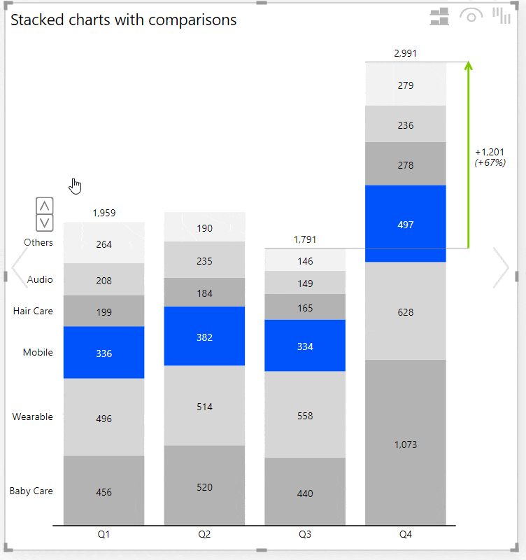
Top N + Others feature
In case you have a lot of data series, the Zebra BI visual will automatically aggregate or sum them up. This feature is usually called the Top N + Others, only that this time we’re using the Others category to display all of the other data series on top of the selected Top N data series. Now, you can reduce or increase this with a simple click on an Up-down command that appears when you hover over the chart.
Learn more to make your reports and dashboards much more focused and actionable using Top N + Others.→
The total for every column is always displayed on the top.
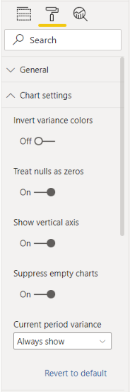
Control the behavior and display of the chart
Under the Settings, you’ll find a lot of options to change the behavior and display of the charts, for example, color scales. You can also change the display of the labels inside the chart to display normalized labels (eg. the percent of the total of each column).
You’re able to rename the label for the Others, you can translate it into your own language, and more.
Various stacked charts in Zebra BI visuals
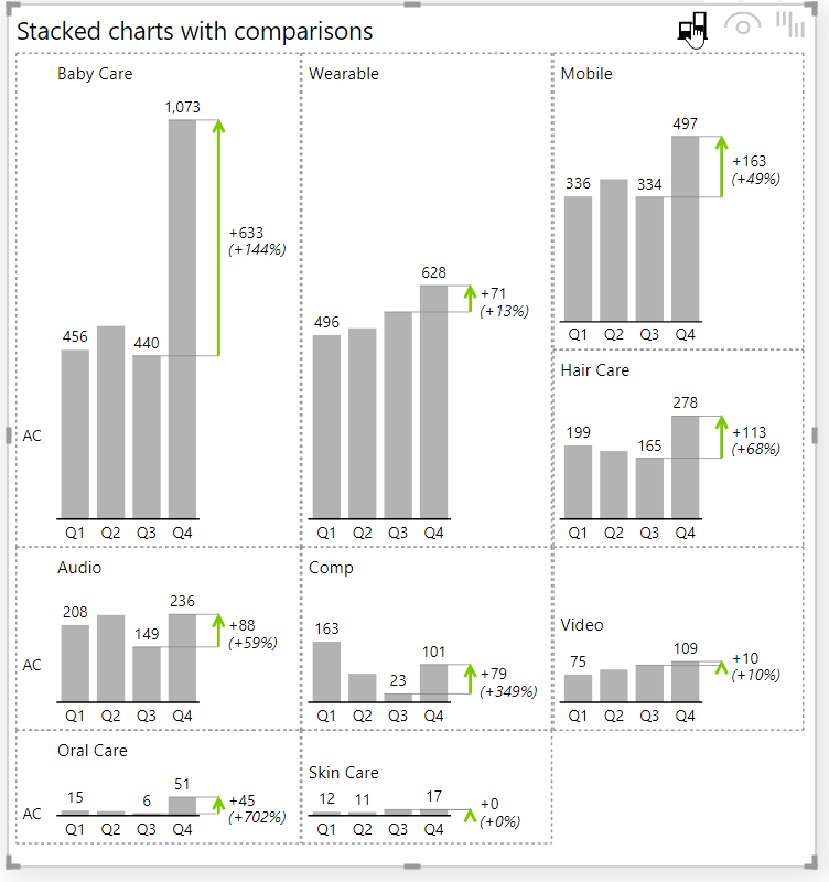
Switch between small multiples and a stacked chart
The user can simply switch between small multiples and a stacked chart with one click. This means the data series will just get flipped apart into small multiples or they will be stacked one on top of the other in the stack chart. Every user can do this – even viewers after the report is already published.
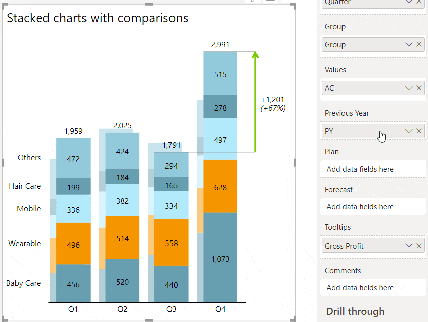
Comparison highlight
You can display many measures in your stacked charts – you can actually add your comparisons, your plan, your forecast, etc.
For example, if you’d like to add the Forecast, or a Previous Year value, or a plan, you can just take it and place it into the placeholder. That is now a Stacked Chart with a comparison.
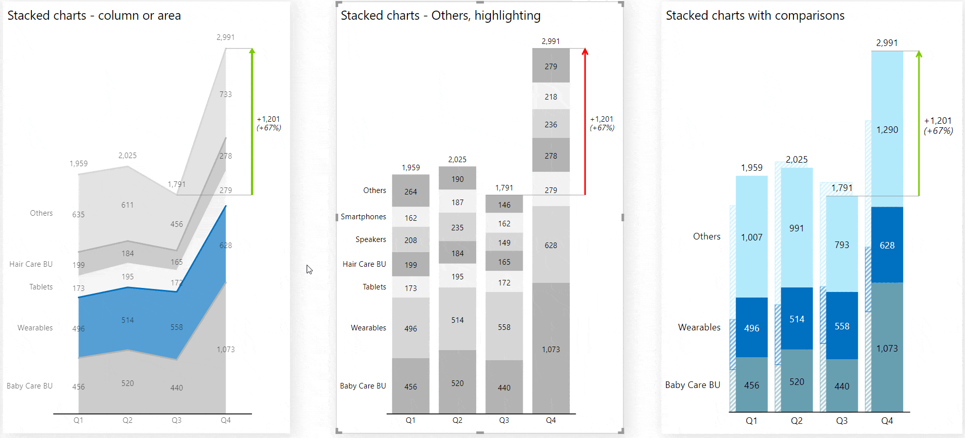
Responsive Filtering
Responsive filtering can be used to highlight one data series and automatically change other graphs for the most appropriate ones. This way you can easily display even more information (e.g. difference highlight, variances, etc.) related to that selected series.
If you want, you can easily switch between charts to further customize the appearance.
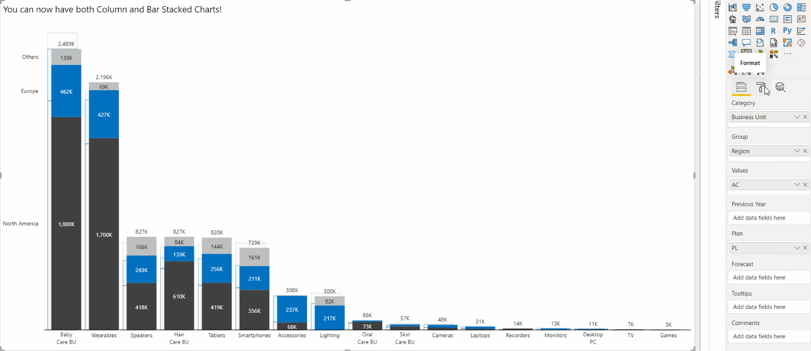
Stacked bar chart
Besides the stacked column chart, the 5.2 version of the Zebra BI Charts visual allows you to also display the stacked bar chart! How to create it?
Step 1: Create a stacked column chart by adding the measure which should be displayed on the X-axis to the Category placeholder. For the Y-axis insert some measures to the Group placeholder.
Step 2: Go under Chart settings and flip the chart by toggling on the option to Show the vertical axis
Step 3: Apply any feature used in stacked column chart also to this chart type e.g., top N + others, switch view to Small Multiples, etc.
Other chart settings
You’re invited to explore other settings too, such as inverting variance colors (eg. when a drop in value means declining costs) and more.
This feature was also a part of the Zebra BI for Power BI 5.0 release.