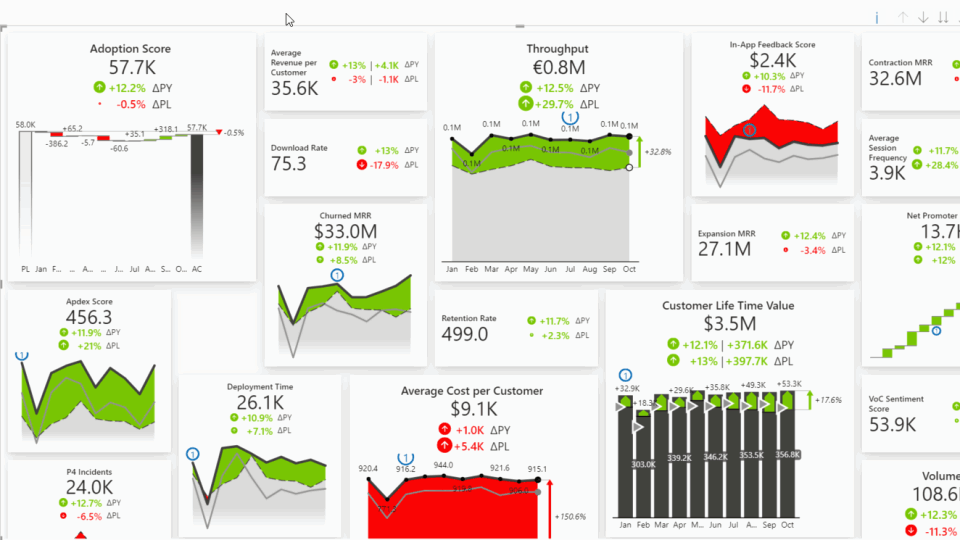
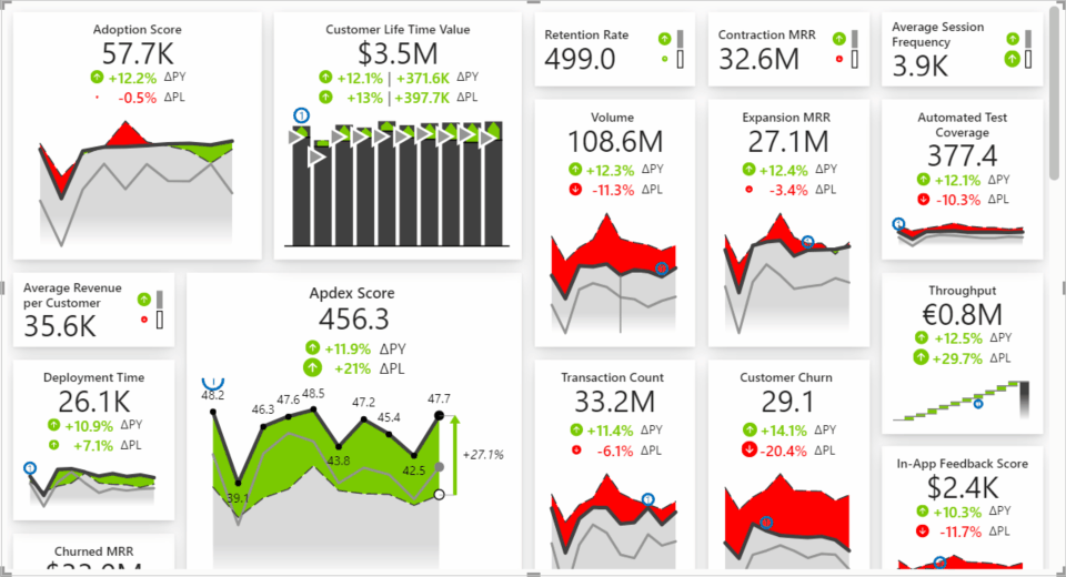
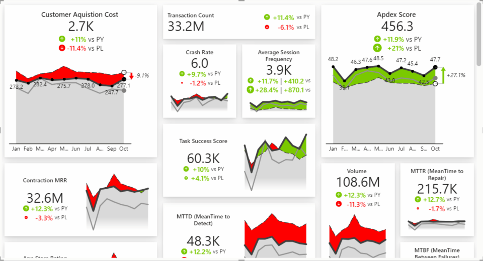
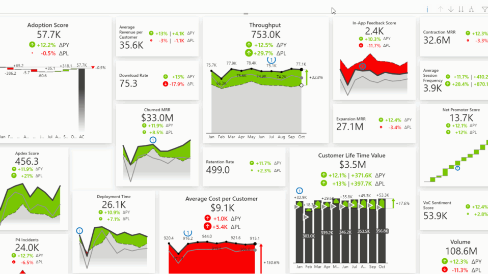
The Zebra BI Cards visual allows you to present your KPIs or scorecard in a powerful way and gain immediate insight into the most important metrics of your company’s performance. Create KPI cards that show comparisons and trends with just a few clicks. More context and explanation can be added with the help of advanced features like Scaled groups, Drill-through, Focus mode, Dynamic comments, and more. All of that on multiple cards within one visual to improve your report performance!
Watch an overview of the Zebra BI Cards visual
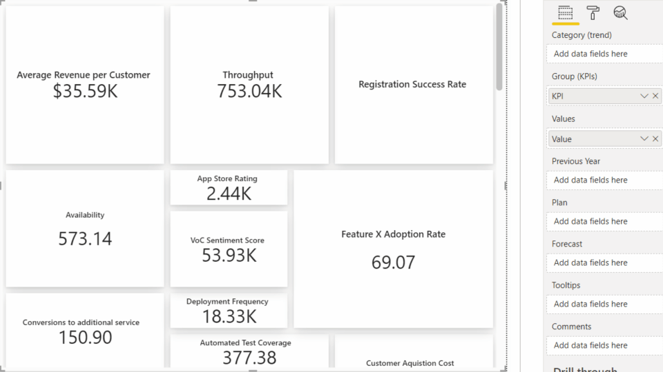
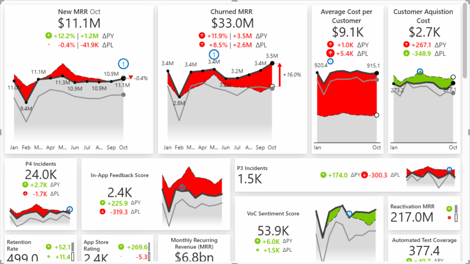
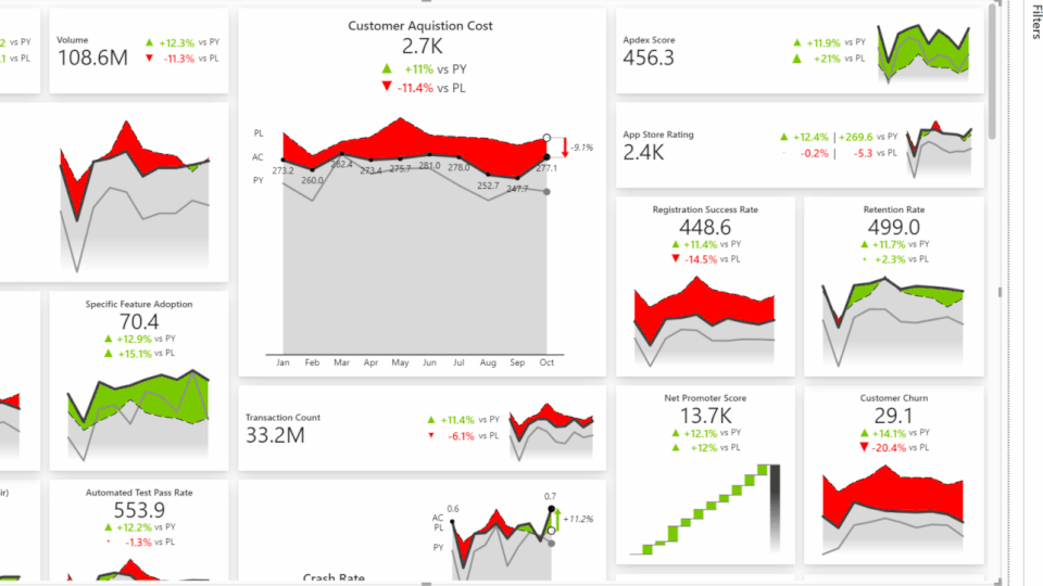
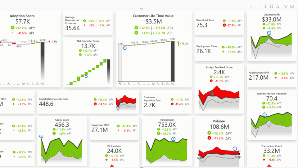
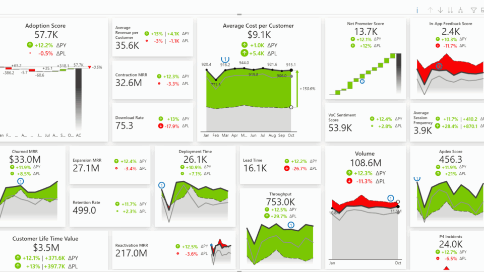
Zebra BI Cards visual offers several different possibilities for visualizing your KPI data. You can display only the numbers or add additional visualization elements to provide more insights at-a-glance.
Integrated charts and Comparison view
Start by adding the Cards visual to the Power BI page, then add value to the measure placeholder (e.g., put Value to the Values placeholder), and finally add your KPIs to the dimension placeholder (Group). By doing this, you should get the display of the so-called Big Annoying Numbers (BAN) where only the value for each KPI is shown. However, just a bare number is often not enough to provide a real insight into what’s happening with the company’s performance: is it good or bad, are the numbers on the plan, and even more importantly, why?
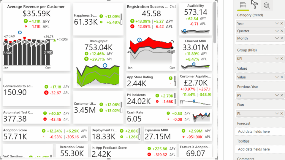
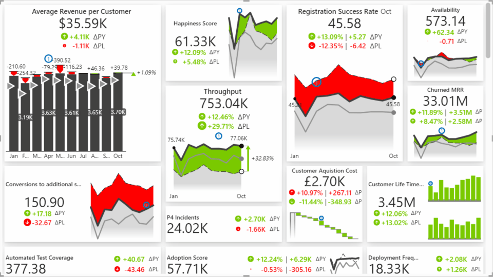
To create a comparison, add values in the comparison placeholders (e.g., in our example below, we added PL to Plan and PY to Previous Year placeholder).
Cards visual automatically calculates comparisons, such as growth rates from the previous year, and provides you with a visual representation of the comparison for each KPI.
To understand the trend, bring also other dimensions like Months and/or Year to the Category (trend) field.
You can add up to four measures to one card.
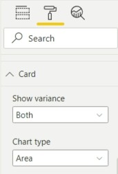
To properly visualize each KPI, you can select the chart type in the Settings. Based on the data type, you can choose Waterfall, Area, Variance, or Line chart.
To understand which chart works best for different purposes, check out the Overview of Zebra BI Charts. →
If you prefer to display your KPIs simply as values without additional charts, go under Settings > Card and switch on the Suppress chart option.
Your KPIs will remain actionable because the variance of the values remains visible due to the
scaled icons. The icon’s size indicates the size of the variance to guide your attention to where it is needed.
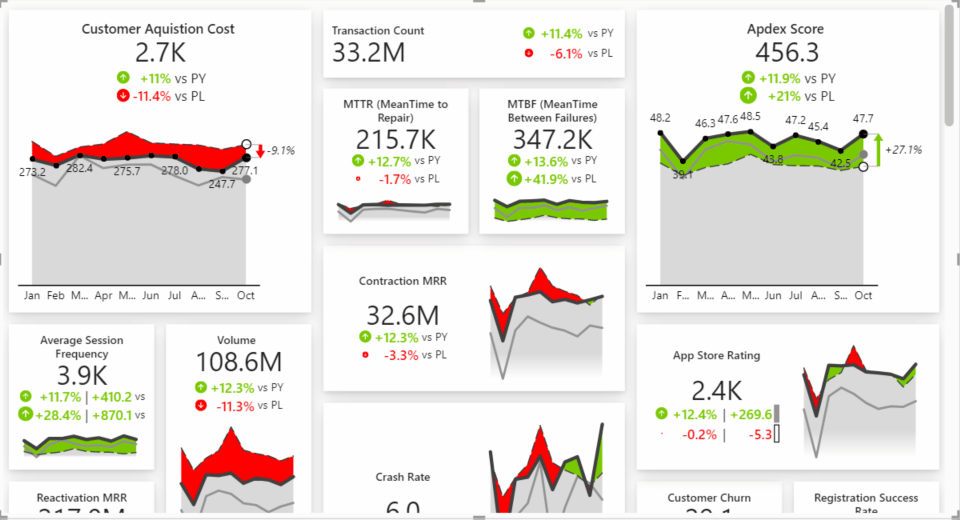
Row layout
Do you prefer to visualize your KPIs in rows instead of using the card layout? You can switch between both within seconds.
Hover to the arrow in the top-middle of the visual and a toolbar will pop out. Under the Layout section select the right icon to switch from the card to the row layout.
When you select the row layout, all variances remain displayed. Additionally, a smaller version of the chart known as the Sparkline chart appears on the right side.
Drag and drop rows to reorder KPIs in the order you want them to appear, from most essential to least important.
Scaled groups
When you want to compare different KPIs, the visualizations might look quite similar at first glance. However, often the problem is that different KPIs that you wish to compare are not properly scaled. As a result, the data can be misinterpreted.
To put charts into the right perspective, you can group related KPIs and smoothly present them side-by-side with an equally scaled axis.
Go to the top part of the selected card and click on the middle icon. This will open the Scaled groups option.
Simply select all the cards that you want to put in one group. Zebra BI will then automatically synchronize the Y-axis across all the selected charts.
Learn more about Scaled groups functionality. →
Dynamic Comments
Comments are a great way to provide report viewers with additional explanations of what’s happening with each KPI. Zebra BI Cards visual enables you to easily add as many comments as you want. Because comments are completely dynamic, they change with filters and respond to resizing.
Simply drag and drop your comments text field into the Comments placeholder.
Zebra BI will automatically display comments that are linked to a specific period in your data and to a specific KPI. The content will appear in the tooltip when users hover over the comment marker or alternatively if they open a specific KPI in Focus mode.
Learn more about using Dynamic Comments in your reports. →
Focus mode
To dive deeper into each KPI, you can use the Focus mode functionality.
Select the first icon in the top right corner of each card. When you click on it, the selected card will expand and take up the entire screen. You’ll be able to see the dynamic comments, all the visuals, and any other additional information available.
Invert negative KPIs
Within the Focus mode functionality, there is also an option to Invert KPIs.
When you have different KPIs on one report page and for some of them the rising trend is good (e.g., revenue) while for others it is not (e.g., costs), you can invert the meaning for latter KPIs and display the proper value.
Open a specific KPI in the Focus mode and choose the Invert KPI option.
Drill-through
Drill through function enables you to explore further details of a certain KPI. Looking at all of the data, it’s easy for report viewers to figure out not just how KPI is performing, but also what are the reasons behind it.
Click on the last icon in the top right corner of the card and select Drill through > KPI details to go to a more detailed report. However, before you can do that, it’s important that you create a new report page.
Report page tooltips
Tooltips are a great way to provide additional insight to the report viewer. Zebra BI Cards visual supports Report page tooltips functionality out-of-the-box so you can create a custom tooltip that works for all cards in the visual.
Resize and reorder cards
You can tailor your layout however you want to display KPIs according to your needs. Since Cards are completely flexible and responsive, you can resize each card and make more important ones larger to display more information or make them smaller if that fits your use case better.
To change the placement of a specific Card, simply drag and drop it to the place in your report where it fits best.
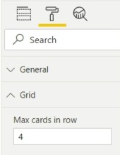
If you’re using the card layout, you can also define how many cards you want to display in one row. Go under Settings > Grid and insert the number in the Max cards in a row field.
Formatting of each individual card
Zebra BI Cards visual is also very flexible as you can adjust many elements on the page or even on each individual card. Having the ability to customize the display of values, format the numbers or change the shape of icons is important as it gives you a lot of options to tailor each card to your needs.
When you enter Focus mode (first icon on the top of each card), you can choose from several formatting options: convert an absolute value to a percentage, change the Unit or adjust the currency symbol for each card individually. All changes can be done within a few clicks.
You can also decide whether you want your cards to display only absolute, relative, or even both variances. Change that for each card that is needed by simply clicking on the values.
Cards also offer automatic detection of the last available value for each KPI. By default, a summarized value will be displayed (e.g., YTD) and with one click you can change that to the last available value.
Additionally, within the top toolbar, you can change the shape of the variance icons without affecting the scaling of them, adjust the style of cards, or even apply your own colors, fonts, or even upload a JSON file to match your custom theme.
Learn more about several options for customizing the visual on each card. →