The Zebra BI Charts visual can render many different types of charts. Column/bar charts, area charts, line, waterfall, variance, “hills & valleys”, dot, and lollipop charts are supported and a user can switch between them by simply clicking on the chart slider. You can also create combination (combo) charts, add forecasts to charts, and above all, render small multiples of any chart type. It’s as easy as looking at pictures on your mobile phone! To fully experience all the features demonstrated in this video, please start your free trial of Zebra BI for Power BI beforehand.
Watch an overview of all the different chart types in the Zebra BI visual
The Zebra BI Charts visual can display a number of different chart types. The selection of charts depends on the data that is added to the visual, mostly on the number and type of measures you bring into the visual.
Charts with one measure
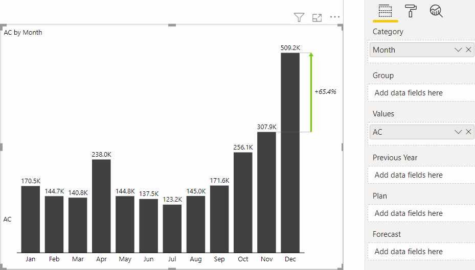
If you only add one single measure to the Zebra BI visual, you can choose between column, line, area, “hills & valleys”, dot plot (lollipop), and waterfall charts. Simply click on the chart slider (the right-arrow button) to switch between charts:
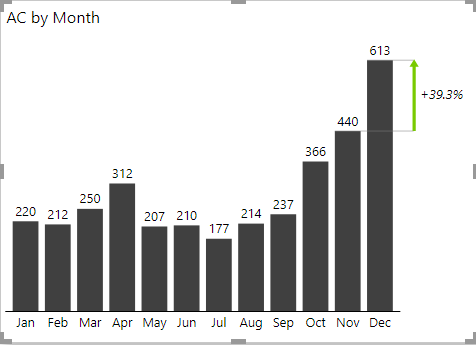
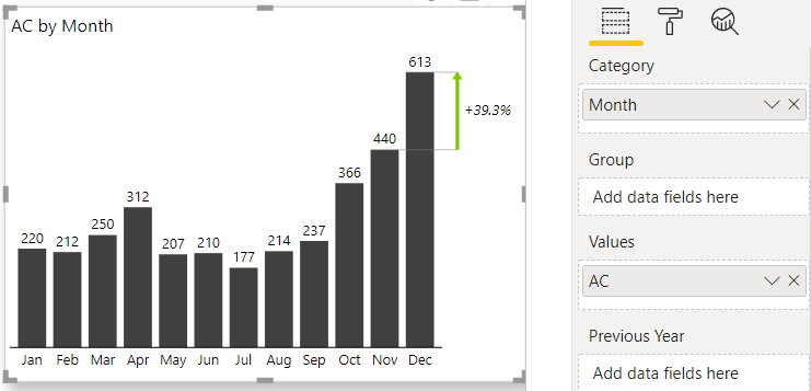
These are the most basic Zebra BI charts. To create them, simply put your measure in the Values placeholder and your data categories into the Categories placeholder like this:
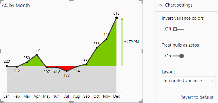
Some of the charts have additional layouts available under Charts settings > Layout. For example, you can change the layout of area chart from “Integrated variance” (the version with red/green areas) and “actual” (plain area chart) like this:
You can completely customize any chart by changing the design (colors, font types, etc.), formatting numbers, adding grand totals, turning the legend on/off, changing the difference highlight, renaming legend entries, setting gaps between columns, etc. Please read Customizing Zebra BI charts to learn more.
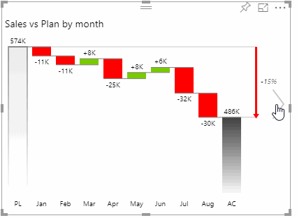
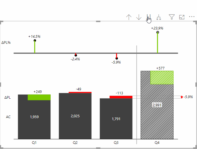
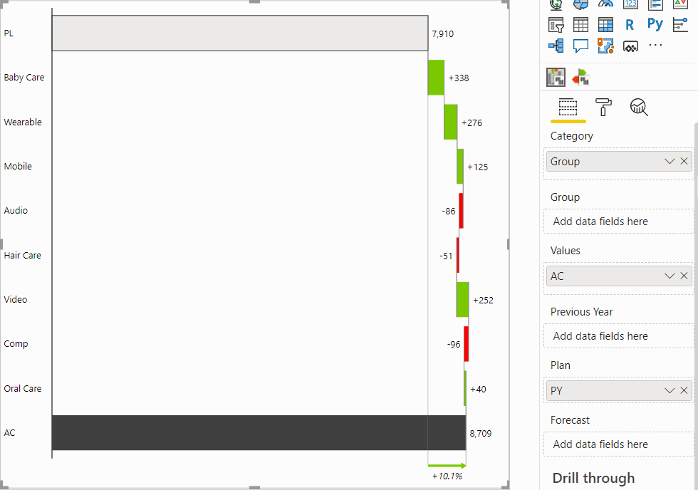
The waterfall chart is a special type of chart that is extremely versatile. It is used for displaying calculations or performing contribution analysis. It can display subtotals, the differences between them, and allows you to invert selected data points in your data series:
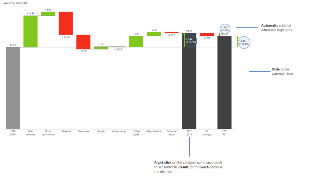
To create waterfall charts with subtotals from one single measure as shown in the picture above, please refer to the article Creating waterfall charts with subtotals.
Charts with two measures (comparison or variance charts)
The Zebra BI Charts visual is especially powerful in situations where you need to compare two measures and/or display variances between those two measures. Sales vs plan, Costs vs budget, Revenue vs Previous Year, and similar comparisons can be visualized in a number of meaningful ways.
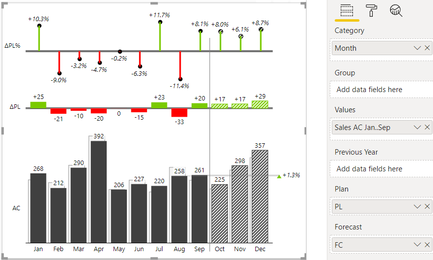
To create a comparison chart, add your base measure (the actuals) to the Values placeholder and then bring your comparison measure (e.g. Sales plan, Last year sales, Revenue PY, etc.) into the Previous Year placeholder (for comparisons to the previous year) or into the Plan placeholder (for plans, budgets, benchmarks and similar):
Similarly, you can create a comparison to a forecast by dropping your forecast measure into the Forecast placeholder.
When you create a comparison chart, Zebra BI will automatically calculate the variances (differences) between your measures and display them in charts. This means that you do not have to create separate measures for absolute variance and relative variance in your Power BI model. Zebra BI will do this automatically for you and as a result, simplify your data model in Power BI by reducing the number of measures needed and the number of calculations being performed. This will also result in faster performance of your reports and dashboards.
Once you drop two measures into the Zebra BI visual, you can use the chart slider to choose the most appropriate chart. You can choose between a waterfall chart, integrated variance column chart, area “hills & valleys” chart, and line chart:
Comparison (variance) charts have a ton of additional options. You can choose from a number of layouts (check the Layout option in Chart settings), add grand totals, display multiple comparisons (e.g. compare your actuals to PY and plan at the same time), change the display of variances (absolute or relative or both), rename the AC, PY, PL, and FC labels, break the axis, etc.
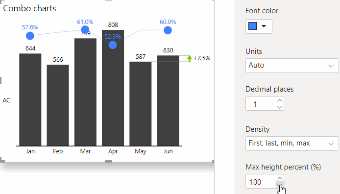
Combo charts (combination charts)
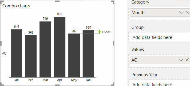
Combination (“Combo”) charts are suitable for displaying two measures of different types or units. For example, to visualize Sales in million USD and Gross Margin in % on the same chart. You can save the space in your report or dashboard by simply bringing both measures into the same Zebra BI Charts visual (just drop the second measure into the Values placeholder):
The second measure in the Values placeholder will always be rendered on the secondary Y-axis (will be rendered in a separate scale). Also, additional chart settings called Combo chart will become available for you to further design and control the secondary data series:
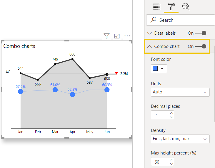
The tricky part of any combo chart is that it is quite likely that some of the labels will overlap. To improve the legibility of labels, try setting the Max height percent (%) setting to the most appropriate value in your specific case:
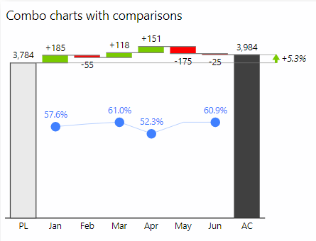
It gets even better. The Zebra BI Charts visual allows you to create combo charts from all supported chart types! Thus, you can create a variance chart or even a waterfall chart and then combine it with an additional measure on the secondary axis. Here’s an example of Sales vs Plan chart, combined with Gross Margin in %:
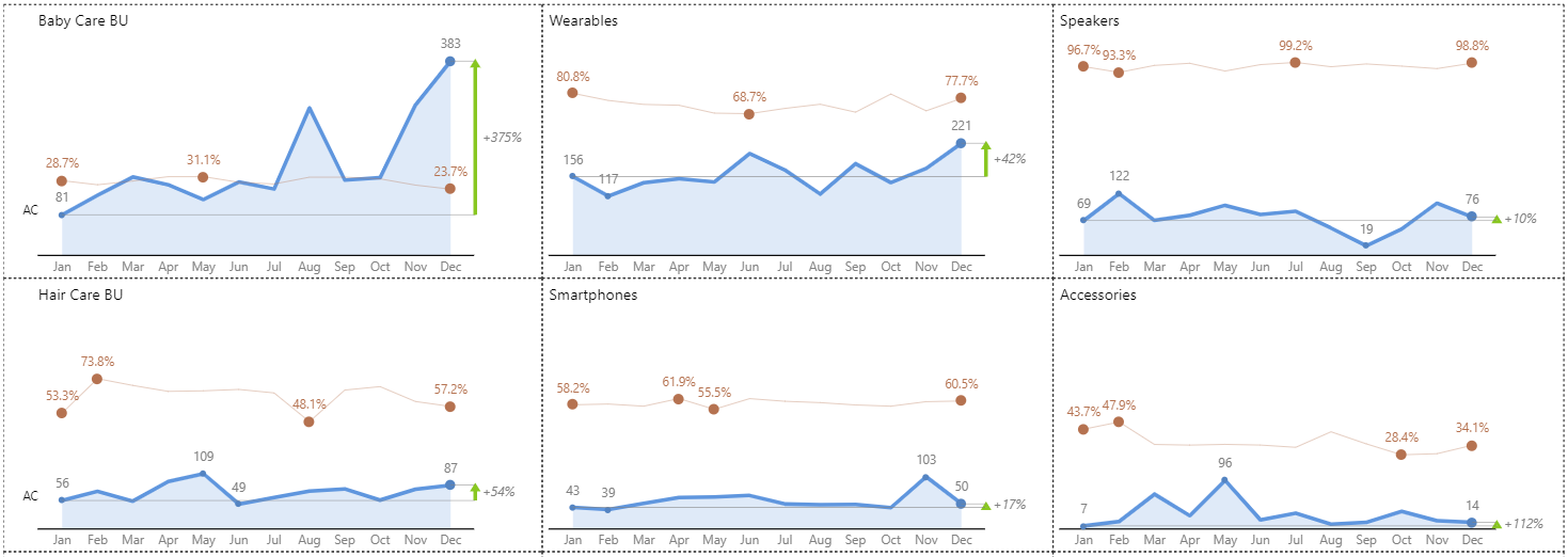
Lastly, you can easily create small multiples of combo charts in Zebra BI by adding an additional data field to the Group placeholder. Here’s an example where monthly sales trends are combined with gross margins and displayed for 6 business units in the same visual:
Charts with forecasts (segmented charts)
The Zebra BI Charts visual offers extensive support for displaying forecasts. If you add a measure with a forecast to the visual, it will display the actuals up to the current period and then render the forecast for the rest of the time series (for example, for the rest of the year). All Zebra BI charts support the display of forecasts:
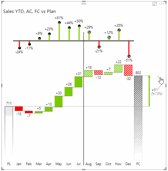
These charts are also called segmented charts.
To create a chart with a forecast, first put your base measure (actuals) into the Values placeholder and then add your measure with forecast to the Forecast placeholder:
Zebra BI will automatically detect the end of your actuals (the measure in the Values placeholder), so it is important that this measure has empty values for the periods after the current period.
Charts with a hierarchical X-axis (drill-down charts)
All Zebra BI charts support the standard Power BI drill-down options, namely drill-down, drill-up, go to the next level and expand all down:
As soon as you add 2 or more data fields into the Category placeholder (or even better, add a hierarchy there), the standard Power BI drill-down buttons will automatically become available at the top of the visual:
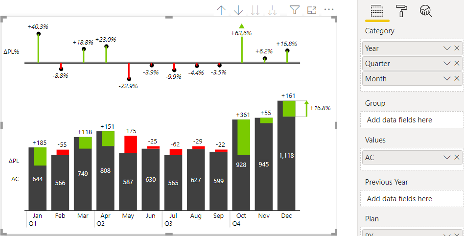
Notice that by using the expand all down option, the labels on the chart axis become hierarchical and extremely readable (observe the picture above). By using hierarchies (or placing multiple data fields) in the Category placeholder, you will typically achieve much cleaner and legible axis labels.
Charts with a vertical axis
Besides charts with a horizontal X-axis (e.g. monthly or weekly charts where time runs left-to-right), you can also create charts with a vertical X-axis.
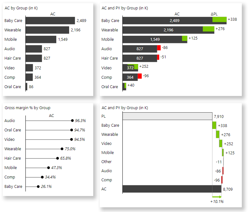
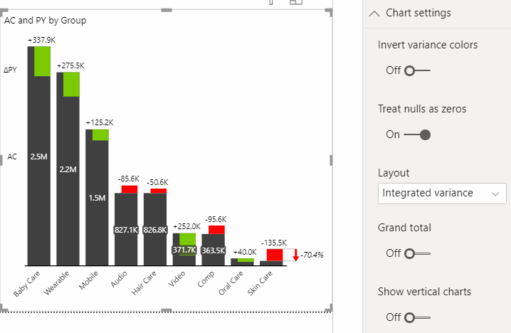
Charts with a vertical X-axis are useful especially when your categories are not a time-series, but rather products, customers, business units, cost centers, accounts, etc. Here are a few examples:
To create a chart with a vertical X-axis, simply turn the setting Show vertical charts to On:
Small multiples
All the above-mentioned charts can be rendered as small multiples, meaning that the Zebra BI Charts visual is able to display multiple charts in one single visual. Here’s an example where the performance in four business units is visualized in the same visual:
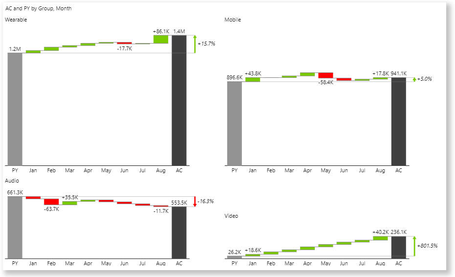
Small multiples are one of the most powerful data visualization methods and also one of the most powerful features in Zebra BI. You can create them from any Zebra BI chart, including combo charts, charts with forecasts, or vertical charts. It’s also childishly easy – simply put your desired data field into the Group placeholder:
To get inspired and learn more about how small multiples can take your Power BI reports and dashboards to the next level, read Creating small multiples in Zebra BI.
We assume you already are a Zebra BI for Power BI user. If not, feel free to start a free trial.