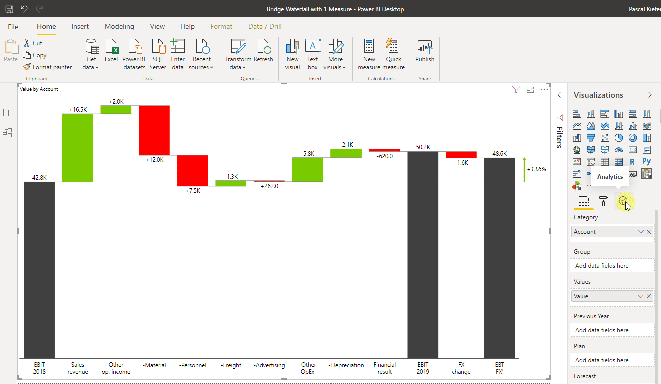
The waterfall chart is a very popular chart type because it gives so much valuable insight. Creating a chart like the one below is usually tricky, yet a piece of cake when working with Zebra BI.
If you are not the Zebra BI for Power BI user yet, you will have the best experience, if you start a free trial.
⚠️ Hint: We also offer an add-in for Excel and PowerPoint which makes adding waterfall charts super easy.

Want to learn how to create this waterfall chart in Power BI? Read below for step by step instructions.
Create a list in Excel
Before you can create this kind of visual, you need to manually create an Excel file according to your needs. In this article, we are using this table.

Let’s look at what the 3 columns mean:
- AccountID: Because the accounts should show up in a specific order and the standard sorting of accounts which are defined as text would be alphabetical, a column with the sort order is needed.
- Account: These are the accounts that will be shown in the chart. Of course, you could also set up a similar visual for countries, products, employees, or any other category.
- Value: The values could be plain actuals, or already a calculated deviation between Actuals and Budget or Actuals and Previous Year or any other calculation.
Load data from Excel to Power BI
If you need help, learn how to load data from Excel.
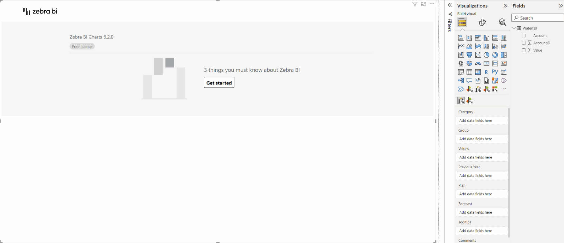
Insert a Zebra BI Charts visual to the report
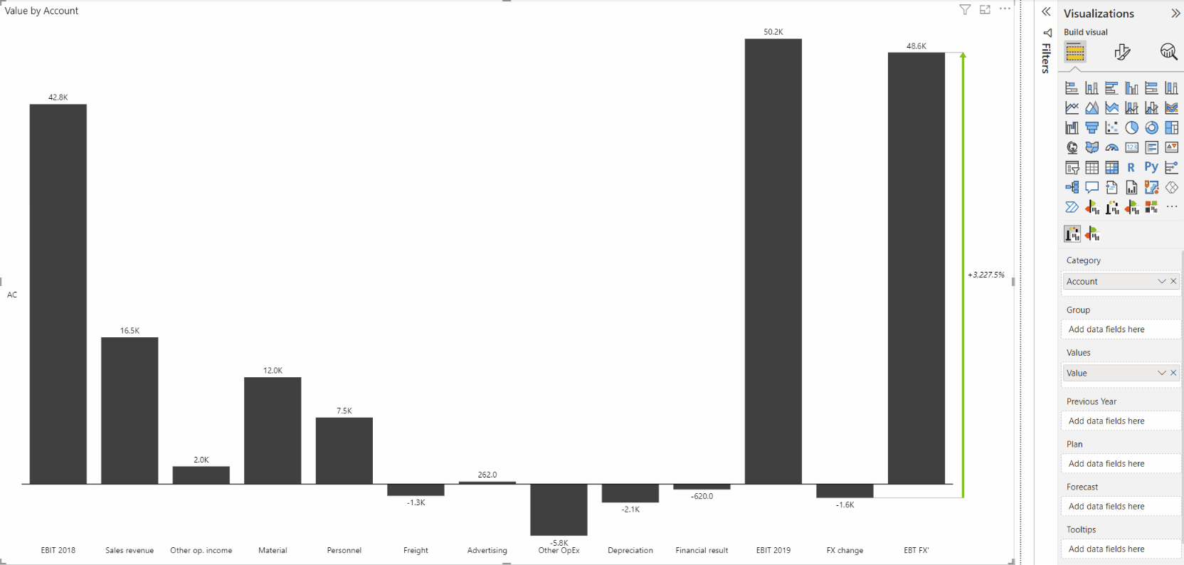
Add the Accounts to Category and values to the Values placeholder
(In this article we focus only on how to create the income statement so we took a shortcut and didn’t create any measures. As you can see, we added 2017 and 2018 directly to the visual. This is not best practice so we recommend that you learn how to create basic measures and add measures instead.)
Use the chart slider to show the waterfall chart
The chart slider arrow button appears when you hover over the left or right side of the visual. Click it until the waterfall chart is shown.
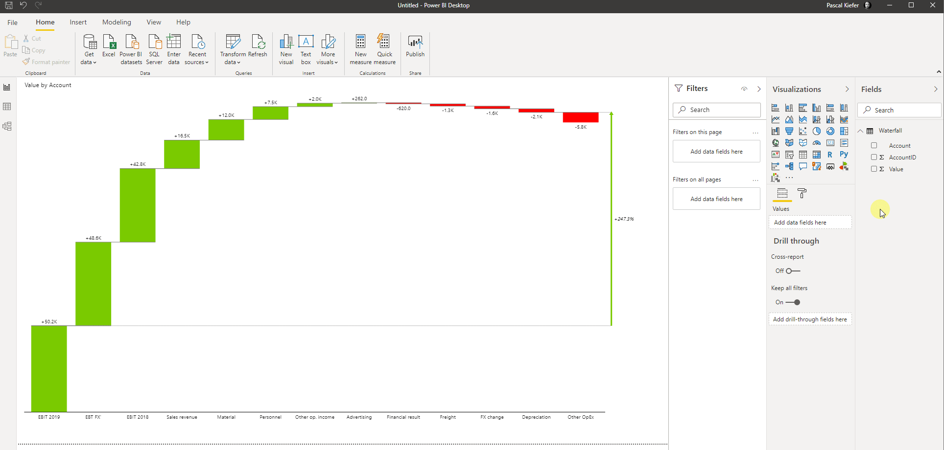
Add the correct sort order to the accounts
To do that, select the account dimension in the Fields list and then select
Column tools > Sort by column > Account ID. From now on, the accounts are not sorted alphabetically anymore but by the numbers in the sort column. For the already added visual, you need to change the sort order by clicking on the three dots which appear when you select the visual. Select sort by > Account. Since the standard sorting is descending, you have to go back to the sort menu by clicking the three dots again and select Sort ascending.
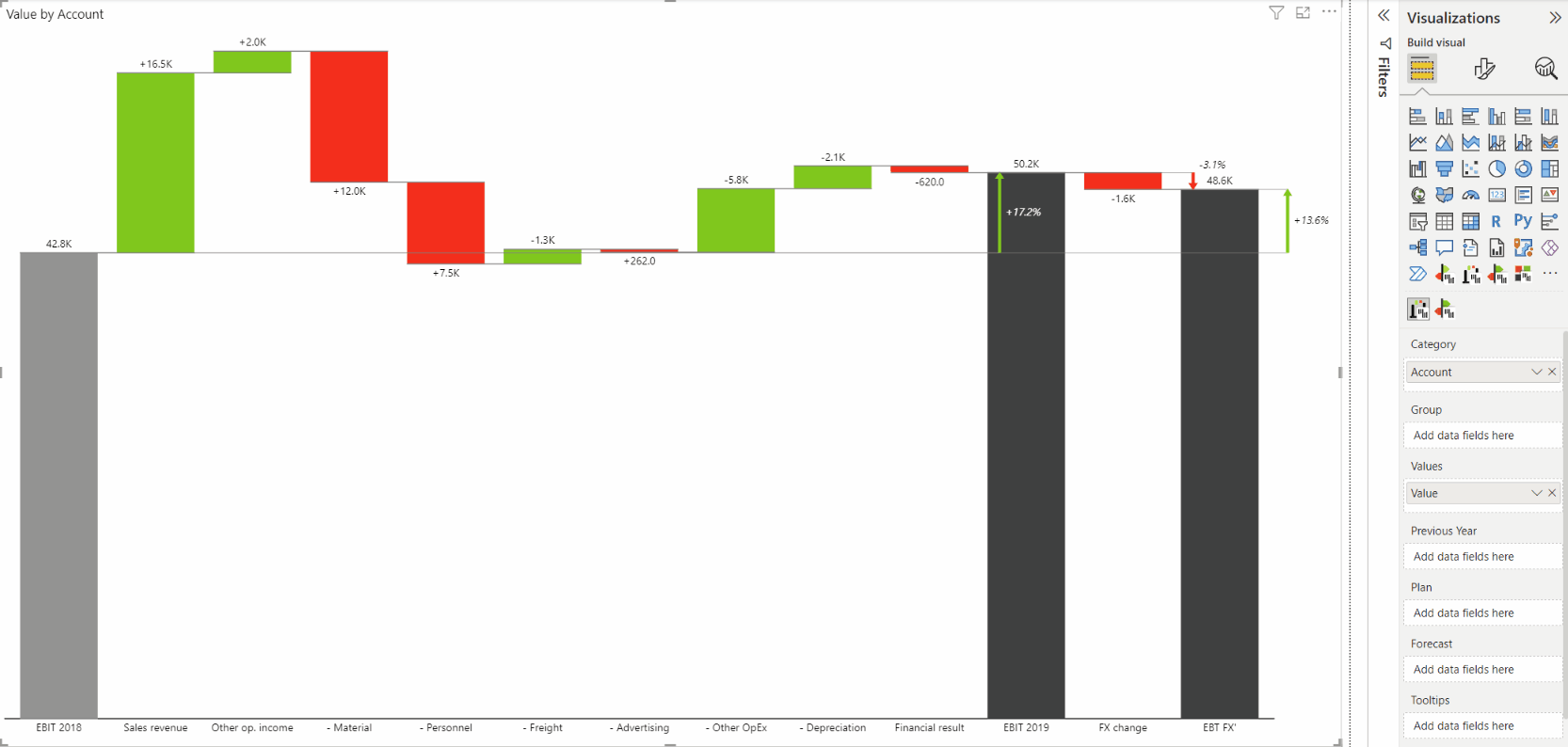
Make sure every bar is defined correctly
The standard behavior of the waterfall visual is to make a green bar going up for all positive, and a red bar going down for all negative values. Since our data contains totals (the black bars) and some negative accounts (For example the account material is a cost account so +12 means more costs and this is a negative impact), we need to make sure every bar is defined correctly. To change the definition of a bar, right-click on the label and select the appropriate option. For EBIT 2018 select Result, which turns the bar black.

The same needs to be done for all other totals (EBIT 2019 and EBIT FX).
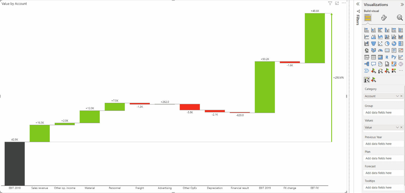
Eliminate the gap in the chart by inverting the cost accounts
⚠️ Hint: You can also change the sign logic for negative accounts in the source. By doing this, you don’t need to invert these positions in the visual.
Of course, the same also works for the Zebra BI Tables visual. You can change between the visuals by selecting the desired visual from the visualizations pane. You need to change the visual style of the Values column to Waterfall to see the correct result.
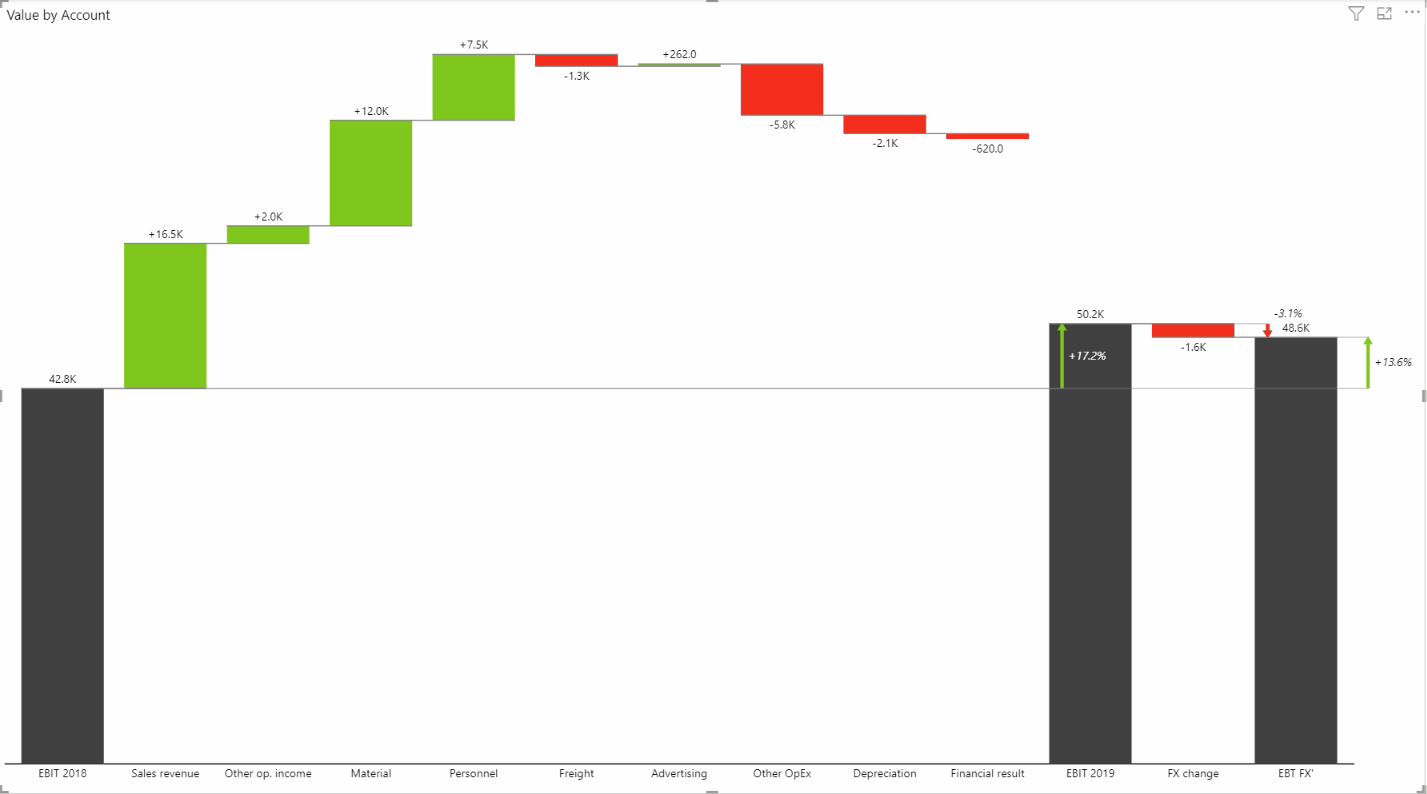
A visual like this can be very powerful and you can add your custom categories and show what’s essential to your end users. As such, we recommend you include it in every report possible.
Add scenario notation
The 5.4 update of the Zebra BI Charts visual brought an important upgrade to the single-measure waterfall chart. The notation patterns can now be applied to this chart and this can be done in just a few simple steps:
- Add one measure to the Values placeholder
- To present data with the custom notation, mark the categories (Previous Year, Plan, Actual, and Forecast) as a Result by clicking o the category name.
- By default, the pattern will be marked as an Actual for all the categories.
- To assign the IBCS patterns, click again on the category and choose the appropriate pattern.
This will make your single-measure waterfall chart even more actionable and insightful.
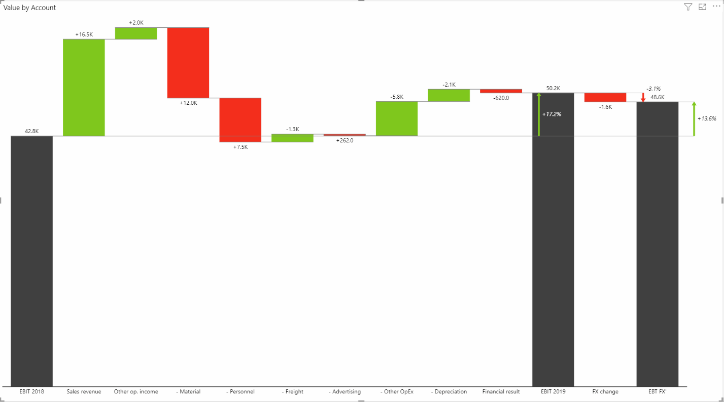
Subtotal difference highlight
To see the changes between different subtotal values immediately is crucial for obtaining immediate business insights. With the 6.1 update of Zebra BI Charts for Power BI visual, the single-measure waterfall chart lets you do just that.
By default, the subtotal difference highlight is turned on which means it appears automatically when you add the values (in step 2). To adjust the settings (or turn the functionality off), you can go to the Formatting pane > Difference highlight. You will see that you can adjust several different settings like the type of variance displayed (absolute, relative, or both), the From/To points of the highlight, the line width, style and color, the arrow style, and the highlight shape (ellipse, circle, or nothing).
⚠️ Hint: You can also change the variances directly on the visual by simply clicking on the values.
If you’d like to explore your options and start building reports with Zebra BI visuals right away, you’re welcome to try them with a free trial.