Sometimes the default scenarios (Actuals, Previous Year, Plan, and Forecast) that come with Zebra BI aren’t enough and you want to add an additional scenario, showing your custom calculation. These additional columns can increase the value of your report by giving even more insights. There are countless possibilities of what you could add to the report so in this article we will focus on how custom calculations/measures can be added to Zebra BI Tables.
We assume that you have already created a visual which compares Actuals vs Previous Year in your income statement, but what you would like to see in addition to that, is the percentage of each account compared to the revenue. So let’s create this additional measure, add it to the visual, and format it in a way that will make it stick out as shown in the picture below.
Of course, this calculation is just an example, depending on what you show in the report, you might want to have a different calculation.
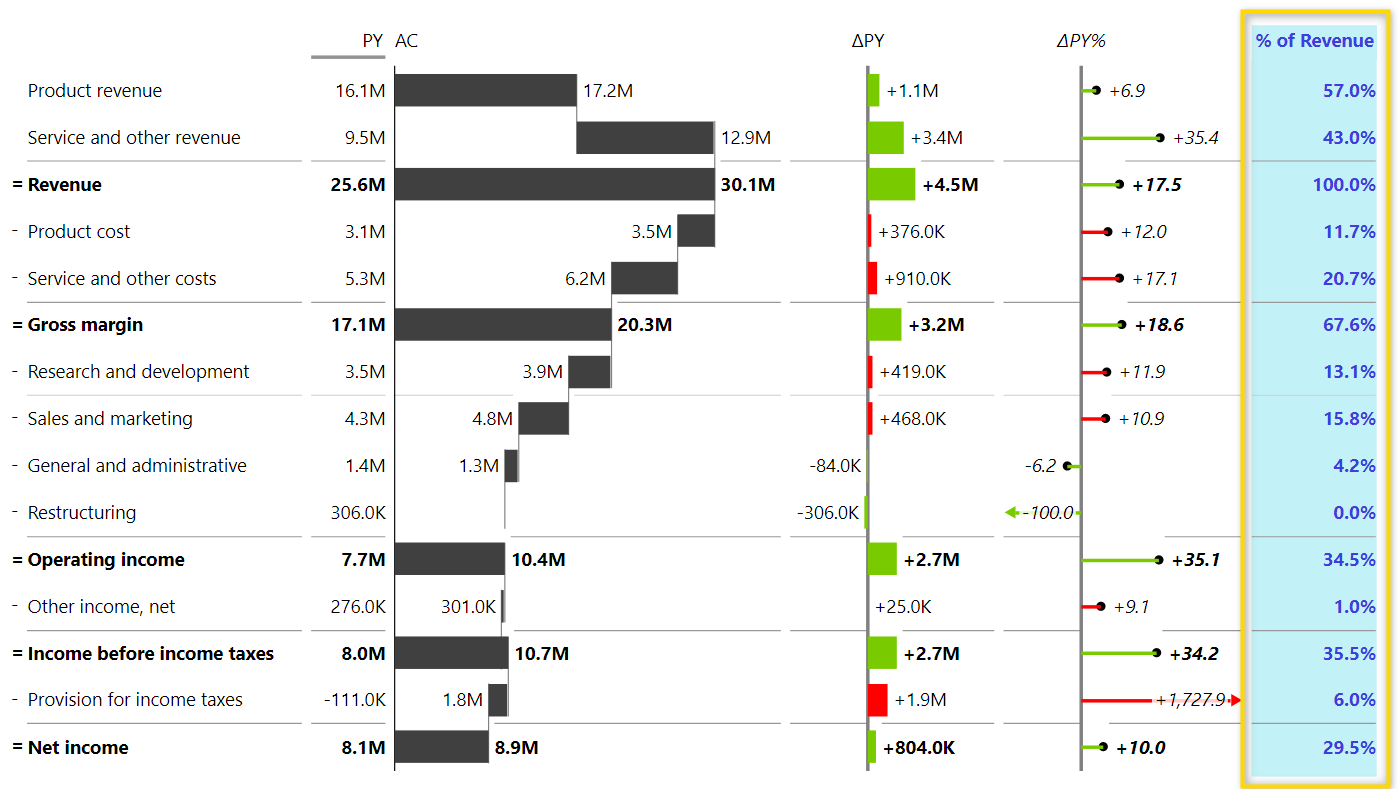
Calculate the percentage of each account compared to the Revenue
You need to create a measure like this:
% of Revenue =
	 DIVIDE(
	 SUM(IncomeStatement[2018]),
	 CALCULATE(SUM(IncomeStatement[2018]),ALL(IncomeStatement),IncomeStatement[Account]="Revenue"))
Let’s break down this measure into its individual parts:
% of Revenue =
This is the name of the measure.
DIVIDE
Because you want to see the value of each row compared to the revenue in %, you need to divide the value per row by total revenue.
SUM(IncomeStatement[2018])
Use the same measure as you have used for the AC column which is the measure in the Values placeholder of the visual.
CALCULATE(SUM(IncomeStatement[2018]),ALL(IncomeStatement),IncomeStatement[Account]="Revenue"))
SUM(IncomeStatement[2018] is the measure you are using for AC. The second part includes the ALL function which disregards applied filters. Because the measure is evaluated for each row but you always want to divide by the total revenue, you need the ALL function to manually overrule the filter to always be the revenue account.
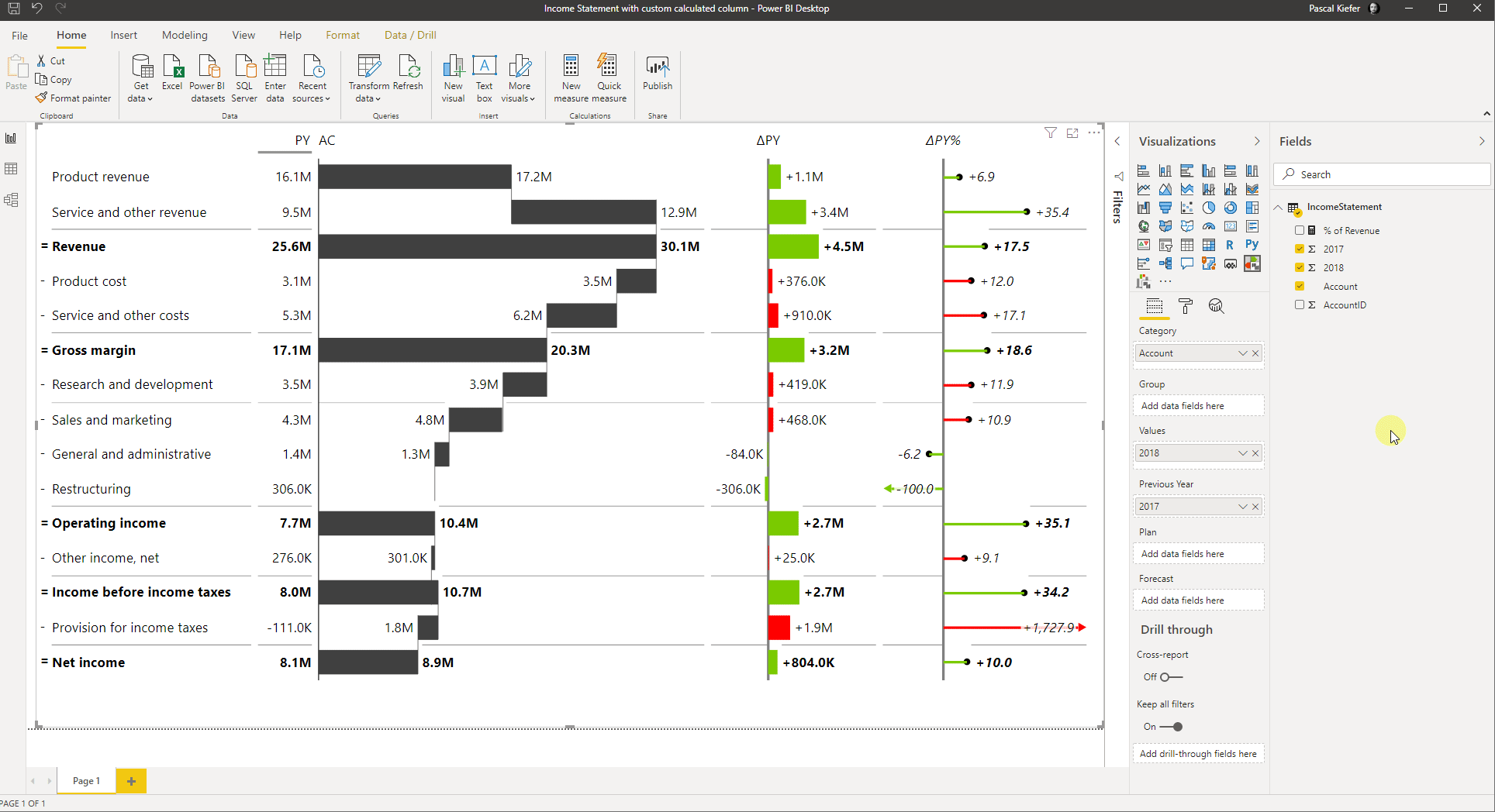
Add the new measure to the visual
Note that all additional columns need to be added to the Values placeholder.
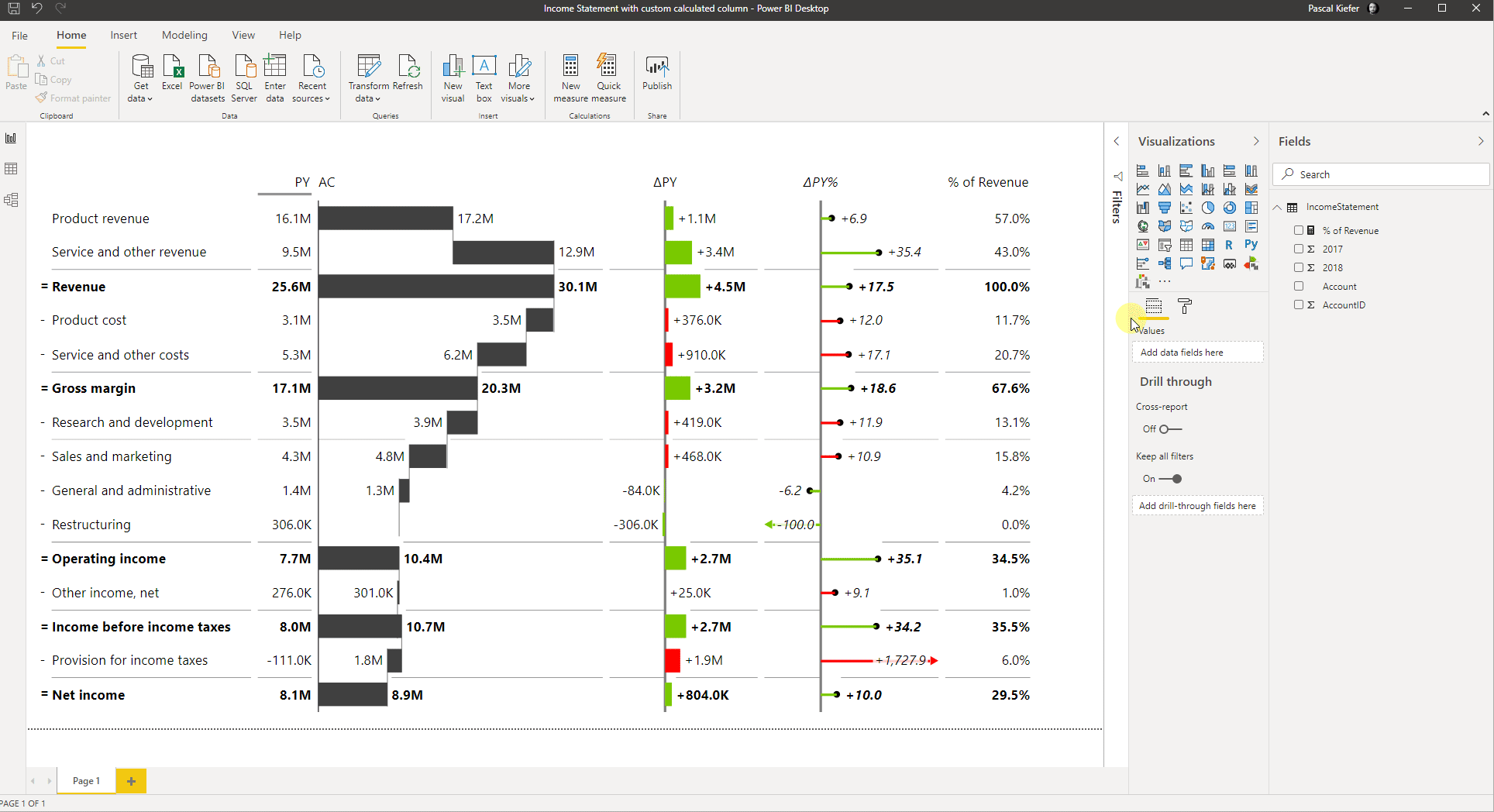
Format a column you want to highlight
To make the new column stick out, you can format it differently. There are a couple of options available. You can change the font color, background color, or make it bold.
You now have an additional custom calculation shown in the visual. Actually, you can add up to 20 custom-calculated columns to a visual to show exactly the KPIs your end-users want to see.