The Zebra BI Tables visual allows you to create a huge variety of tables and table-chart combinations. You can create simple charts with a vertical X-axis or complex hierarchical tables with charts. With the help of many great features, you will be able to create complex, yet transparent and presentable tables.
Watch an overview of the Zebra BI Tables visual
Comparison tables
We will start with a common business example of comparing Sales vs. Plan.
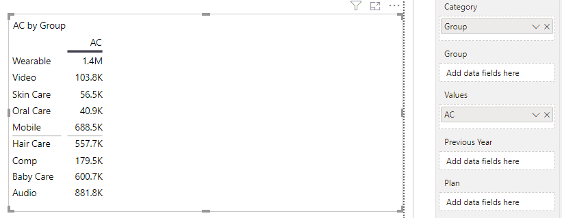
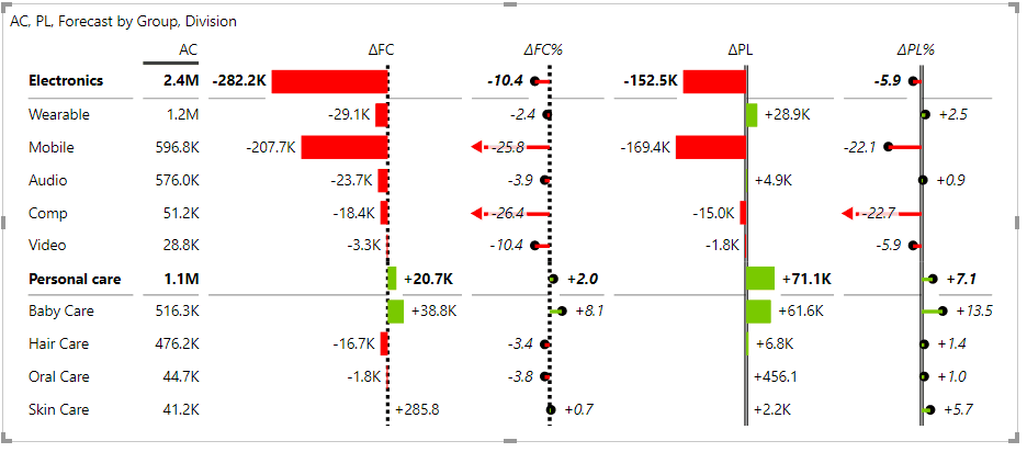
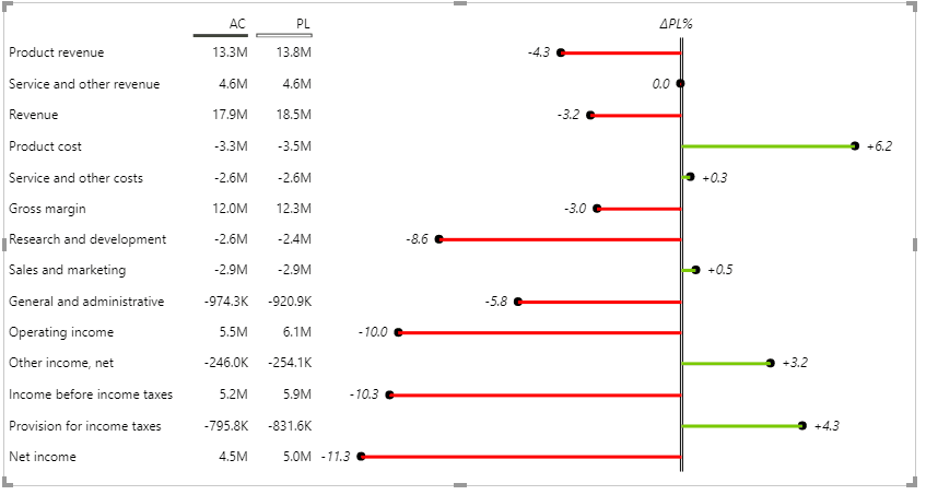
Let’s create a simple table in which we would like to compare actual numbers with a plan to see how product groups are performing. By adding product groups to the Category placeholder and measure AC to Values placeholder we get our first table of actual sales. Next, we will add our measure for the plan (called “PL” in our example) to the table to create a comparison:
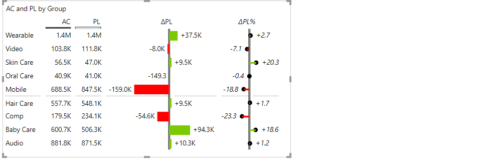
Did you see how quickly Zebra BI tables visual creates a presentable table with chart elements included without any additional calculations? Both the absolute variance to plan and the relative variance to plan are automatically calculated and displayed visually. Cool right?
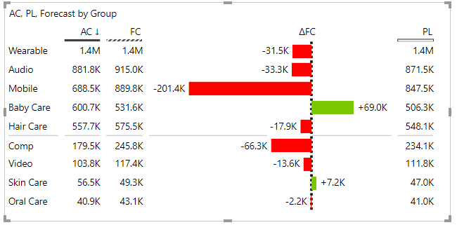
Now let’s add a third measure. We’ll add a forecast to get a better insight. Responsive layout seamlessly adds Forecast comparison. Since the Zebra BI Tables visual supports up to three comparison measures, we could also include a measure for the Previous year or another forecast. Additionally, you can hide or unhide any column in a table, change default calculations like AC-PL, AC-PY, AC-FC to different combinations like PL-FC, PL-AC, PY-PL, etc.
Learn more about displaying forecasts in charts and tables. →
Column management
We are not done with cool Zebra BI tables features. With a click or two, you can also:
- sort your measures,
- change chart types,
- change column order with a simple drag & drop or
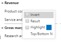
- apply different highlight elements like font color, font boldness, background color, and borders.
All these features are explained in more detail in the second part of the article Displaying forecasts in charts and tables.
Oh, one last thing. Do you prefer plain tables with just numbers? Are you a “numbers” person? Well, your favorite table is literally a click away. The slider button allows any user, even a viewer/consumer, to change the view on a Zebra BI Tables visual between a chart view and a table view:
Note that you can design these two views completely independently.
Typically, it’s a good idea to design the chart view more visually and with fewer columns to grab user’s attention and focus on the most important data columns and then provide more details in the data view for users who need to check all the data in the visual, read particular data values, etc.
Hierarchical tables
In previous examples, we have shown practical features that you can apply to enhance your tables, but we have still used the most basic example with just one data field in rows. In reality, we are often dealing with more complex datasets that are harder to display.
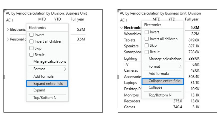
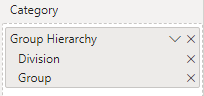
So let’s add another data field (Division) to our previous example. The Zebra BI Tables visual creates a hierarchical table with expand/collapse buttons that makes your data much more organized and easier to drill down into the details.
To use the expand/collapse functionality, simply click on the little arrow in the column header.
If you want to expand or collapse all items within a level, you can use the Expand entire field or Collapse entire field by right-clicking on any row and selecting the option from the menu.
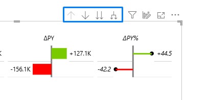
Or use the native drill-down option at the top right corner:
This is ideal for complex data exploration. You can add an unlimited number of levels to your hierarchies.
Speaking of hierarchies, you can create them in two different ways, namely
- By adding multiple individual data fields:
- By creating a hierarchy in Power BI and adding it to the Category placeholder:
To learn how to create a hierarchy in Power BI, please check out Creating hierarchies in Power BI. →
Hierarchy in columns
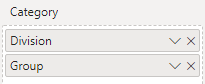
We are not done with hierarchies. By adding the quarter and month fields to the Group placeholder you create a hierarchy in columns as well. You get a cross-dimensional table (“cross-tab”) where you can drill down in rows, as well as in columns. This is super powerful. Let’s look at an example:
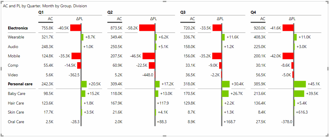
See how easy this is? You can do a lot more with multi-group (segmented) tables or cross-tables, for example:
- Add grand totals and subtotals
- Hide a column from a particular group
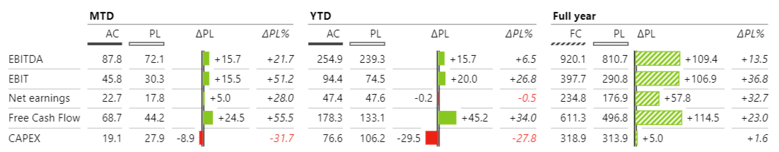
- Add period calculations as groups to create tables with MTD/YTD/Full year results
- Add KPIs as groups to compare the performance of several measures in the same table, etc.
For details, please check Creating tables with multiple groups (“cross-tables”). →
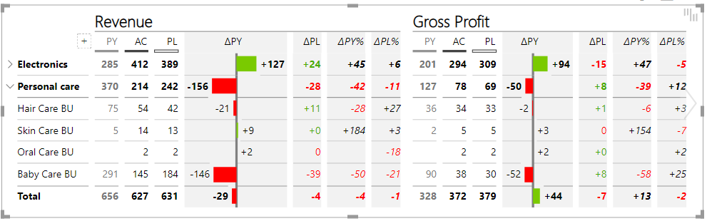
Income statement
An income statement is part of every financial report but visualizing it can be quite tricky. With the Zebra BI Tables visual, creating a visual like the one below only takes a few steps thanks to subtotals, invertible rows for costs, and automatically calculated absolute and relative variances (e.g. to the previous year, to plan or both):
In our case, the categories for costs are already negative values but in practice that is not always the case. In the Zebra BI Tables visual you can simply change this by right-clicking on a category name and select Invert option so that categories like this will be subtracted instead of added to the income statement.
Read a detailed explanation of how an income statement (P&L) report can be created from scratch. →
Additional measures
Besides default scenarios like Actuals, Previous year, Plan and Forecast, you can also create and add up to 20 additional measures to provide additional insight to your tables.
Let’s look at an example below where we added a custom measure “Portfolio %” in order to better understand the split between our product categories:
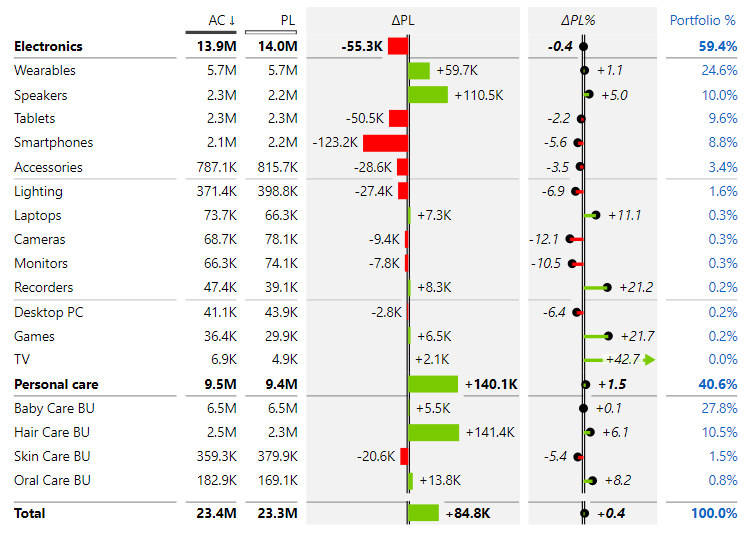
Of course, you can also display additional measures as a chart or apply standard highlighting options like font color, background color, border, etc.
Learn more about adding custom-calculated columns. →
Top N + Others in Zebra BI Tables
Last but not least we’ll take a look at the Top N + Others feature that provides additional flexibility to your reports and makes them more presentable, organized, and focused.
This feature comes handy especially when working with larger data sets. You can focus on what really matters by selecting top N elements. Less relevant items are automatically grouped in the “Others” category but still included in a chart so that nothing is left out.
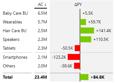
We will demonstrate the benefits of Top N in the following example. If you carefully observe the table below you can see that the top 6 categories constitute the majority of revenue, therefore we would like to focus the attention on these categories.
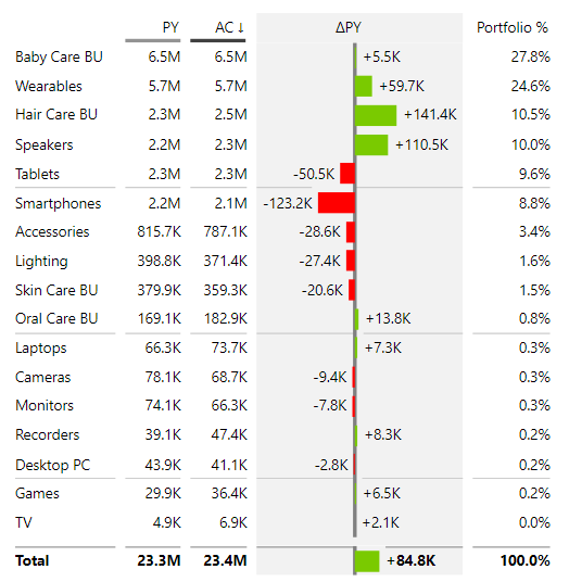
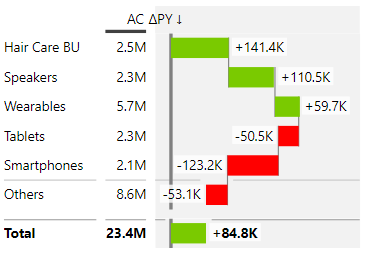
With the Top N feature we will select only the top 6 categories based on AC values. As you can see, we get a much smaller chart with a clear message.
Similarly, you could present the categories with the worst or best performance compared to the previous year. In this case, select Top + Bottom N categories based on absolute difference. The chart looks different, but it still conveys a clear and precise message:
Did you know that Top N can also be used on charts? Read all about it in Using Top N + Others in Zebra BI. →